Cropping to digital zoom presets, keeping the aspect ratio.
| “Focal length” | Pixels (ref) | Scale (1-dim) |
|---|---|---|
| 28mm | 8368 x 5584 | 1.00 |
| 35mm | 6704 x 4472* | 0.80 |
| 50mm | 4688 x 3128* | 0.56 |
| 75mm | 3136 x 2096 | 0.37 |
| 90mm** | 2603 x 1740 | 0.31 |
| 103mm*** | 2280 x 1522 | 0.27 |
| 166mm**** | 1408 x 939 | 0.17 |
| 333mm***** | 704 x 470 | 0.08 |
* Cropping in Photomator and respecting original aspect ratio, the 35mm height is +2px and the 50mm height is -2px vs expected.
** The 90mm is featured on the Q3, not Q2, but I simply did 90mm/28mm ≅ 3.214x for the scale factor, and (1/3.214) * 8368px = 2603px.
*** I'm interested in 2280px width because I'm developing a new website media display standard max width of 1140px, so a 2x pixel density means exporting to 2280px width. I reverse approximated the focal length via (8368 / 2280) * 28mm ≅ 102.8mm.
**** I'm also interested in 1408px width because it's 2x the current website text width of 704px. So text-width photos (again, 2x pixel density) would be exported to 1408px width. Focal length again reverse approximated with (8368 / 1408) * 28mm ≅ 166.4mm.
***** Same story for 704px, just a perverse experiment.
I don’t get these crops automatically in Apple Photos or Photomator even when I take a photo with those crop lines on,01 so there isn’t any real reason to abide by these. These just seemed like convenient settings to try.
Question: If the full photo is a 28mm focal length, why do the specs call it a “Digital 35 mm compact camera, fixed focal length?” Is this a convention, or about the sensor size?
Cropping Limits
I am curious about how focus interacts with crop in shallow-DOF photos. Here are a variety of crops shown on a photo:
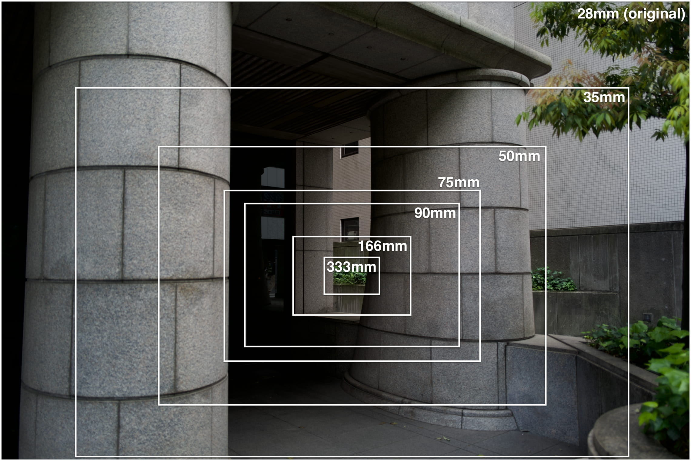
Here are each of those crops displayed at text-width.02
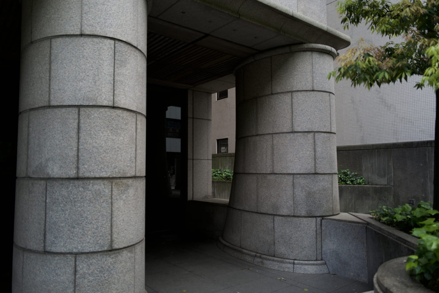
28mm (orig) [f1.7]
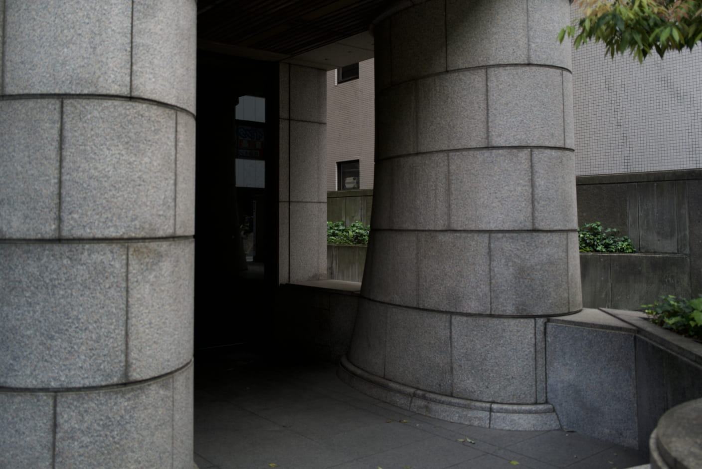
“35mm” [f1.7]
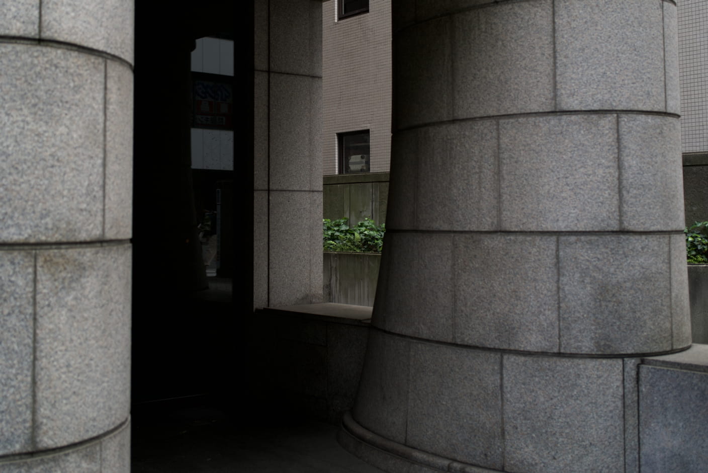
“50mm” [f1.7]
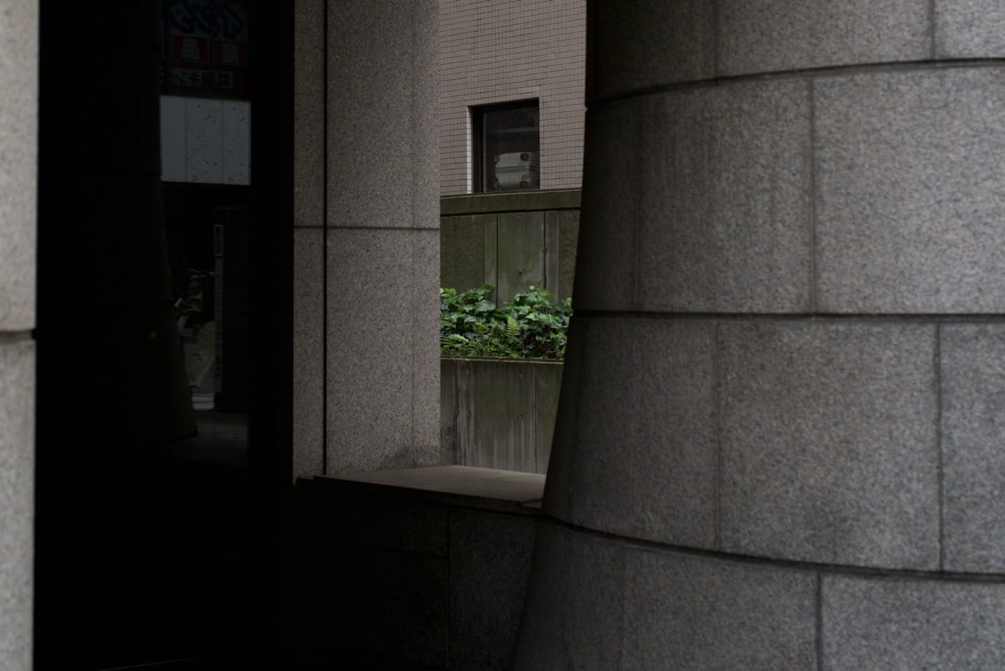
“75mm” [f1.7]
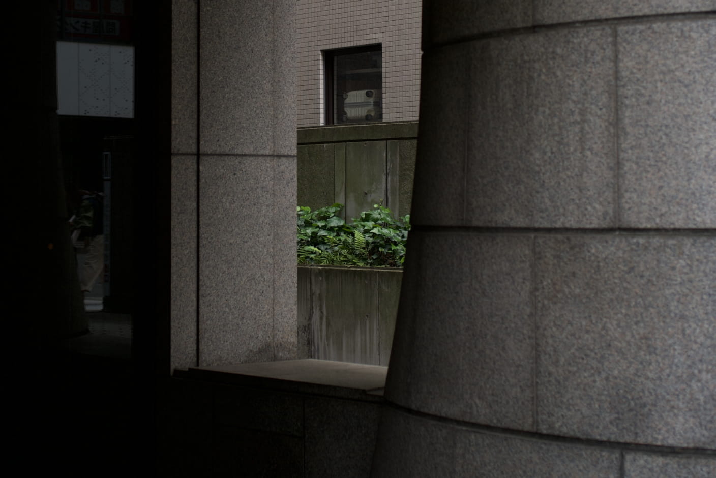
“90mm” [f1.7]
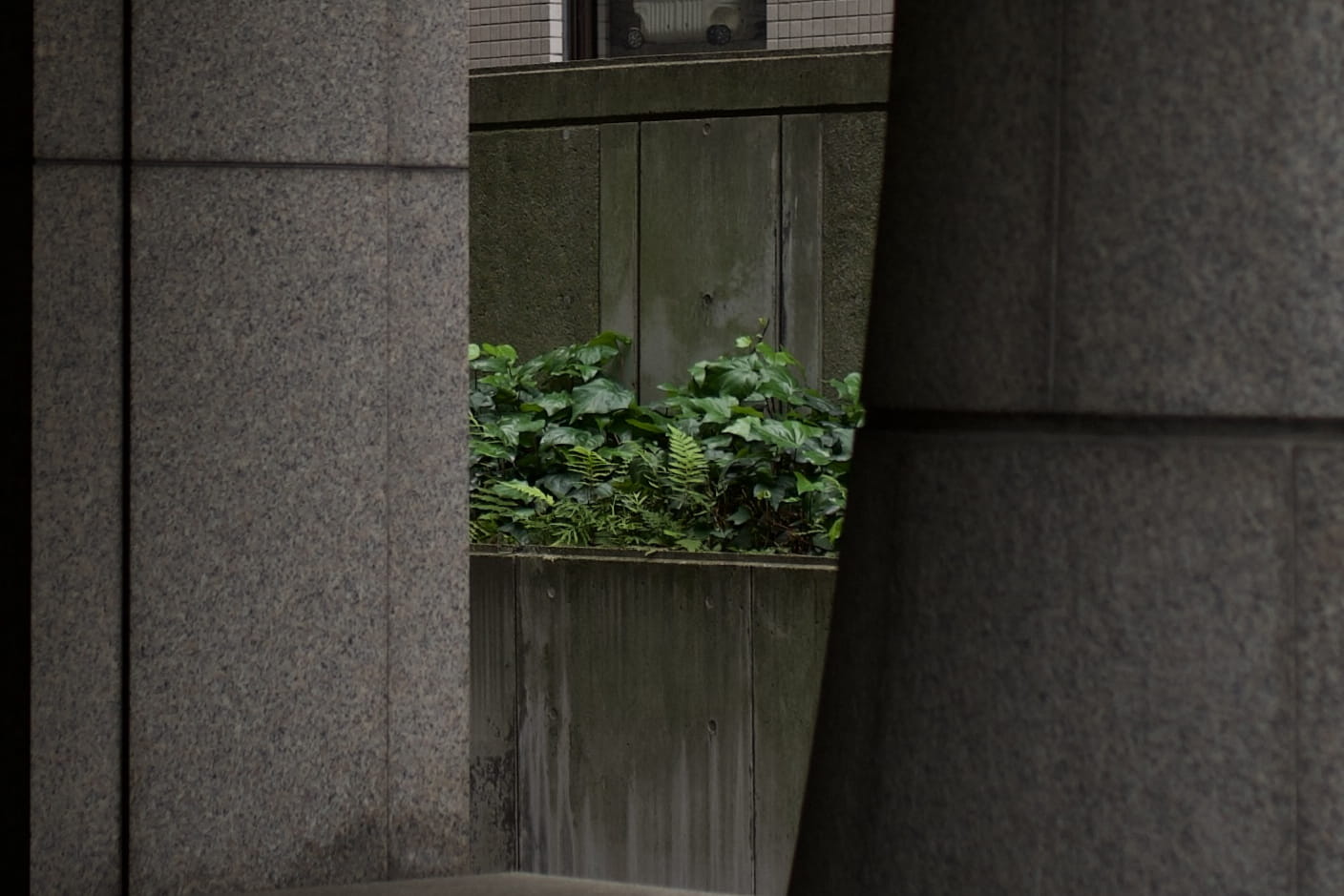
“166mm” [f1.7]
I am shocked to see that, at this small of a width, the “90mm” crop is totally usable.
Out of sheer curiosity, I cropped down to 1408px, the equivalent to an eye-watering 166mm zoom, and… it looks excellent. This is totally surprising and delightful. I assumed that the raw image pixels didn’t correspond to usable pixels, just a somewhat arbitrary binning of sensor data. But it completely works.
And since if something is worth doing, it’s worth overdoing, I went past the 2x pixel density and made a raw 704px width photo, which I guess would be 333mm.
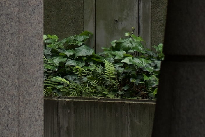
“333mm” [f1.7]
To me, this finally looks blurry. I think this is because it’s now actually stretched on a 2x pixel density screen. To verify, we can display it 1/2 size03 to make it 2x pixel density again.

“333mm” [f1.7], displayed 1/2 size for 2x pixel density
Doing this, I realized I’m stupid and this is now just exactly a cutout of the “166mm” photo.
My tentative conclusion is that yes, you really can use each pixel that comes out of the camera.
Practical Limits
On the website, I anticipate exporting at two potential widths:
- 2280px (“103mm”) for wide media of max 1140px @ 2x pixel density
- 1408px (“166mm”) for a text-width media of max 704px @ 2x pixel density
This means, when cropping, those are my realistic boundaries.04
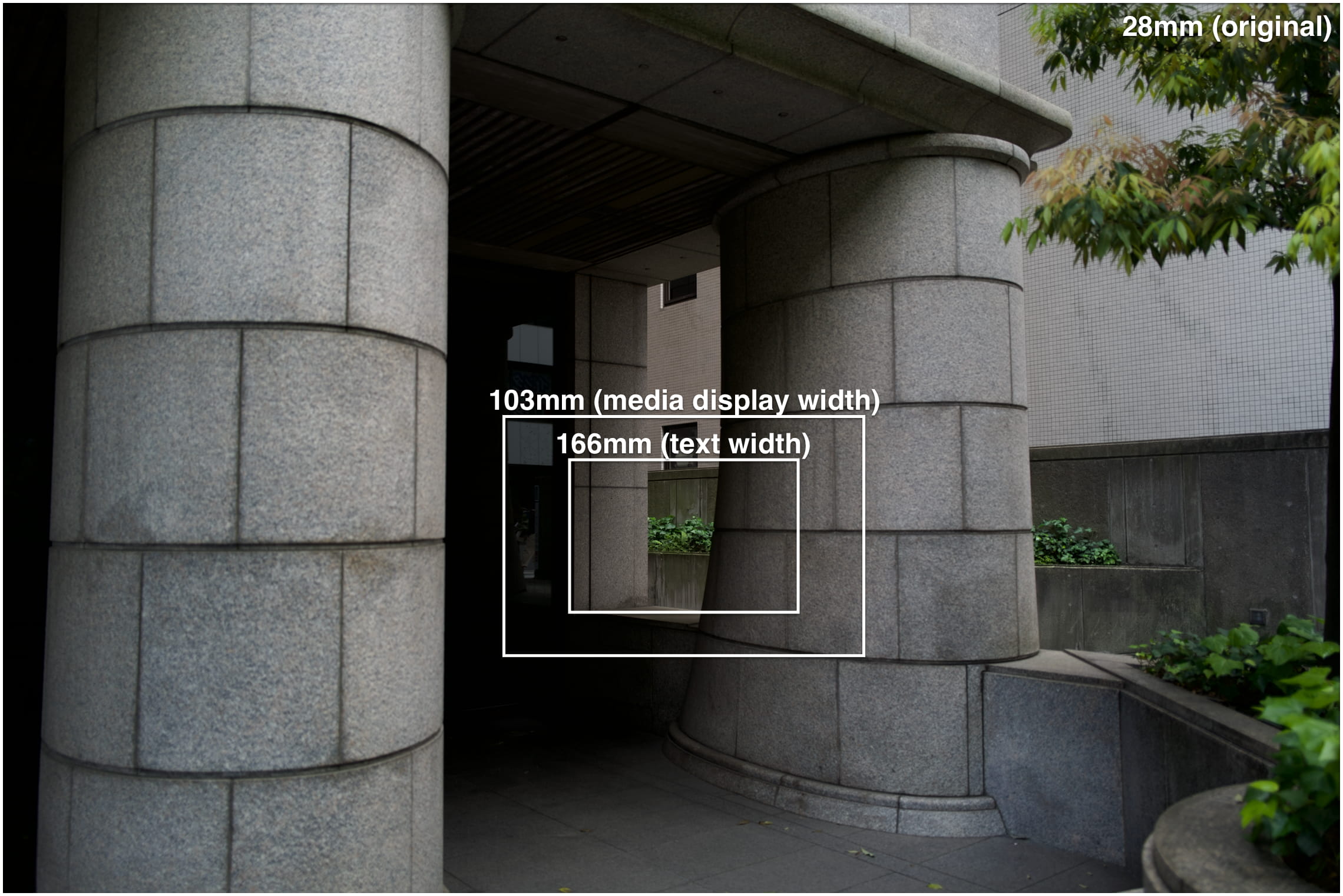
Here’s what each of these crops look like at their intended display size.
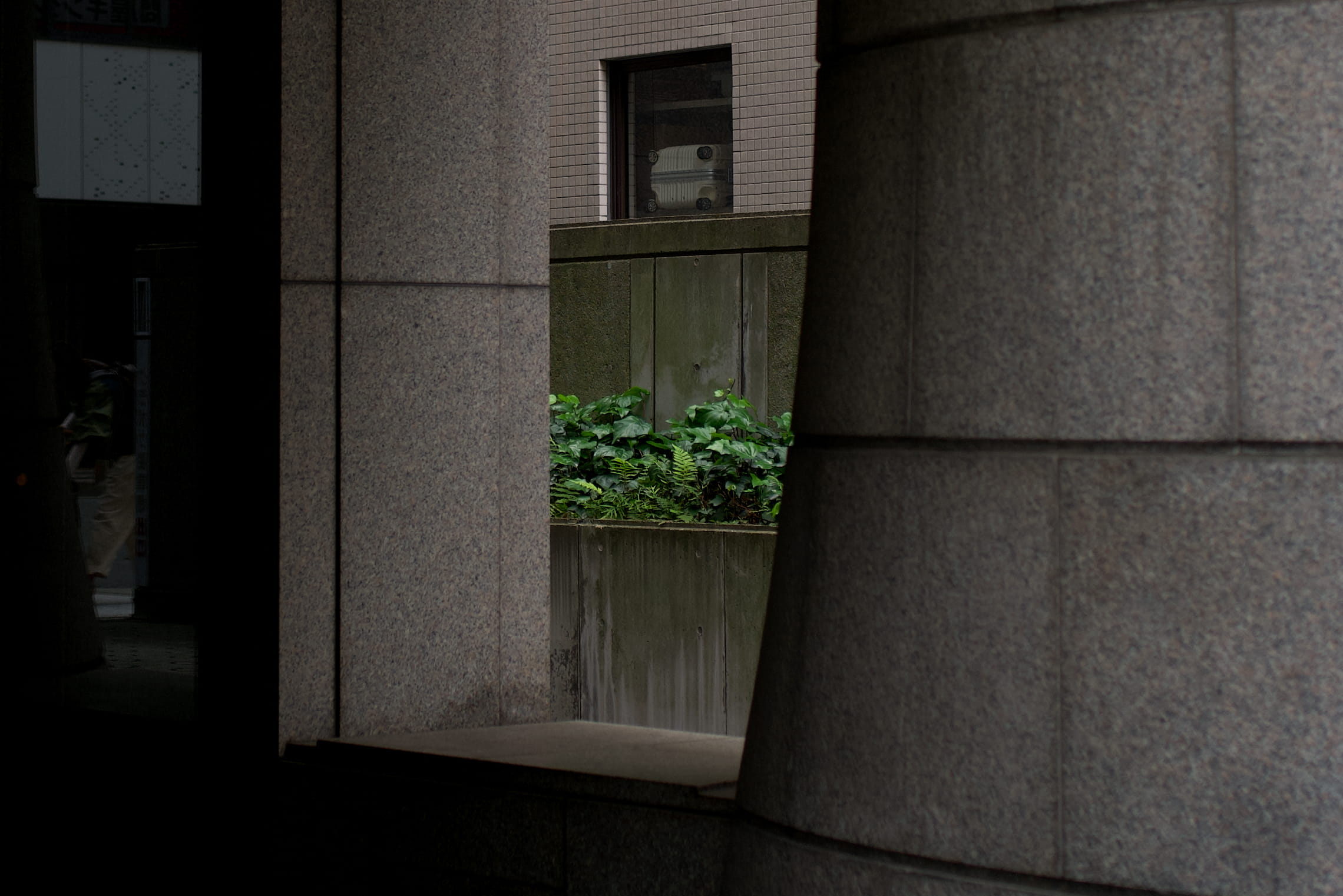
Crop of 2280px (“103mm”), displayed at max 1140px [f1.7]

Crop of 1408px (“166mm”), displayed at max 704px [f1.7]
On a big enough screen, the bottom image should just look like a cutout of the top. I.e., they should be at the same scale.
This is, again, delightful because there’s so much room to crop.
Footnotes
I think Lightroom might do it, but I haven’t been willing to take that plunge yet. ↩︎
All crops are exported to 1408px width and displayed at maximum of 704px to allow a 2x pixel density. ↩︎
Sizes are confusing. This cuts each of the width and height in half, so it feels like “half size,” though the area gets cut by 1/4. ↩︎
There are also cover photos, which will probably be bigger. ↩︎