Image layout test page
I want to experiment with wider layouts, so want to have HTML/CSS formulas for breaking out of the normal content flow.
Result: House styles [v2]
v1 styles were height-limited but stretched to the full screen width where possible. They could incorporate SVG filter background blurs for single-row images or videos to help create consistent margins.
v2 styles are width-limited using .max-w-media. This width limit factors in a device’s height to allow two-column portrait orientation 2:3 photos to be displayed fully. The same limit allows one-column landscape orientation 4:3 image to be displayed fully. Width limits apply to a new container, not the images. As a result, all row configurations will display with identical margins, assuming images are of a sufficient width. Background blur via thumbhash is automatically applied to single images. Extra options include container (all row) width limits and extra image classes.
With the new width limit, tall single images will stretch beyond the height of the page. This is an intentional omission given (a) the upcoming focus on 3:2 photos, (b) the desire to have consistent margins. Currently, this can be worked around with container width limits.
Non-w-full max-w-full is still supported, now with an options argument {fullWidth: false} or shortcut img2i.
See them in action at the image placeholder test page.
Workbook
My process of working through getting the house styles.
Small, centered
This image should be smaller than the main page flow, so should be centered.
The next one should also be smaller and centered.
Pixel density
This image should display at 256. The source is 768. For displays that use higher pixel densities (e.g., retina displays, most phones), it should be crisp.
To compare two side-by-side, the following images are both displayed at 256 x 256 pixels, but their source images are:
- 256 x 256 pixels
- 768 x 768 pixels (i.e., exported @3x)

I use 3x for all higher-pixel-density images on this page simply because that’s best for my own devices. But devices should render any source / display ratio. E.g., here’s 0.5x, 2x, and 4x.
@0.5x
@2x

@4x
Text width image, pixel density
Even without manually specifying a width (as we did in the above pixel density test), we expect the page width clamping to have the same effect, and higher pixel count images to be crisper.
The current full width of the layout is 704px.
The following image is 704 x 704 px, rendered at that size on the page.
The following image is 2112 x 2112 px, rendered at 704 x 704 px on the page.
Excellent.
We could go to 4x for future-proofing, but I think there is diminishing returns, even with devices.
Real image, pixel density
Deep dive into this in Image size test page
w-full max-w-full image
This image will take up the full width of the page no matter what size the image or the page is. (My screen only goes up to 1680px width.) It will have no horizontal margins.
w-full max-w-full image, with horizontal margins
See next section for technique notes. (These images aren’t width-limited, so they may go past 1500px width.)
px-2
px-4
px-8
Wider-than-text width centered image
While the page width is ≤ the image width, this image will take up the full width of the page with no horizontal margin. Once the page is wider than the image, it will be centered in the page with equal horizontal margins.

We achieve the breakout by using the .w-full max-w-full CSS class designed for w-full max-w-full images, but we instead put it on a parent <div> to the image. This <div> then takes up the full screen width, and the image is free to position inside it.
For a desired 3x pixel density (width px: src 3k, disp 1k), its width needs to be manually limited, or it will, by default, be displayed at its true “size” and a lower pixel density. This can be accomplished with the attribute width="1000" or style="width: 1000px;"
Wider-than-text width centered image, horizontal margins
… as needed as the page shrinks.
px-4
Max-width (centered) wider img, horizontal margins only on ~m+ sizes
Desired behavior:
- small (phone): no H margins (want to see as much of photo as possible)
- medium: some H margins
- large: bigger than photo, so margins don’t matter
md:px-1 lg:px-4
Three images arranged wider than text
These each take up exactly 1/3:

⅓
We can add a horizontal page margin:
⅓, px-4
If we make them each take 33%, they distribute the remaining 1% of available width between them.
33%, px-4
We can set their max-width CSS so they are spaced more evenly when space is available.
⅓, px-4, max-width imgs
This effect—using available spacing—is more readily visible with smaller images.

⅓, px-4, max-width imgs
To get the images to stay closer to the center, you make the images bare and add justify-center flex. However, they then have no margin. Adding padding or margins works until the page shrinks so their widths are shrinking; then they balloon out past the page width with their extra margins/padding. To fix, I had to wrap them in <div>s, then control the padding on the outside. Making the images proper (max) widths then involves a calc() on the <div>. Quite complex.
justify-center + px-2; divs w/ ⅓, px-1, max-width (on divs); imgs bare
Turning up the padding is fine. Be careful going down the rabbit hole of trying to get consistent horizontal page margins, though. Because of symmetric padding on the image LOL went down rabbit hole. Turns out switching to margins makes this somehow all work beautifully, and don’t even need <div>s (which we need so the images are the same size and they aren’t shifted L or R on the page), combined with overall padding, we end up in 0.5 Tachyon units (I think).calc() in the max-widths, because we’re not affecting the image sizes now. (Next example still uses padding; house style uses margins.)
justify-center + px-4; divs w/ ⅓, px-2, max-width (on divs); imgs bare
Regardless, we now have something that looks and works fine for 3 max-width’d imgs w/ some margins.
Seeking a “house style” below:
Margin 1 between images always. Page border is: nothing (small), 1 (m), 3 (l).
Testing this third house-style w/ larger images
Margin 1 between images always. Page border is: nothing (small), 1 (m), 3 (l).
Simplifying from later findings; I think we don’t need w-1/3 at all.
Portrait and landscape w/ “house style”
The following isn’t working:


Broken portrait & landscape (first image shrinks before & too much). Margin 1 between images always. Page border is: nothing (small), 1 (m), 3 (l).
While margins are fine, and the heights all match up at full size, but the height of the first image is shrinking before the second.
Wild enough, removing the <div> third/two-third widths fixed.
Fixed portrait & landscape. Margin 1 between images always. Page border is: nothing (small), 1 (m), 3 (l).
Mixed sizes with house style

Incredibly, this just works as well. My takeaway is to export things to be the same height and then let flexbox’s basic layout take it away.
Other little tricks
-
make images
db(i.e.,display: block) so that divs don’t leave little bits of extra space apparently for descender elements -
accordingly, then add
mv1when doing grids for vertical spacing -
… and relatedly, don’t forget to add
my-0to the images so that the margins can be controlled with the containing<div>s
Rewrapping
Simply adding flex-wrap to the container gives us a simple wrap, where elements are wrapped as soon as the row can’t fit both at full size. We can add my-0 to the images and fig to the container if we want them to wrap closely (moving the vertical margin to the overall block).
Rewrapping w/ house style, but doing immediate when smaller than full size.
Ideally, I’d want to be able to choose to wrap only when they’ve shrunk to a certain size. In other words, we don’t need the photos to be full size, but there might be a significantly smaller display size (like if it would only be 200px wide or something) for which we’d rather wrap.
This might be possible using display: grid and grid-template-columns: ..., but TBD still. A couple resources:
… or, wait, maybe we can just use a media query to only add flex-wrap! Going from the house style below. Also needed to do margin adjustments: inter-pic margin is right only when not wrapped, and bottom when wrapped.
This isn’t perfect, because I think once the page width is less than even 600px or so, the photo get a bit too small, and this only wraps < 480px. But realistically, this will fix the other major viewing use case (phones), and all the media queries work exactly together, so I think it’s worth it.
Doing for 3 imgs too:
Height limits
I can’t ignore it: I probably implicitly designed for image heights that fit my viewport. Let’s think about limiting them.
Capping @ view height. Should we also set another max height? It actually seems to look pretty good everywhere.
Does this work for 2 imgs?
Wow, yes, it does beautifully… I guess I should just go for this? Only potential downside would be over-stretching for bigger screen devices. But honestly, being > CSSpx but < PHYSpx isn’t the end of the world, it’s already better than most photo displays people are going to encounter.
One more test: 1 img portrait.
Capping @ view height, portrait.
I think the answer here is that “it depends on the design.” For almost all layouts, a portrait photo isn’t going to get that big. For laptop/desktop/ipad-in-landscape, the height caps the img, leaving lots of space in the width, and it goes with the flow. For a phone, the width caps it, since they’re so tall, and the photo only takes up ~1/2 of the screen. BUT, the one exception is the iPad in portrait mode. It’s exactly portrait-photo-size, so a big portrait photo will fill the whole thing.
That’s where the design part comes in. If it’s a nice photo, it could be really cool. If it’s kinda crummy, yeah, it’ll be a huge crummy photo. If you want to design around that for iPad users in portrait mode, then throw in a min(100vh, 939px) or something. Otherwise, just keep 100vh and roll with it.
Determination for max-height:
min(100vh, 939px)— general purposes. let images be seen in full, and also keep things at least @2x. wider displays will have photo sets nicely centered in the middle939px— portrait images we want as bigger/establishing. this way smaller desktops will have it display larger (than the viewport height), and we’re keeping things crisp for ipads rather than having them blow up huge.
Varying Widths: Region Filling
Ugh, the thing I didn’t want to address.
In some situations, this will happen inevitably as long as we’re limiting photo heights to viewport heights, and are unwilling to make surrounding photos more narrow (width-limited). Examples:
-
a portrait photo, then a landscape one
-
a landscape photo (height-limited), then two side-by-side photos (width-limited)
I’m still torn philosophically on limiting photos to viewport heights. I think I like it, at least for landscapes. For portraits where the aim is more establishing footage, I’m not so sure; they’d be so tiny on a poorly-dimensioned landscape-oriented screen.
I am pretty confident limiting side-by-side images to narrower widths is bad, though. They are already nearly too small at full-screen with full width access; much smaller and it’s basically pointless to have them.
Assuming I do end up with consecutive varying photo row widths, the main thing I can try is some background. Below contains a graveyard (in comments) of approaches, with one that finally worked:
- ❌ SVG-generated fractal noise (colors too random)
- ❌ BG gradient (manual + didn’t look good)
- ❌ BG gradient + alpha (manual, still didn’t look good)
- ❌ BG image, as addl. element, CSS blurred (could not get horizontal edges crisp)
- ❌ BG image, as parent. element, opacity w/
background-blend-mode(could not get blurring, didn’t look good without) - ✅ BG image, as addl., element, blurred w/ SVG filter (hat-tip) (looks good, can re-use image, crisp edges). Implemented below:
However, now a new challenge arises: it’s too wide.
Varying Widths: Width Matching [draft]
Because the photos are now all viewport height-limited, it’s possible for even side-by-side images to not take up the full width. This means that our new burred image background gets 100% page width when it shouldn’t.
Reading a bit about CSS Flexbox, it seems like it really only thinks row-by-row. When there’s a new flex row, it doesn’t know about the content above it. This seems to be a problem because I explicitly want my rows to be of equal width. CSS Grid is recommended for 2D layouts.
However, thinking a bit more, my constraints are kind of odd:
- the target width should be determined dynamically by the contents of the rows
- the target width will be the largest combined content width
- all rows will achieve this target width
- for rows whose content fills less than the target width
- the columns inside should spread to fill the remaining space proportionally
- the content should be centered
- the backgrounds will have blurred/semi-transparent versions of the images
- all items become 1 per row for smaller displays
- ideally, none of this uses JavaScript
- ideally, this is achieved with minimal manual markup
… phew.
I can see why you’d want to simply design on a fixed-width grid.
Explicit image sizes: basics
An age-old confusion of mine. Learning in the hopes I can use this to get lazy loading to work.
Takeaway: CSS instructions take priority over attribute dimensions with both are given.
NB: Here I’m using “pixels” to mean (a) CSS pixels when referring to the display, (b) true image pixels when referring to the image size.
No dimensions given; displays at original size:
<img src="/assets/garage/image-test-pages/256x256.png">
Attribute dimensions match image dimensions; same:
<img width="256" height="256" src="/assets/garage/image-test-pages/256x256.png">
Attribute dimensions do not match image dimensions; displays attribute dimensions:
<img width="100" height="100" src="/assets/garage/image-test-pages/256x256.png">
Attribute dimensions do not match image dimensions, and do not match aspect ratio; displays attribute dimensions:
<img width="150" height="100" src="/assets/garage/image-test-pages/256x256.png">
Attribute dimensions do not match image dimensions, but CSS style does; displays CSS style dimensions:
<img style="width: 256px; height: 256px;" width="100" height="100" src="/assets/garage/image-test-pages/256x256.png">
Attribute dimensions match neither image dimensions nor aspect ratio, but CSS style matches original (both dimensions and aspect ratio); displays CSS style dimensions:
<img style="width: 256px; height: 256px;" width="150" height="100" src="/assets/garage/image-test-pages/256x256.png">
Both attribute dimensions and CSS styles are different than original; displays CSS style dimensions:
<img style="width: 400px; height: 400px;" width="100" height="100" src="/assets/garage/image-test-pages/256x256.png">
CSS styles are different than original, but attribute dimensions match original; displays CSS style dimensions:
<img style="width: 400px; height: 400px;" width="256" height="256" src="/assets/garage/image-test-pages/256x256.png">
CSS style specifies non-pixel width (100%) and no height, while attribute dimensions match original; displays CSS width, but attribute height:
<img style="width: 100%;" width="256" height="256" src="/assets/garage/image-test-pages/256x256.png">
CSS style specifies non-pixel width (100%) auto height, while attribute dimensions match original; displays CSS width, and height to match correct aspect ratio:
<img style="width: 100%; height: auto" width="256" height="256" src="/assets/garage/image-test-pages/256x256.png">
Explicit image sizes: into house styles
Now, to go more flexible. This uses the house style, which breaks out of the normal margins using the following container.
<div class="w-full max-w-full flex justify-center md:px-1 lg:px-4 fig">
  <!-- image goes here -->
</div>
Here’s a normal house-style image, whose dimensions are 2,718 x 2,718.
<img class="block my-0" src="/assets/garage/image-test-pages/[email protected]" style="max-height: min(100vh, 939px);">
But if we add the size attributes with the true image size, it goes too wide or too narrow, always taking up 100% width!
<img class="block my-0" src="/assets/garage/image-test-pages/[email protected]" style="max-height: min(100vh, 939px);" width="2718" height="2718">
Can we fix it? If we add width: auto to the CSS, it fixes the case of it going too wide, but it will still go too narrow. In other words, when the image is width-limited, it won’t then shrink the height.
<img class="block my-0" src="/assets/garage/image-test-pages/[email protected]" style="max-height: min(100vh, 939px); width: auto;" width="2718" height="2718">
Experiments:
aspect-ratioalone (w/o width spec) doesn’t fix anything vs originalwidth: autoandaspect-ratiodoesn’t improve overwidth: autoobject-fit: containalmost works, ugh so close. it adds vertical whitespace above and below the image when it’s small (e.g., try 1/3 screen size). i guess it’s maintaining some kind of “box” that’s full size while resizing the image in it.- also can’t get rid of
100vhin themax-heightthough, even thoughobject-fit: containshould height limit as well (?)
- also can’t get rid of
width: auto; height: autoworks! but… is this really going to allow lazy loading now?- update: lazy loading works! the issue was elsewhere (the background blurred SVGs)
- but the real question is: will this prevent layout shifts?
- it seems to (see below via Studio page experiment)
- but the REAL question is: can we fix this for multi-img multi-dim layouts? (see below)
<img class="block my-0" src="/assets/garage/image-test-pages/[email protected]" style="max-height: min(100vh, 939px); width: auto; height: auto;" width="2718" height="2718">
Preventing layout shifts: is this possible since CSS sets max-width and max-height, and width and height to both auto? Theoretically, it seems like it should work; the only information you get when you load the image is its dimensions, which you have if they’re in attributions. But event after reading a lengthy article about this, I’m still not sure what the answer is. Need to try it.
Easiest spot to see this right now is Studio page w/ slow 3G throttling turned on. Can see each row pop in. Intrinsic usually 216 x 216.
This works on Studio page! With the attributes, the space is reserved before any load. Note: needed to set height: auto to get layout correct, and CSS width isn’t set. So, I’m optimistic to try.
However, now trying multi-img w/ diff dims, the layout is again broken:
NOTE: I was testing this by directly embedding images w/ paths generated by eleventy imgs plugin, which I decided to stop using, so the HTML is all broken because the images aren’t there. I took screenshots for most of them, which appear after the code blocks. This is to help leave a breadcrumb trail if I’m foolish enough to pursue this direction again.
<div class="w-full max-w-full cb flex flex-wrap sm:flex-nowrap justify-center fig">
<div class="md:ml-1 lg:ml-4"><img class="block my-0 " style="max-height: min(100vh, 939px); height: auto; width: auto;" loading="lazy" decoding="async" alt="" src="/assets/eleventyImgs/OXm8tvrg-F-1252.jpeg" width="1409" height="1878" srcset="/assets/eleventyImgs/OXm8tvrg-F-1252.jpeg 1252w, /assets/eleventyImgs/OXm8tvrg-F-1409.jpeg 1409w" sizes="100vw"></div>
<div class="sm:mx-1 mv1 sm:my-0"><img class="block my-0 " style="max-height: min(100vh, 939px); height: auto; width: auto;" loading="lazy" decoding="async" alt="" src="/assets/eleventyImgs/yU7E_JSouU-1252.jpeg" width="2504" height="1878" srcset="/assets/eleventyImgs/yU7E_JSouU-1252.jpeg 1252w, /assets/eleventyImgs/yU7E_JSouU-2504.jpeg 2504w" sizes="100vw"></div>
<div class="md:mr-1 lg:mr-4"><img class="block my-0 " style="max-height: min(100vh, 939px); height: auto; width: auto;" loading="lazy" decoding="async" alt="" src="/assets/eleventyImgs/aPBhDDAiiJ-1252.jpeg" width="2504" height="1878" srcset="/assets/eleventyImgs/aPBhDDAiiJ-1252.jpeg 1252w, /assets/eleventyImgs/aPBhDDAiiJ-2504.jpeg 2504w" sizes="100vw"></div>
</div>
This appears to be caused by srcset (and sizes) attributes. If I remove it (them), the layout is fine again.
<div class="w-full max-w-full cb flex flex-wrap sm:flex-nowrap justify-center fig">
<div class="md:ml-1 lg:ml-4"><img class="block my-0 " style="max-height: min(100vh, 939px); height: auto; width: auto;" loading="lazy" decoding="async" alt="" src="/assets/eleventyImgs/OXm8tvrg-F-1252.jpeg" width="1409" height="1878"></div>
<div class="sm:mx-1 mv1 sm:my-0"><img class="block my-0 " style="max-height: min(100vh, 939px); height: auto; width: auto;" loading="lazy" decoding="async" alt="" src="/assets/eleventyImgs/yU7E_JSouU-1252.jpeg" width="2504" height="1878"></div>
<div class="md:mr-1 lg:mr-4"><img class="block my-0 " style="max-height: min(100vh, 939px); height: auto; width: auto;" loading="lazy" decoding="async" alt="" src="/assets/eleventyImgs/aPBhDDAiiJ-1252.jpeg" width="2504" height="1878" ></div>
</div>
It might be we just need height: auto and not also width: auto?
<div class="w-full max-w-full cb flex flex-wrap sm:flex-nowrap justify-center fig">
<div class="md:ml-1 lg:ml-4"><img class="block my-0 " style="max-height: min(100vh, 939px); height: auto;" loading="lazy" decoding="async" alt="" src="/assets/eleventyImgs/OXm8tvrg-F-1252.jpeg" width="1409" height="1878" srcset="/assets/eleventyImgs/OXm8tvrg-F-1252.jpeg 1252w, /assets/eleventyImgs/OXm8tvrg-F-1409.jpeg 1409w" sizes="100vw"></div>
<div class="sm:mx-1 mv1 sm:my-0"><img class="block my-0 " style="max-height: min(100vh, 939px); height: auto;" loading="lazy" decoding="async" alt="" src="/assets/eleventyImgs/yU7E_JSouU-1252.jpeg" width="2504" height="1878" srcset="/assets/eleventyImgs/yU7E_JSouU-1252.jpeg 1252w, /assets/eleventyImgs/yU7E_JSouU-2504.jpeg 2504w" sizes="100vw"></div>
<div class="md:mr-1 lg:mr-4"><img class="block my-0 " style="max-height: min(100vh, 939px); height: auto;" loading="lazy" decoding="async" alt="" src="/assets/eleventyImgs/aPBhDDAiiJ-1252.jpeg" width="2504" height="1878" srcset="/assets/eleventyImgs/aPBhDDAiiJ-1252.jpeg 1252w, /assets/eleventyImgs/aPBhDDAiiJ-2504.jpeg 2504w" sizes="100vw"></div>
</div>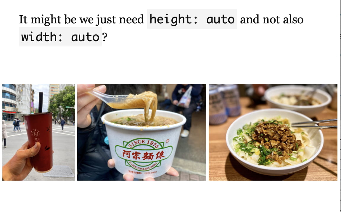
Let’s try confirm it w/ the big image:
<img class="block my-0" src="/assets/garage/image-test-pages/[email protected]" style="max-height: min(100vh, 939px); height: auto;" width="2718" height="2718">
Nope, the width is indeed broken (it stretches beyond its aspect ratio). Why is it OK for the three (update: or two) small images but not one big one?
Let’s try some experiments:
- ❌
heightandaspect-ratio:widthattr then used,aspect-ratioignored
I think the easiest for now is just to remove width: auto for 2- or 3- images layouts, but keep it for one big image. Sigh…
Nope, that doesn’t even fix it. Enter shorter image:
<div class="w-full max-w-full cb flex flex-wrap sm:flex-nowrap justify-center mv1">
<div class="md:ml-1 lg:ml-4"><img class="block my-0 " style="max-height: min(100vh, 939px); height: auto;" loading="lazy" decoding="async" alt="" src="/assets/eleventyImgs/_EDdord68w-313.jpeg" width="2504" height="1878" srcset="/assets/eleventyImgs/_EDdord68w-313.jpeg 313w, /assets/eleventyImgs/_EDdord68w-626.jpeg 626w, /assets/eleventyImgs/_EDdord68w-1252.jpeg 1252w, /assets/eleventyImgs/_EDdord68w-2504.jpeg 2504w" sizes="100vw"></div>
<div class="sm:mx-1 mv1 sm:my-0"><img class="block my-0 " style="max-height: min(100vh, 939px); height: auto;" loading="lazy" decoding="async" alt="" src="/assets/eleventyImgs/tMFXf8ajHv-313.jpeg" width="2504" height="1878" srcset="/assets/eleventyImgs/tMFXf8ajHv-313.jpeg 313w, /assets/eleventyImgs/tMFXf8ajHv-626.jpeg 626w, /assets/eleventyImgs/tMFXf8ajHv-1252.jpeg 1252w, /assets/eleventyImgs/tMFXf8ajHv-2504.jpeg 2504w" sizes="100vw"></div>
<div class="md:mr-1 lg:mr-4"><img class="block my-0 " style="max-height: min(100vh, 939px); height: auto;" loading="lazy" decoding="async" alt="" src="/assets/eleventyImgs/JU22y1OINo-313.jpeg" width="1440" height="1080" srcset="/assets/eleventyImgs/JU22y1OINo-313.jpeg 313w, /assets/eleventyImgs/JU22y1OINo-626.jpeg 626w, /assets/eleventyImgs/JU22y1OINo-1252.jpeg 1252w, /assets/eleventyImgs/JU22y1OINo-1440.jpeg 1440w" sizes="100vw"></div>
</div>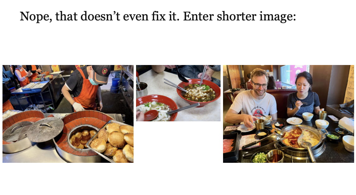
Also (important!), this setting (height: auto only) breaks the two big image layout for tall images. Check out “Two Images” at top of this page. They’ll be height-limited but will stretch to the full width of the screen.
Seeing if we can fix:
- ❌
height: 100%;— just stretches smaller img vertically - ❌
height: 100%; width: auto;— takes liberties w/ aspect ratio- wide renders at 1.49
- narrow renders 1.33 (4/3)
- orig is 1.50
- ❌
height: 100%; width: auto; aspect-ratio: [what it is]- seems to work for this case
- reveals its failure in the 1 tall two wide image case: it just stretches the wide images out
- ❌ + adding
aspect-ratioto the img-containing<div>— does nothing
<div class="w-full max-w-full cb flex flex-wrap sm:flex-nowrap justify-center fig">
<div class="md:ml-1 lg:ml-4"><img class="block my-0 " style="max-height: min(100vh, 939px); height: 100%; width: auto; aspect-ratio: 2504/1878;" loading="lazy" decoding="async" alt="" src="/assets/eleventyImgs/_EDdord68w-313.jpeg" width="2504" height="1878" srcset="/assets/eleventyImgs/_EDdord68w-313.jpeg 313w, /assets/eleventyImgs/_EDdord68w-626.jpeg 626w, /assets/eleventyImgs/_EDdord68w-1252.jpeg 1252w, /assets/eleventyImgs/_EDdord68w-2504.jpeg 2504w" sizes="100vw"></div>
<div class="sm:mx-1 mv1 sm:my-0"><img class="block my-0 " style="max-height: min(100vh, 939px); height: 100%; width: auto; aspect-ratio: 1440/1080;" loading="lazy" decoding="async" alt="" src="/assets/eleventyImgs/JU22y1OINo-313.jpeg" width="1440" height="1080" srcset="/assets/eleventyImgs/JU22y1OINo-313.jpeg 313w, /assets/eleventyImgs/JU22y1OINo-626.jpeg 626w, /assets/eleventyImgs/JU22y1OINo-1252.jpeg 1252w, /assets/eleventyImgs/JU22y1OINo-1440.jpeg 1440w" sizes="100vw"></div>
<div class="md:mr-1 lg:mr-4"><img class="block my-0 " style="max-height: min(100vh, 939px); height: 100%; width: auto; aspect-ratio: 2504/1878;" loading="lazy" decoding="async" alt="" src="/assets/eleventyImgs/tMFXf8ajHv-313.jpeg" width="2504" height="1878" srcset="/assets/eleventyImgs/tMFXf8ajHv-313.jpeg 313w, /assets/eleventyImgs/tMFXf8ajHv-626.jpeg 626w, /assets/eleventyImgs/tMFXf8ajHv-1252.jpeg 1252w, /assets/eleventyImgs/tMFXf8ajHv-2504.jpeg 2504w" sizes="100vw"></div>
</div>
Let’s try on our cases above:
<div class="w-full max-w-full cb flex flex-wrap sm:flex-nowrap justify-center fig">
<div class="md:ml-1 lg:ml-4"><img class="block my-0 " style="max-height: min(100vh, 939px); height: 100%; width: auto; aspect-ratio: 1409/1878;" loading="lazy" decoding="async" alt="" src="/assets/eleventyImgs/OXm8tvrg-F-1252.jpeg" width="1409" height="1878" srcset="/assets/eleventyImgs/OXm8tvrg-F-1252.jpeg 1252w, /assets/eleventyImgs/OXm8tvrg-F-1409.jpeg 1409w" sizes="100vw"></div>
<div class="sm:mx-1 mv1 sm:my-0"><img class="block my-0 " style="max-height: min(100vh, 939px); height: 100%; width: auto; aspect-ratio: 2504/1878;" loading="lazy" decoding="async" alt="" src="/assets/eleventyImgs/yU7E_JSouU-1252.jpeg" width="2504" height="1878" srcset="/assets/eleventyImgs/yU7E_JSouU-1252.jpeg 1252w, /assets/eleventyImgs/yU7E_JSouU-2504.jpeg 2504w" sizes="100vw"></div>
<div class="md:mr-1 lg:mr-4"><img class="block my-0 " style="max-height: min(100vh, 939px); height: 100%; width: auto; aspect-ratio: 2504/1878;" loading="lazy" decoding="async" alt="" src="/assets/eleventyImgs/aPBhDDAiiJ-1252.jpeg" width="2504" height="1878" srcset="/assets/eleventyImgs/aPBhDDAiiJ-1252.jpeg 1252w, /assets/eleventyImgs/aPBhDDAiiJ-2504.jpeg 2504w" sizes="100vw"></div>
</div>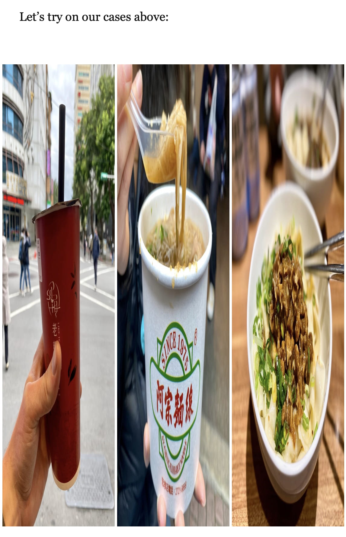
Experimenting here:
<div class="w-full max-w-full cb flex flex-wrap sm:flex-nowrap justify-center fig">
<div class="helpdiv md:ml-1 lg:ml-4"><img class="block my-0 " style="max-height: min(100vh, 939px); height: auto; width: auto;" loading="lazy" decoding="async" alt="" src="/assets/eleventyImgs/OXm8tvrg-F-1409.jpeg" srcset="/assets/eleventyImgs/OXm8tvrg-F-1409.jpeg 1409w"></div>
<div class="helpdiv sm:mx-1 mv1 sm:my-0"><img class="block my-0 " style="max-height: min(100vh, 939px); height: auto; width: auto;" loading="lazy" decoding="async" alt="" src="/assets/eleventyImgs/yU7E_JSouU-2504.jpeg" srcset="/assets/eleventyImgs/yU7E_JSouU-2504.jpeg 2504w"></div>
<div class="helpdiv md:mr-1 lg:mr-4"><img class="block my-0 " style="max-height: min(100vh, 939px); height: auto; width: auto;" loading="lazy" decoding="async" alt="" src="/assets/eleventyImgs/aPBhDDAiiJ-2504.jpeg" srcset="/assets/eleventyImgs/aPBhDDAiiJ-2504.jpeg 2504w"></div>
</div>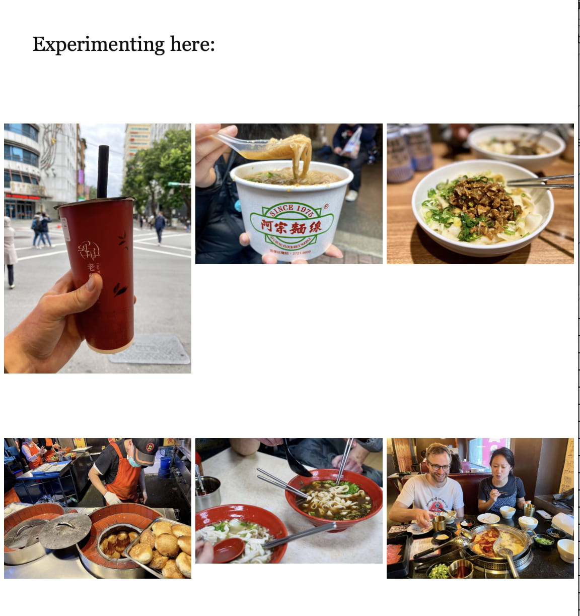
The taller image is getting:
- 500w: 159/500 32%
<div class="w-full max-w-full cb flex flex-wrap sm:flex-nowrap justify-center fig">
<div class="md:ml-1 lg:ml-4"><img class="block my-0 " style="max-height: min(100vh, 939px); height: auto; width: auto;" loading="lazy" decoding="async" alt="" src="/assets/eleventyImgs/_EDdord68w-313.jpeg" width="2504" height="1878" srcset="/assets/eleventyImgs/_EDdord68w-313.jpeg 313w, /assets/eleventyImgs/_EDdord68w-626.jpeg 626w, /assets/eleventyImgs/_EDdord68w-1252.jpeg 1252w, /assets/eleventyImgs/_EDdord68w-2504.jpeg 2504w" sizes="100vw"></div>
<div class="sm:mx-1 mv1 sm:my-0"><img class="block my-0 " style="max-height: min(100vh, 939px); height: auto; width: auto;" loading="lazy" decoding="async" alt="" src="/assets/eleventyImgs/JU22y1OINo-313.jpeg" width="1440" height="1080" srcset="/assets/eleventyImgs/JU22y1OINo-313.jpeg 313w, /assets/eleventyImgs/JU22y1OINo-626.jpeg 626w, /assets/eleventyImgs/JU22y1OINo-1252.jpeg 1252w, /assets/eleventyImgs/JU22y1OINo-1440.jpeg 1440w" sizes="100vw"></div>
<div class="md:mr-1 lg:mr-4"><img class="block my-0 " style="max-height: min(100vh, 939px); height: auto; width: auto;" loading="lazy" decoding="async" alt="" src="/assets/eleventyImgs/tMFXf8ajHv-313.jpeg" width="2504" height="1878" srcset="/assets/eleventyImgs/tMFXf8ajHv-313.jpeg 313w, /assets/eleventyImgs/tMFXf8ajHv-626.jpeg 626w, /assets/eleventyImgs/tMFXf8ajHv-1252.jpeg 1252w, /assets/eleventyImgs/tMFXf8ajHv-2504.jpeg 2504w" sizes="100vw"></div>
</div>
All images, including the middle (shorter) one are getting the same W at layout time. But because the middle one is shorter, it doesn’t take up the height. This makes me think that the browser is using the width only of srcset to assign width proportions, which then means they don’t match heights. The above two even worked on Safari on first load (!) and now are broken on all future reloads (!!).
Working (w/o srcset):
<div class="w-full max-w-full cb flex flex-wrap sm:flex-nowrap justify-center fig">
<div class="md:ml-1 lg:ml-4"><img class="block my-0 " style="max-height: min(100vh, 939px); height: auto; width: auto;" loading="lazy" decoding="async" alt="" src="/assets/eleventyImgs/OXm8tvrg-F-1409.jpeg" width="1409" height="1878"></div>
<div class="sm:mx-1 mv1 sm:my-0"><img class="block my-0 " style="max-height: min(100vh, 939px); height: auto; width: auto;" loading="lazy" decoding="async" alt="" src="/assets/eleventyImgs/yU7E_JSouU-2504.jpeg" width="2504" height="1878" ></div>
<div class="md:mr-1 lg:mr-4"><img class="block my-0 " style="max-height: min(100vh, 939px); height: auto; width: auto;" loading="lazy" decoding="async" alt="" src="/assets/eleventyImgs/aPBhDDAiiJ-2504.jpeg" width="2504" height="1878" ></div>
</div>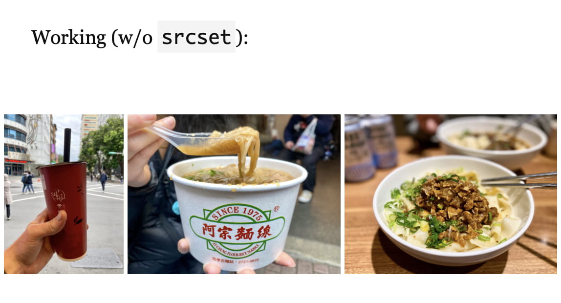
Wow, I hate this.
OK, so the width and height attributes don’t seem to actually be reserving space in the layout. If removing those fixes things, that would be worth it.
<div class="w-full max-w-full cb flex flex-wrap sm:flex-nowrap justify-center fig">
<div class="md:ml-1 lg:ml-4"><img class="block my-0 " style="max-height: min(100vh, 939px); height: auto;" loading="lazy" decoding="async" alt="" src="/assets/eleventyImgs/OXm8tvrg-F-1252.jpeg" srcset="/assets/eleventyImgs/OXm8tvrg-F-1252.jpeg 1252w, /assets/eleventyImgs/OXm8tvrg-F-1409.jpeg 1409w" sizes="100vw"></div>
<div class="sm:mx-1 mv1 sm:my-0"><img class="block my-0 " style="max-height: min(100vh, 939px); height: auto;" loading="lazy" decoding="async" alt="" src="/assets/eleventyImgs/yU7E_JSouU-1252.jpeg" srcset="/assets/eleventyImgs/yU7E_JSouU-1252.jpeg 1252w, /assets/eleventyImgs/yU7E_JSouU-2504.jpeg 2504w" sizes="100vw"></div>
<div class="md:mr-1 lg:mr-4"><img class="block my-0 " style="max-height: min(100vh, 939px); height: auto;" loading="lazy" decoding="async" alt="" src="/assets/eleventyImgs/aPBhDDAiiJ-1252.jpeg" srcset="/assets/eleventyImgs/aPBhDDAiiJ-1252.jpeg 1252w, /assets/eleventyImgs/aPBhDDAiiJ-2504.jpeg 2504w" sizes="100vw"></div>
</div>
The tall img is now broken again, doesn’t seem easily fixable. The other one is fine.
<div class="w-full max-w-full cb flex flex-wrap sm:flex-nowrap justify-center fig">
<div class="md:ml-1 lg:ml-4"><img class="block my-0 " style="max-height: min(100vh, 939px); height: auto;" loading="lazy" decoding="async" alt="" src="/assets/eleventyImgs/_EDdord68w-313.jpeg" srcset="/assets/eleventyImgs/_EDdord68w-313.jpeg 313w, /assets/eleventyImgs/_EDdord68w-626.jpeg 626w, /assets/eleventyImgs/_EDdord68w-1252.jpeg 1252w, /assets/eleventyImgs/_EDdord68w-2504.jpeg 2504w" sizes="100vw"></div>
<div class="sm:mx-1 mv1 sm:my-0"><img class="block my-0 " style="max-height: min(100vh, 939px); height: auto;" loading="lazy" decoding="async" alt="" src="/assets/eleventyImgs/tMFXf8ajHv-313.jpeg" srcset="/assets/eleventyImgs/tMFXf8ajHv-313.jpeg 313w, /assets/eleventyImgs/tMFXf8ajHv-626.jpeg 626w, /assets/eleventyImgs/tMFXf8ajHv-1252.jpeg 1252w, /assets/eleventyImgs/tMFXf8ajHv-2504.jpeg 2504w" sizes="100vw"></div>
<div class="md:mr-1 lg:mr-4"><img class="block my-0 " style="max-height: min(100vh, 939px); height: auto;" loading="lazy" decoding="async" alt="" src="/assets/eleventyImgs/JU22y1OINo-313.jpeg" srcset="/assets/eleventyImgs/JU22y1OINo-313.jpeg 313w, /assets/eleventyImgs/JU22y1OINo-626.jpeg 626w, /assets/eleventyImgs/JU22y1OINo-1252.jpeg 1252w, /assets/eleventyImgs/JU22y1OINo-1440.jpeg 1440w" sizes="100vw"></div>
</div>
Abandoning this direction. Eleventy Imgs is too slow with the current num. images anyway, given we need to restart the server every time because it caches files wrong. I’m also pretty sure that with all the auto dimensions it wouldn’t reserve space anyway.
Width-limiting
We can width-limit individual images. Is it best to width-limit containers so that we can margin-align multiple images?

One thing I can’t remember, even looking at my notes above, is why I’m using padding to create page edge margins with single large images, but using margins for two or three images.
I do see that I switched to margins for between-image spacing to get the property of margins collapsing.01 But I don’t know whether it was necessary to switch from padding for page-margin spacing. I guess I’ll try it and find out.
Removing height-limiting means single and double images now create clean margins. For a smaller screen (e.g., 1336 x 679), portrait (2x3) images will now bleed off. This could be alleviated by making the max-width dynamic rather than static. E.g., the width of a container could be capped at a value such that a 2x3 image at roughly half its size won’t be taller than 100vh. That’s 3/2 * 0.5w ≤ 100vh, so w ≤ 133.3vh?
Wow, I think that works.
Of course, single portrait images will still be massive, but that’s just inevitable. This way, at least, they still match the margins because the container is limited, not the image.
With the new styles, there won’t be a way to insert height-limited single portrait photos. But they are so rare right now that I can build that in when desired.
I’m debating whether to try to add this to the existing styles, or to make a new shortcode. There are more differences than I’d anticipated in the features needed:
| feature | w-full max-w-full (old) | width-limited (new) |
|---|---|---|
| video embeds | ✅ | ✅ |
| svg bg blur | ✅ | ❌ |
| max height | ✅ | ❌ |
| extra div | ❌ | ✅ |
| 2/3-img margin → padding | 👌 | ✅ |
| array processing | ✅ | ✅ |
| swap to options | ❌ | ✅ |
I’m curious enough about how my DX can be improved that I’m going to try it.
This was added as v2 house styles (see top of this page).
An additional improvement will be in image size savings. Here’s the math for landscape images:
v1: height limit of 1878px → 2815 x 1878 ≅ 5.29M pxv2: width limit of 2280px → 2280 x 1522 ≅ 3.47M px ≅ 65.6% of the previous size
There’s also a chance this helps me start integrating source sets (multiple image sizes) or even adding dimensions to reserve space, though I don’t want to jinx it.
Reminder: Matching Heights
Another thing I’m noticing re-reading my old design notes is I’d tested my layouts all assuming side-by-side images have the same height. I wonder if this was related to the issues I had above when trying to use auto-generated image sizes: that if the heights don’t match, my CSS might not work. I remember the issue being weirder though.
NOTE: omitted for now because it breaks page
v2: And it's even wilder since we've removed height-limiting.
Out of curiosity, I checked eleventy-img again, and there is indeed no way to specify height resizes, only width. The issue that contains that feature request has been open since November 2020 and as of writing (June 2023) it remains the top feature request but is still unimplemented. Damn.
v2: Non-Matching Heights
Will this work w/ the new changes?
Exports
The maximum display size for portrait orientation images w/ the new 1140px width is 570 x 855px, or 1140 x 1710px to get @2x. A massive single-image scroller could hit 2280 x 3420px @2x, but honestly that’s rare enough I will be fine re-exporting those outside of the batch.
I could limit dimension (i.e., height for portrait) to 2280, though the size reduction would probably be substantial:
- 2280 x 1520px = 3.47M px
- 1710 x 1140px = 1.95M px (56% of size)
Anyway, good to know. Right now I’m testing non-matching heights so just gotta export to something.
Layout
Proof of concept using manually-set width percentages:
Computed as:
- ratios are w/h
- img1 is 2/3 (ratio)
- img2 is 3/2 (ratio)
- total ratio is 3/2 + 2/3 = 2.1666
- img1w = (2/3) / 2.1666 = 0.3077
- img2w = (3/2) / 2.1666 = 0.6923
- (OK but something might be backwards because the taller image gets the less wide container)
I’m almost certain there’s no way of doing this (at least that I’ll ever find) w/ CSS Flexbox (or Grid) if the images are of different pixel heights. This still seems bonkers to me, because they’re never rendered at their true size anyway. And yet, yes, it does seem like without the images having the same pixel heights at the source, they won’t create a same-height, aspect-ratio-preserving, w-full max-w-full flexbox row.
I guess the good news is that if I ever do figure out the right CSS incantation, I can just strip out any manual widths I’ve added in with the macro.
For reference, current results of img2 macro:
v2: Saving space
Working on v2 layout w/ invalid sources (discovered in image placeholder development page) to get placeholder sizes working.
One image
Single image (3:2)
Adding width and height attributes blasted out the image’s size, as somewhat anticipated.
But interestingly, the layout hasn’t been wasn’t working as I expected:
- when the page was < 1140px wide, the image (with
max-width: 100%) was limiting the display width to 100% - when the page was > 1140px wide, the div (with
max-width: min(1140px, 133.3vh)) was limiting the display width to 1140px
When the image got width and height attributes, this seemed to override the max-width: 100% style. Even setting the element style directly (i.e., not from CSS) didn’t help. So I updated the div’s style (this is max-w-media) to a triple-min max-width: min(100%, 1140px, 133.3vh). Then, height: auto on the image fixes the height.
Two images, equal dims
This breaks things afresh. The flex container with max-w-media obeys the width limit, but the divs containing the images allow themselves to be busted out by the images.
@media screen and (min-width: 30em) {
    .w-2col-50-ns {
        /* tachyons unit 1 (e.g., sm:mr-1) is 0.25rem, divided here across two columns */
        width: calc((100% - 0.25rem) * (1/2));
    }
}
Manually setting width: 50% on the image-containing divs seems to work. For the mobile layout, they need w-full sm:w-1/2.02 I wouldn’t have been willing to set widths manually, but from all my explorations above, it’s the only thing that has worked for unequal height images.
But I think the margin between the divs isn’t accounted for, and they’re breaking into the page’s padding. So I need to do a more complex style that subtracts it. I can’t do media queries in element styles, so I’ll need some CSS rules.
Update: here’s a confounding thing that happened when I started implementing this. When the image paths were valid, even before the images loaded, they were sized correctly without any modifications to the containing divs. E.g., the following:
If the images were to point to nonexistent files, the layout would become terrible and their sizes would blast beyond the divs.
I don’t know why this happens, but it worries me we may be wading into browser-specific territory. Update: Checking Chrome, Firefox, and Safari, only Chrome makes this explosion happen when the src is invalid! So that’s bizarre.
Two images, unequal dims
From my exploration with explicit width computation above, I know that a 3:2 portrait and landscape image side-by-side would take up 30.77% (4/13) and 69.23% (9/13) widths, respectively. So we combine that with the 1-Tachyon-unit margin and not-small media query to explicitly set widths.
@media screen and (min-width: 30em) {
    .w-2col-31-ns {
        /* one border of tachyons unit 1 (e.g., sm:mr-1) is 0.25rem */
        width: calc((100% - 0.25rem) * (4/13));
    }

    .w-2col-69-ns {
        /* one border of tachyons unit 1 (e.g., sm:mr-1) is 0.25rem */
        width: calc((100% - 0.25rem) * (9/13));
    }
}
The only thing that’s worrying me is that since I can’t put media queries in element style CSS, I’ll need to pre-generate all the CSS classes I’ll need, either by hand or on-the-fly. On-the-fly might be also good in that the above heights aren’t perfectly the same because images don’t end up perfectly at 3:2 (e.g., 1.498…).
Three images
I think at this point things ought to work, but testing three images for completeness. Doing unequal sizes to make sure it’s robust.
- ratios are w/h
- img1 is 2280/1522 (ratio)
- img2 is 1522/2280 (ratio)
- img3 is 2280/1522 (ratio)
- total ratio is 1522/2280 + 2280/1522 + 2280/1522 = 3.66…
- img1w = (2280/1522) / 3.66 ~= 0.41…
- img2w = (1522/2280) / 3.66 ~= 0.18…
- img3w = (2280/1522) / 3.66 ~= 0.41…
@media screen and (min-width: 30em) {
    .w-3col-41-ns {
        /* tachyons unit 1 (e.g., sm:mr-1) is 0.25rem, x2 */
        width: calc((100% - 0.5rem) * ((2280/1522)/(1522/2280 + 2280/1522 + 2280/1522)));
    }

    .w-3col-18-ns {
        /* tachyons unit 1 (e.g., sm:mr-1) is 0.25rem, x2 */
        width: calc((100% - 0.5rem) * ((1522/2280)/(1522/2280 + 2280/1522 + 2280/1522)));
    }
}
Here I computed the widths using the exact pixels (e.g., 2280/1522) rather than anticipated ratios (e.g., 3/2), and the results came out pixel-perfect.
The other good news is that removing the w-full max-w-full classes and extra padding, the layouts work great at margin-width.
v1: Reimagined
Maybe doing more sizing w/ div and less w/ img is going to help this.
Currently, v1 style is over-stretching.
The v2 style uses an additional div, and does little sizing on the image itself.
<div class="w-full max-w-full cb flex justify-center md:px-1 lg:px-4 fig">
  <img class="block my-0 h-auto bg-blue-800 " src="/assets/garage/image-test-pages/v2-2280x1522.moz80.jpg" style="max-height: min(100vh, 939px);" loading="lazy" decoding="async" width="2280" height="1522">
</div>
img macro
<div class="w-full max-w-full cb flex justify-center md:px-1 lg:px-4 fig">
    <div class="max-w-media">
        <img class="block my-0 h-auto bg-blue-800" src="/assets/garage/image-test-pages/v2-2280x1522.moz80.jpg" loading="lazy" decoding="async" width="2280" height="1522">
    </div>
</div>
img2 macro
Can’t get this to work. It seems like something about max-w-media being a width-limiter really helps things work.
- If the (new) inner div has a
max-height: 100vh, then the img inside ignores this and blasts out of it - If
max-height: 100%;is the applied to the image, it contorts itself wildly (not maintaining aspect ratio, shrinking height to fit) - By the time we add
w-autoto theh-autoto get the width the shrink too, all purpose of explicit width and height are gone (dimensions are no longer saved)
<div class="w-full max-w-full cb flex justify-center md:px-1 lg:px-4 fig">
    <div class="" style="max-height: 100vh;">
        <img style="max-height: 100%;"  class="block my-0 w-auto h-auto bg-blue-800" src="/assets/garage/image-test-pages/v2-2280x1522.moz80.jpg" loading="lazy" decoding="async" width="2280" height="1522">
    </div>
</div>
Evidence of failure.
I am seriously wondering whether it’s worth keeping the v1 styles around. Why not just migrate to v2? OK an intermediary would be to compute a similar max-w-media that accounts for the 4:3 aspect ratio of old photos.
Let’s try the same logic as w/ media max width: 4/3 * 0.5w ≤ 100vh, so w ≤ 150vh? Huh, nope, need to think that one through more, but 133vh is better. Since we’re allowing w-full max-w-full we could remove the pixel width limit.
max-width: min(100%, 1140px, 133.3vh);max-width: min(100%, 133.3vh);
A complication: I do use explicit height limiting a bunch of places for v1 images, so they kind of need to support that. But (a) it’s always in pixels, (b) it never varies within a row. So I could change them all to a per-row specification, then compute the max-width based on the image ratio and the provided max height. Let’s see whether that would work.
Let’s say we want to limit to 500px height.
- w * h/w < 500px
- w * 3/4 < 500px
- w < 666.6px
It’s still crazy to me that you have to go through all this shenanigans for max-width calculations, and can’t just use max-height directly.
This does get more complicated since we often have a height-limited row of two or three images. I guess in that case we want to sum the widths to get the total W, and do the same computation?
- trying a 300px height limit as these are wide
- w < (w/h) * limit px
- w < (8/3) * 300px
- w < 800px
OK, the logic for the v2 max-w-media was:
E.g., the width of a container could be capped at a value such that a 2x3 image at roughly half its size won’t be taller than 100vh. That’s
3/2 * 0.5w ≤ 100vh, sow ≤ 133.3vh?
So, for a singe 4/3 landscape image, it would be:
- 3/4 * w ≤ 100vh
- w ≤ 133.3vh
IT’S SO WILD IT’S THE SAME
Footnotes
Not sure if collapsing is right term. Thing where if left says
mr1and right saysml1then there is a1margin between them, not2. ↩︎Nagging thought: It’s surprising to me because it seems like the kind of thing that flexbox should handle, and I shouldn’t have to manually specify widths. And I guess it does until the image dimensions are added in… ↩︎
