Don't Justify Web Text
Or at least hyphenate
In print, or when typeset with a good program, justified text is beautiful. All of the academic writing in my field is set justified by default, and I think it looks lovely:
You get these really nice ultra long vertical lines, broken up into a satisfying rhythm by stuff like headers, figures, tables, and equations.
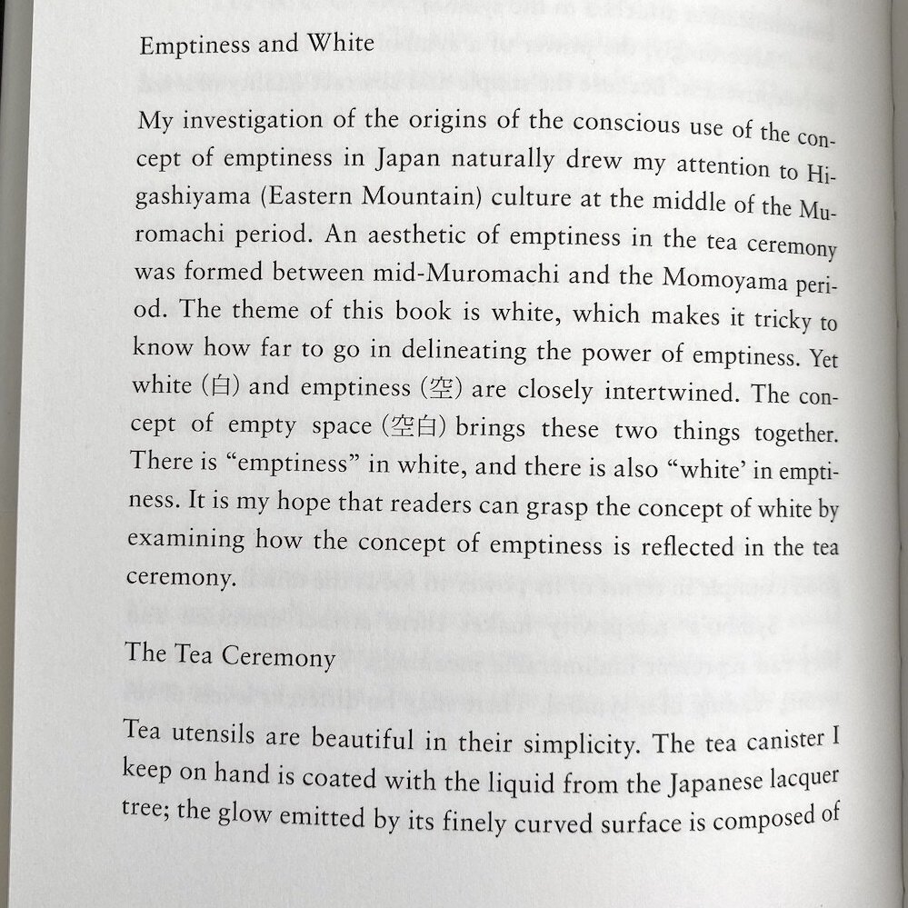
Grab any book and it’s probably justified. I just took one off my bookshelf at random—White, by Kenya Hara:
So, what about the web?
It’s the Hyphenation, Dummy
Whatever is doing your type layout has got to be able to hyphenate words. If you just slap on a text-align: justify CSS, you’ll get goofy spread out text:
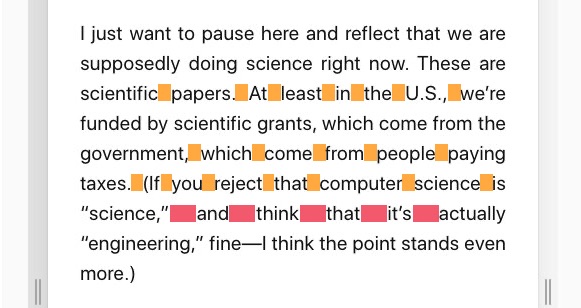
I marked somewhat awkward spaces in orange, and very ugly ones in red.
The last time I’d looked, hyphenation (CSS: hyphens: auto) wasn’t widely available. But, lo and behold, wait a few months, and it’s starting to emerge:
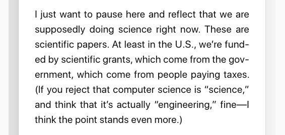
Hey, much better!
This is with Chrome. For, e.g., Safari on macOS and iOS, you’ve still got to use one of those janky CSS -webkit- prefixes. Edge apparently isn’t quite there yet entirely.01
Aside: Hyphenation
When I looked this up a while back, it was the first time I’d really thought about hyphenation. Why would it be hard? As far as I can tell, there are a couple main aspects:
-
Where are you allowed to hyphenate? At syllable boundaries. First of all, this requires knowing where the syllables in all words are. In other words, you suddenly need a huge dictionary with syllable markings for all words. Second, this means the process is now language-specific. Compared to just splatting down symbols on the page and wrapping, knowing about syllables seems way more complex.
-
How do you decide when to hyphenate? There’s some algorithm running making tradeoffs between shoving words further apart and splitting them up. Decisions you make on one line affect the next. Apparently this is surprisingly computationally intensive, which might have factored into it languishing for so long.
The second point especially should reveal that hyphenating justified text involves an algorithm, and the algorithm can be of different quality in different implementations.
Justify + Hyphenation on the Web: It’s Still not Great
Here’s another example of justified text with and without hyphenation in Chrome (this is Chrome 89, on March 29, 2021).
Justified:
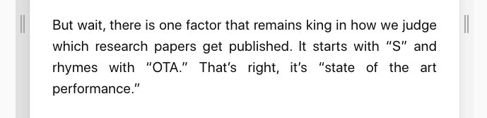
Justified, with hyphenation:
Notice the difference? Exactly; there is none. Chrome couldn’t figure out a good way to lay this out, even with hyphenation turned on.
Compare this with LaTeX,02 which aggressively hyphenates. You will almost never see the kind of floaty word spacing like above. Instead, you’ll see dense blocks rich with hyphenation:
In the above paragraph, of the nine lines that reach the right margin, five (over half!) are hyphenated and split.03
Recommendation: Don’t Do It
I’m not actually in a position to recommend any design decisions to anybody. But my personal preference is still for left-aligned text on the web. If and when a major shop like the NYT, Medium, or Substack justifies their text online, it might be worth looking into.
I only write this because I come across hand-designed blogs semi-regularly that use justified text and no hyphenation.04 Once you are aware of it, you can’t un-see those ghastly word gaps. If this is you, maybe consider turning on hyphenation right now.
Or better yet, just align left.
Gallery of Shame Opportunity
I’ve started collecting pages I find with justified text without hyphenation that ends up looking awkward. To, uhhh, raise awareness?
Footnotes
Here’s a thorough table of browser compatibility for hyphenation, and here’s a condensed one (AKA, English-centric). ↩︎
I would like to take this opportunity to complain that LaTeX iS cApItAlIzEd lIkE tHiS. ↩︎
Once I realized how dense hyphenated words are in printed text, I was surprised that it never bothers me when reading. My guess is that growing up reading books, we’re so used to parsing hyphenated words that we don’t even notice. I wonder whether this might be different for a window of generations that grows up reading text mostly online, but before the web is universally justified and hyphenated. (Or, will it ever be?) ↩︎
These often look OK on a desktop monitor—and I suspect that’s where they were designed—but break down when you read them on your phone. ↩︎
