Fixing Mobile Page Layouts
Some webpages are too damn hard to read on my phone, like this one:
Squint harder
The font is tiny, the page is wide, and the text is wrapping at a weird place. I must read these on my phone like a PDF: scrolling in and panning along each line.01
This post is my guide to fixing these issues. It’s aimed at folks like me who aren’t quite web developers, but blog or run small sites that could use a little fine-tuning.
Contents
-
How to Fix Common Problems — Four tricks I use to fix pages.
-
Walkthroughs — Tutorials of repairing pages.
Disclaimer: I’m not a web developer. I have no idea what I’m doing, really.
How to Fix Common Problems
1. Set the Viewport
Does the page look like a desktop site zoomed way out? You might need to tell web browsers to render the web page at the actual device’s width.02 Add this HTML tag:
<meta
  name="viewport"
  content="width=device-width, initial-scale=1"
>
In action, this makes the following change:
Now the text renders into a more reasonable area. This makes the font look bigger and the lines wrap much earlier. But the page still has a problem that’s making the text only take up half the page. Something is too wide.
2. Scroll Over-Wide Elements
Over-wide elements are easy to miss even from your phone, because your phone might mask them with a horizontal scroll bar. If you accidentally scroll right, though, you’ll fly off the content.
→ Agh!
Once you notice this happens, you can pinch to zoom out and survey the mess. Some element is probably too wide. Find the culprit.
Left: zoomed out. Right: the problem child.
Ah ha. In this case, it’s text in <pre> blocks. We can add some simple CSS to limit their width.
pre {
    max-width: 100%;
    overflow-x: scroll;
}
CSS
This solves it. Here’s the before and after.
No more scroll bar, and the width is correct. This section is a bit weird because of overly wide indentation. Here’s the same result on body text.
What About Bigger Screens?
This article is only about making pages look better on mobile. I try not to break anything for larger screens, but naively applying some of these changes will make desktop layouts more cramped.

Left: For mobile devices, everything must adhere to the body width to avoid making the page scroll horizontally; individual wide elements can scroll on their own.
Center: For larger screens, we can keep the same strategy as with mobile displays and clip everything to the body region, but wide elements will still need to scroll.
Right: If we instead let wide elements spill outside the body area when there is room on larger displays, they won’t need to be scrolled.
When there’s more screen space, it probably makes sense to let larger elements take up more room rather than clipping them and making them scroll horizontally. Consider housing wide content in containers that can break out from the body text.
3. Typographic Cleanup
There are a few bits of low hanging fruit that will make a page go from functional to comfortably readable. (Don’t worry, I’m not going to make the text annoyingly light gray or anything.)
-
Margins. Content should have a bit of breathing room, but not waste real estate.
-
Font size. Text be readable without squinting, but not so big to cause short line lengths.
-
Line height. Picking around
1.5is a standard typography trick for body text and helps with readability.
We can apply all these changes to our running example.
4. Test on Your Actual Phone
This last trick is the most important and also the easiest to skip. Believe me, I forget to do it, too. But there’s no getting around it.03
Yes, test it using your browser’s pretend I’m a phone mode first. But to this day, I’ve never made a page where I didn’t find something to change when I actually looked at it on my phone. It’s easier to recognize bad proportions on the physical device you glue to your poor eyeballs all day.
Furthermore, sometimes the browser simulators are just plain wrong. In fact, our running example is exactly one such case. I describe this more in the walkthrough below.
Walkthroughs
Click on any picture to jump to the walkthrough for fixing the mobile layout on that page.

Disclaimer: I’m nitpicking microscopic stylistic issues on these ages for the sake of illustration. Their actual content is largely fascinating, technical, and well-written. I humbly offer these example fixes because I like what the authors are doing and would like to enjoy it even more on my phone.
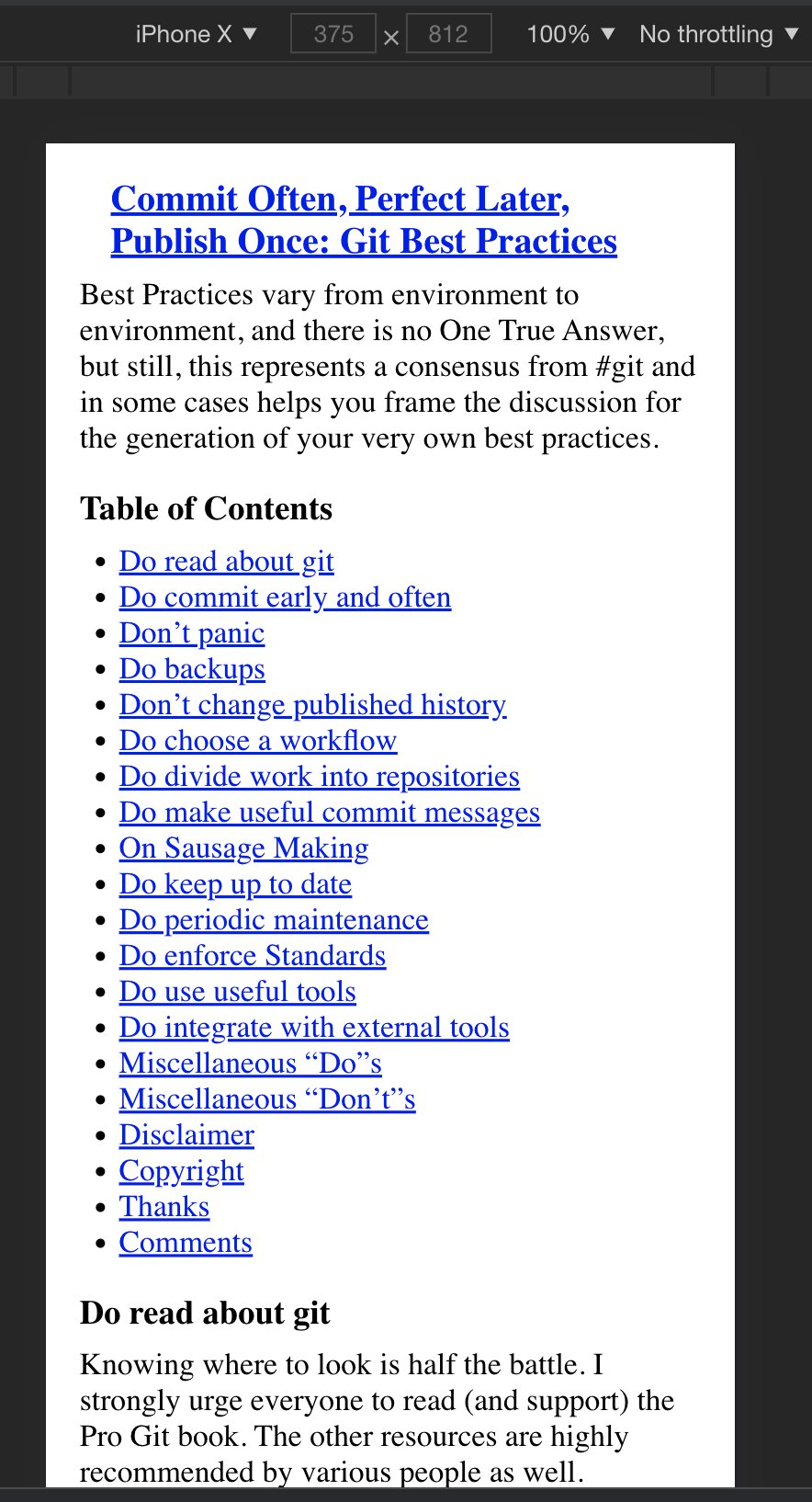
Git Best Practices
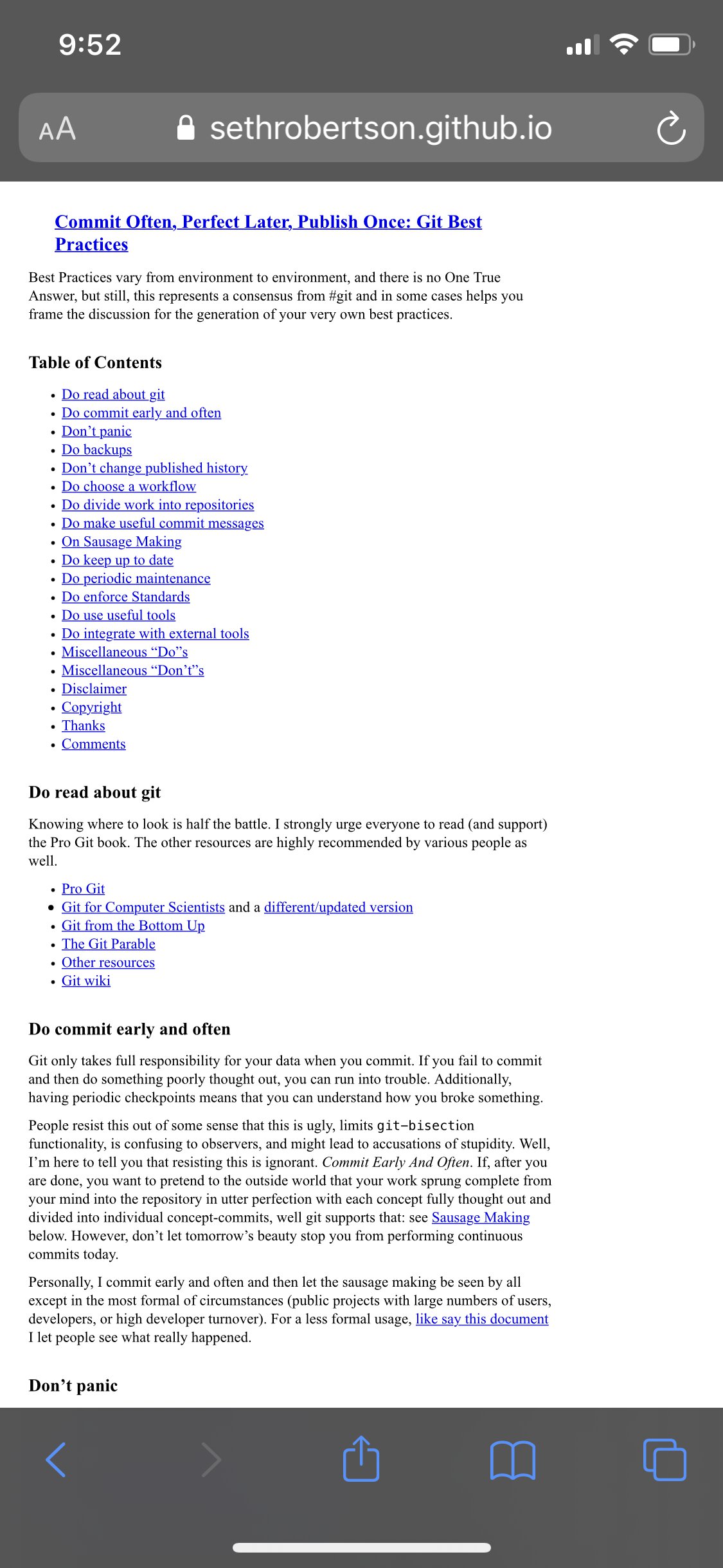
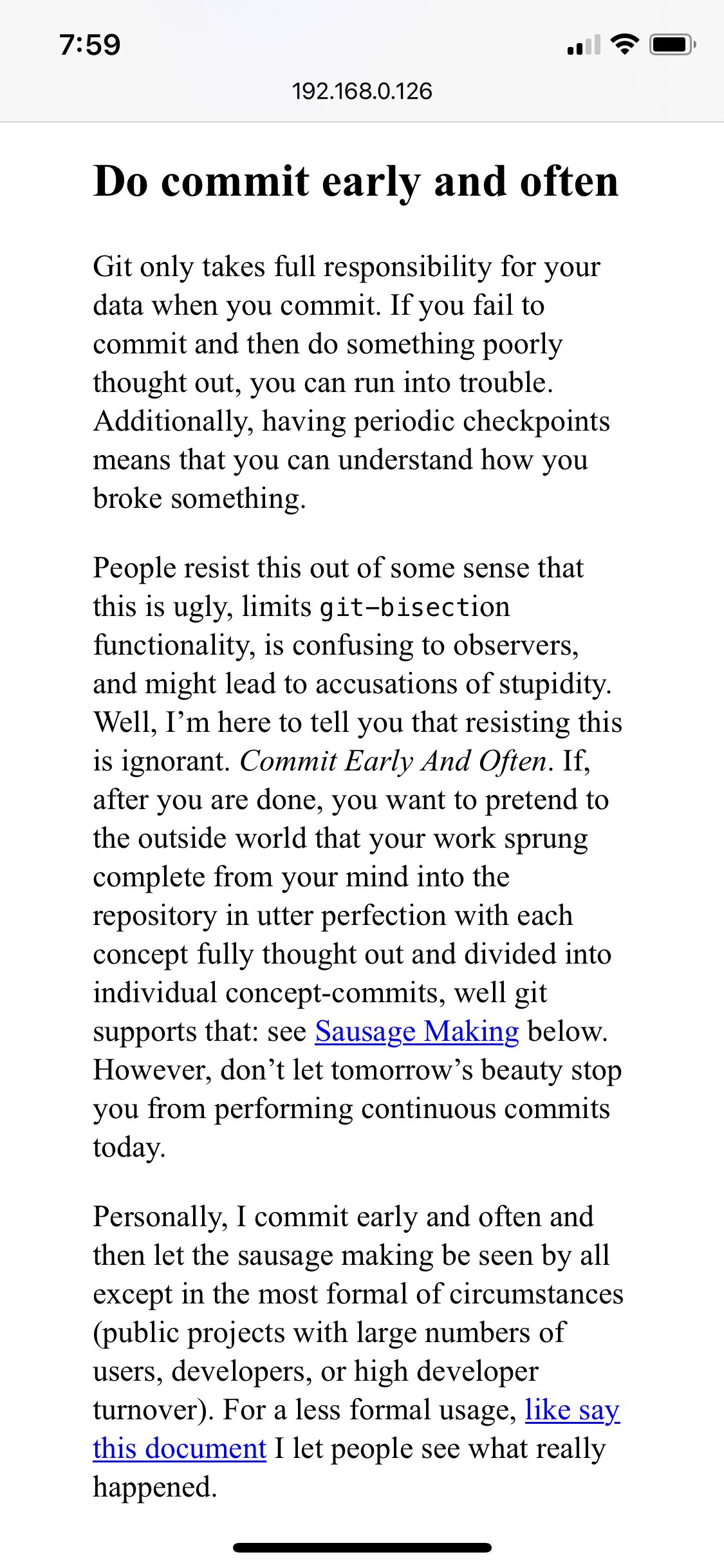
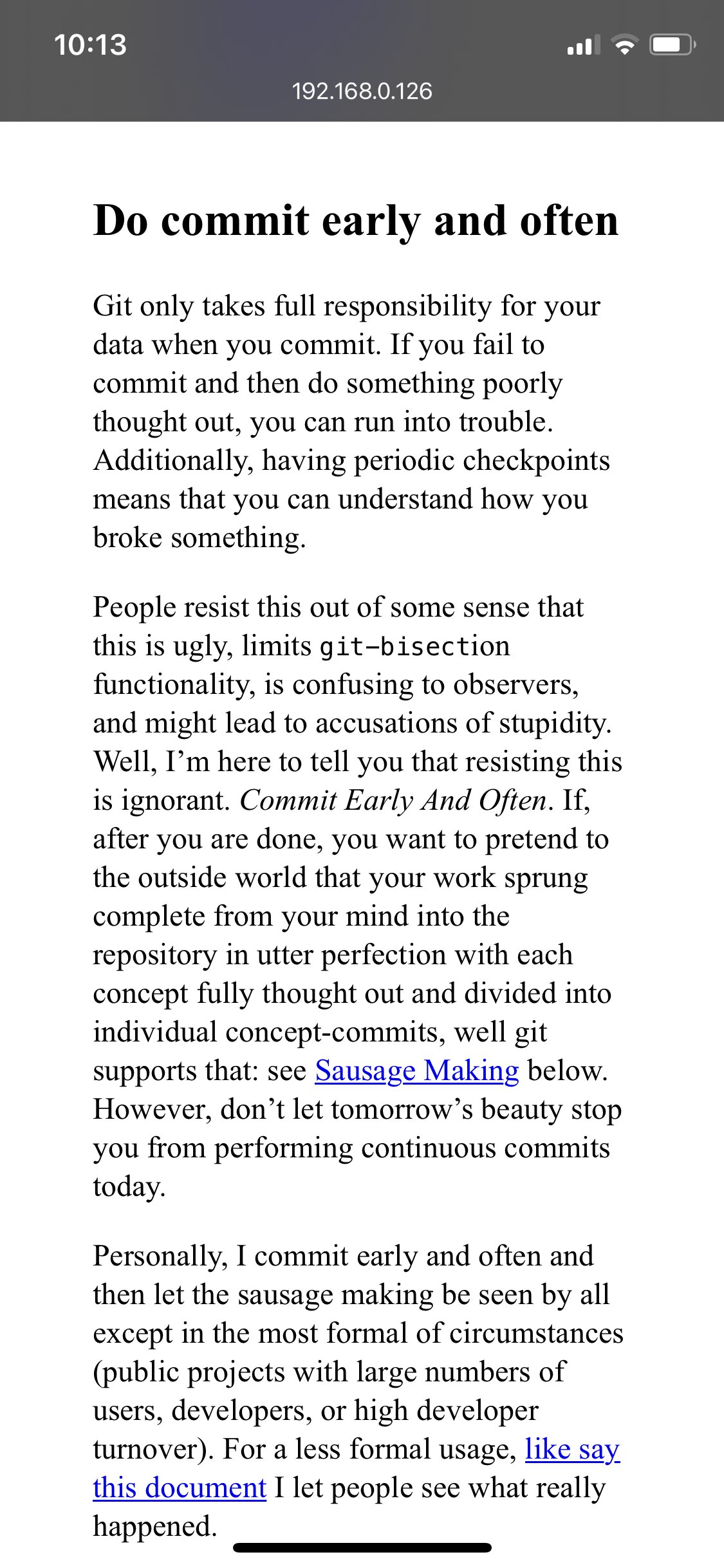
This is the site that I used as the running example for the first section. This page is called Commit Often, Perfect Later, Publish Once: Git Best Practices. The page looks like this on my phone:
Now, I can’t be too hard on the designer.04 First, the page is from 2012—ancient Internet history.
Second, it’s actually kind of hard to tell this was going to happen. Normally, I would guess that they simply didn’t test it using developer tools. But if you ask Chrome and Safari what the page should look like on an iPhone X, they both say, “just fine:”
Top: Left: Chrome’s estimate of the mobile view. Bottom: Right: Safari’s estimate of the mobile view.
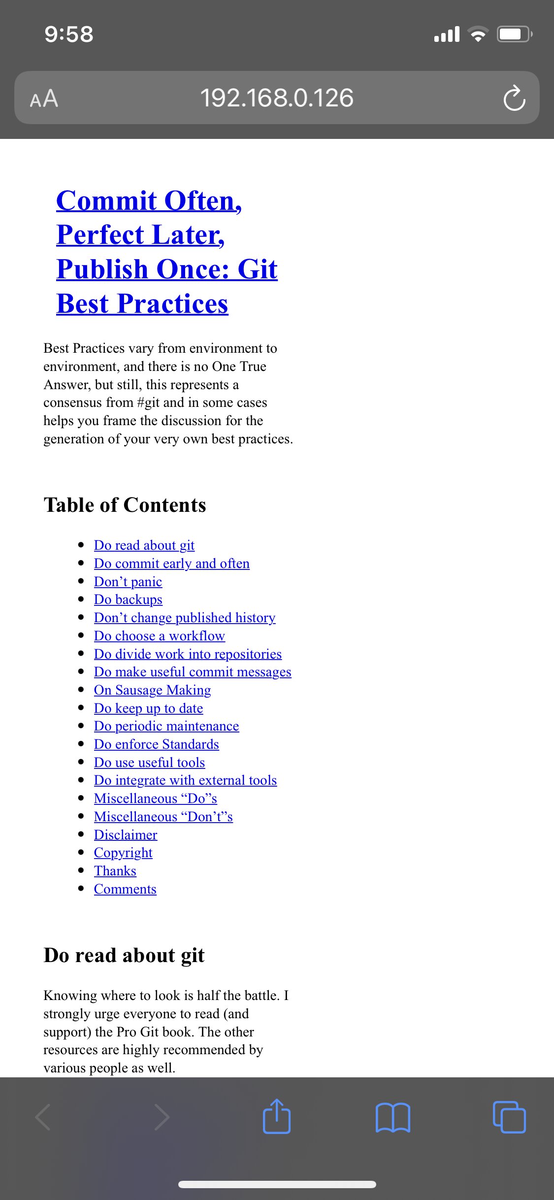
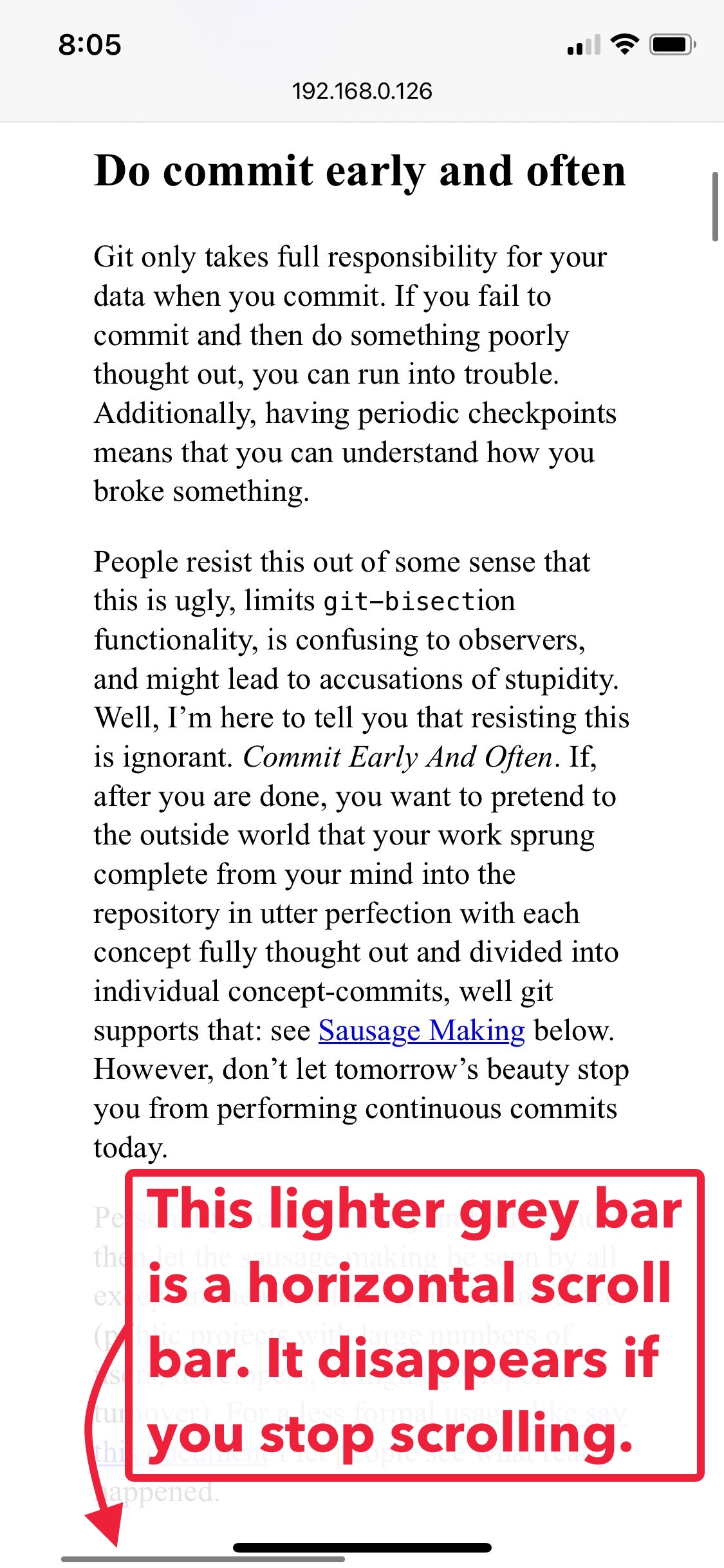
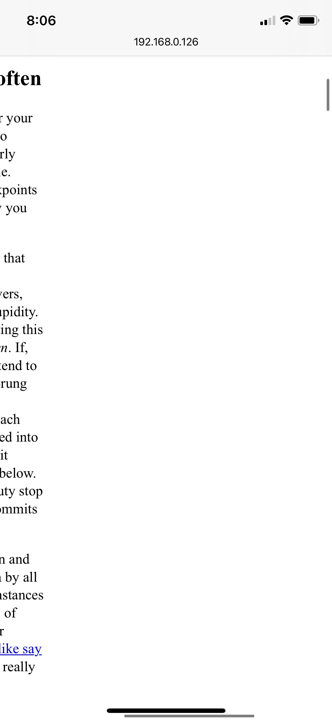
This is annoying, because it means we have to debug on the phone itself. No problem, just download the page, whip up a python -m http.server, find the laptop’s local IP address with ifconfig | grep 192, and point the ol’ telephone to 192.168.0.xxx:8000. We’re in.
Fixing it
These fixes are exactly the ones I describe in detail in the first section, so I’ll run through them quickly.
First, we adjust the viewport (fix #1).
<meta
  name="viewport"
  content="width=device-width, initial-scale=1"
>
Then, we stop <pre>-formatted blocks from stretching out the page width (fix #2).
pre {
    max-width: 100%;
    overflow-x: scroll;
}
CSS
For the final tweaks (fix #3), we apply:
-
Narrower margins. We don’t need that much of a buffer on our phones. I’ll take it from
3em→1em.05 -
Bigger font size. It’s just in the squint-y range for me.
16px→18px. -
Taller line height. The usual
normal→1.5.
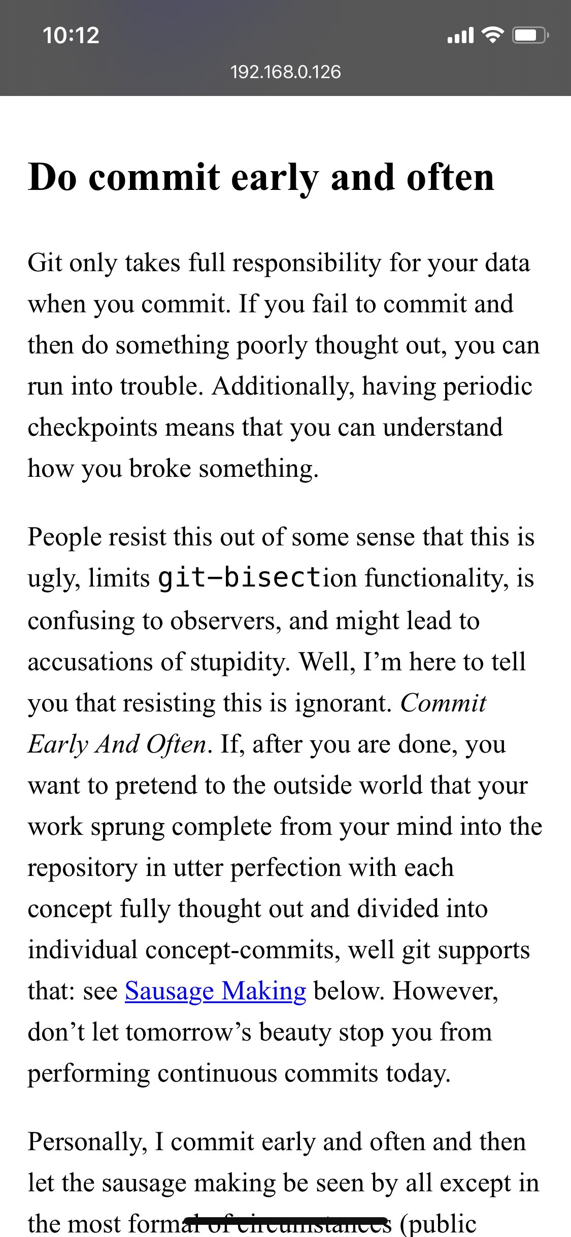
Apply them all, here’s the before/after.
Hooray, super readable!
Extra credit: typography
If we wanted to, one last thing I’d tweak is the indentation, which is so comically large as to end up taking up nearly half the screen width (really only glaring on an actual phone, AKA (fix #4):
… but eh, I’d say we’ve done enough for one evening. Let’s call it an exercise for the reader.
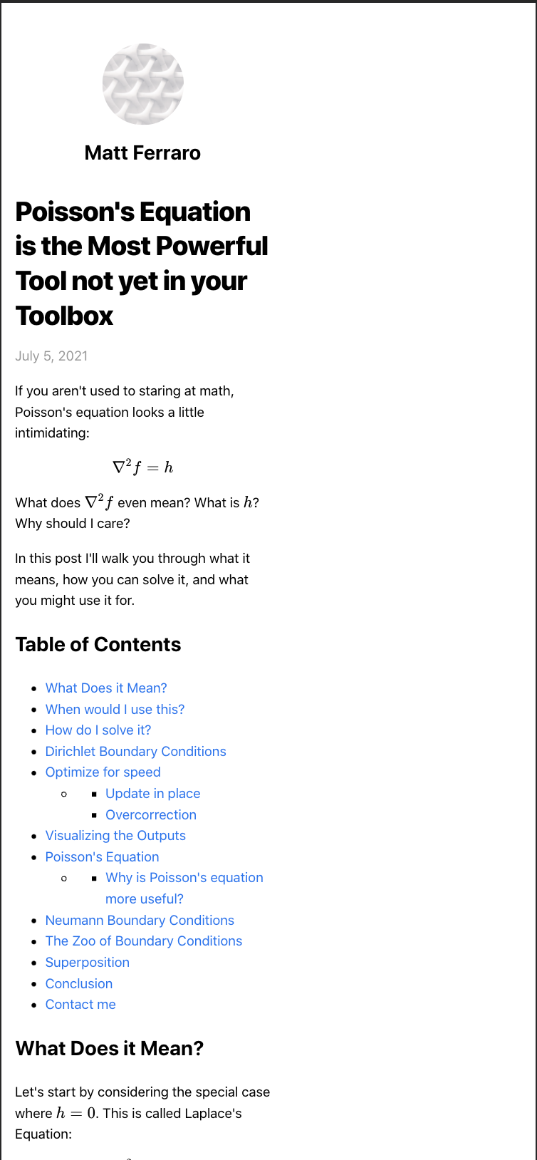
Poisson’s Equation
This page is called Poisson’s Equation is the Most Powerful Tool not yet in your Toolbox. The page’s viewport seems good, but you can accidentally scroll to the right, revealing a bigger page and likely overly wide elements (fix #2).

Left: the default view on pageload. Right: Zooming out to the page’s true width after noticing horizontal scrollbars.
If we scroll down, we can see the worst offenders are, again, over-wide <pre> regions for code. They are already the correct width, but when their content overflows, it spills out.
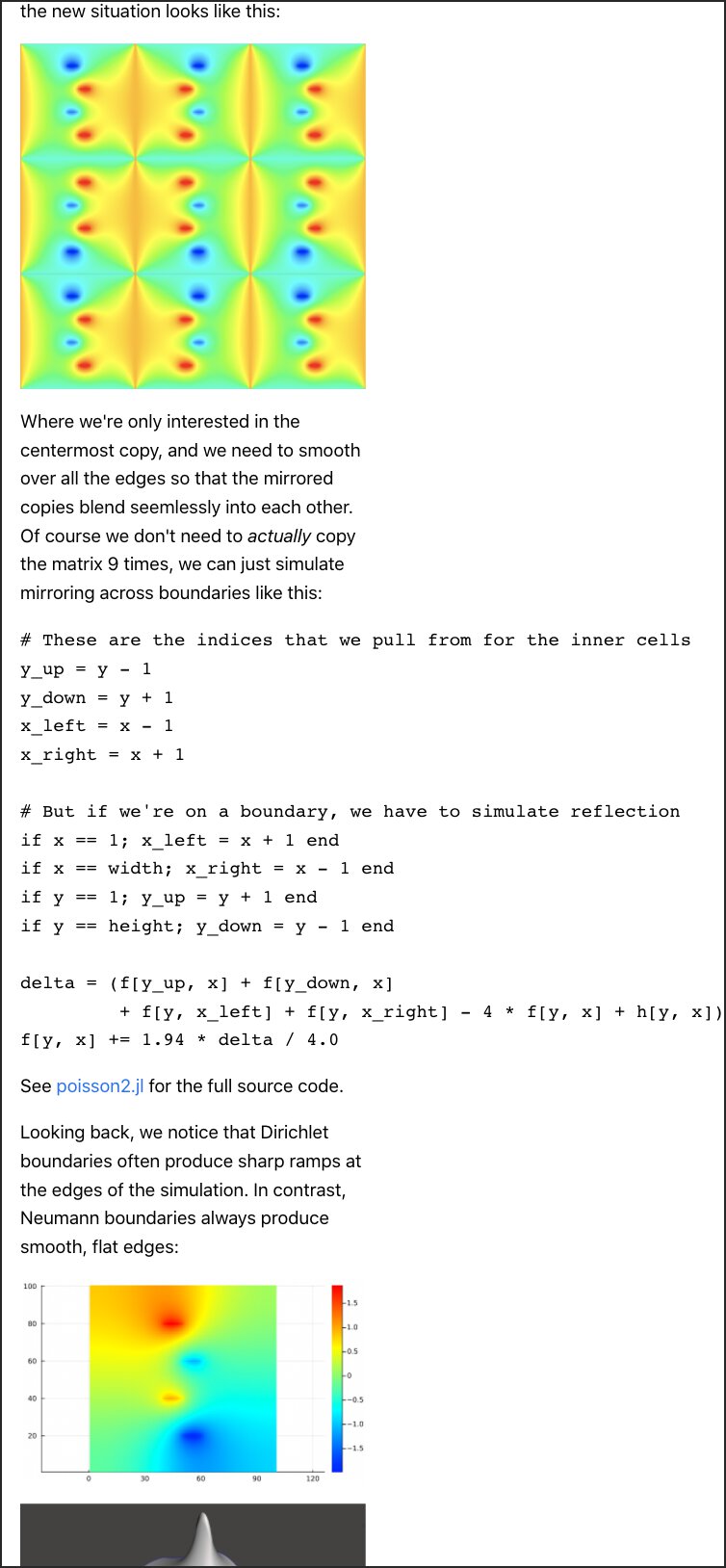
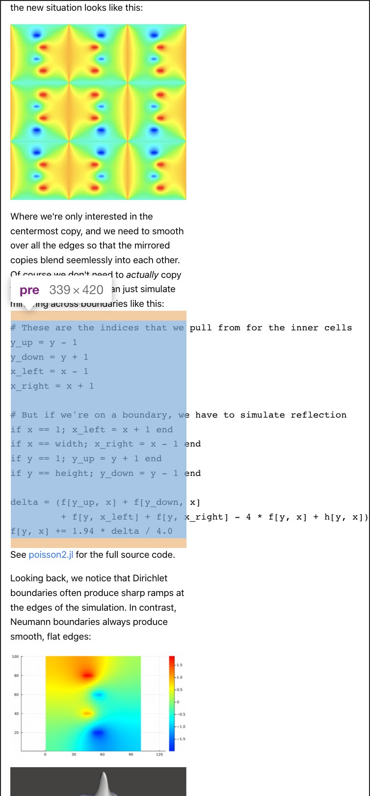
We can fix these,
pre {
    overflow-x: scroll;
}
CSS
… but rendered math is still an issue. Like the <pre> chunks, they’re also set to a good width, but spill out.
The math chunks are all in <div>s with the CSS class math, so we can just add another selector to our rule:
pre, .math {
    overflow-x: scroll;
}
CSS
And with that, we’ve tamed the over-wide elements and the page displays nicely.
Extra credit: code and scrollbars
If I were to add finishing touches, the two things I’d tweak would be the code and math.
The font size for code blocks is bigger than it needs to be (fix #3) and lacks syntax highlighting. If we make those two changes and then reduce the indentation from four to two spaces, we can even fit all the code without any scrolling—we just need to wrap two of the comments.
Aside: This was another place where it was instrumental to check on my physical phone (fix #4). Only there did I notice the code font was so large, and only there could I verify that it was still readable after reducing the font size.
The second aspect I’d improve is the math display—or more generally, the remaining elements that are have their own horizontal scroll bars because of their width.
When possible, it’s nice to have your content fit inside the display so people don’t have to scroll horizontally to see it. But it’s not always worth the effort to make that happen. I think typeset math is one of those occasions. It’s enough work just to make LaTeX display your math nicely, let alone making a version that fits on portrait-sized mobile screen.
But when we do have content that needs scrolling, I think it’s good to show people that scrolling is available. In other words, to show them when an element has the scrolling affordance. Showing content that’s cut off is a hint, but this isn’t reliable unless calculated explicitly, as the content might be cut off in a way that doesn’t reveal there’s more to see.
As I mentioned above, Apple’s browser seems to go out of its way to hide scroll bars. Even when they appear because you accidentally found something scrollable, they vanish a bit later. Can we make sure that our extra wide content has scroll bars them?
In short, I couldn’t robustly figure this out. Using the ::-webkit-scrollbar CSS selector, I could get really big chonky ones to always appear on Chrome, but not using Safari on my phone. Mozilla says this feature isn’t standardized yet, but that it should work on Safari and all iOS browsers 🤷♂️
Left: no scrollbars still on my phone. Right: I could get big ugly ones on Chrome on my desktop.
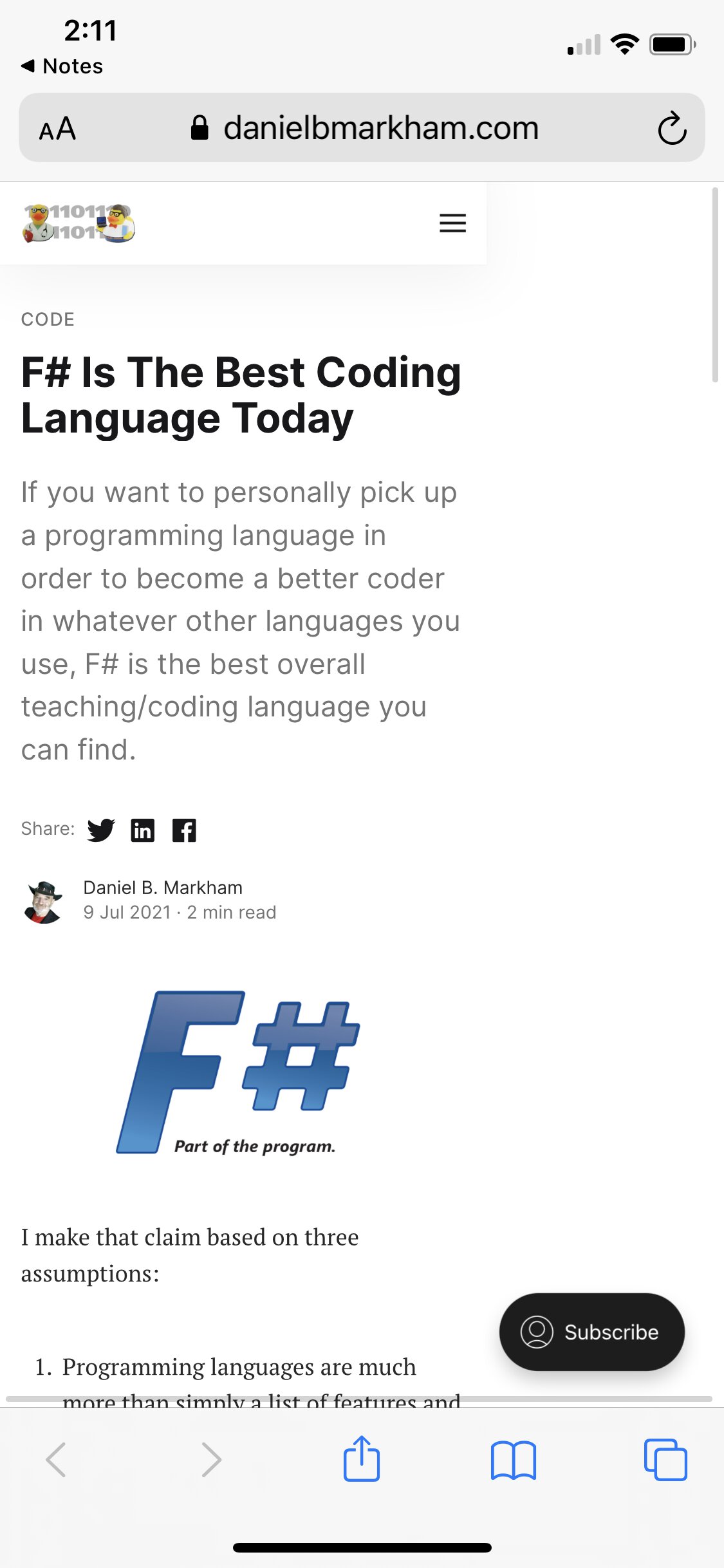
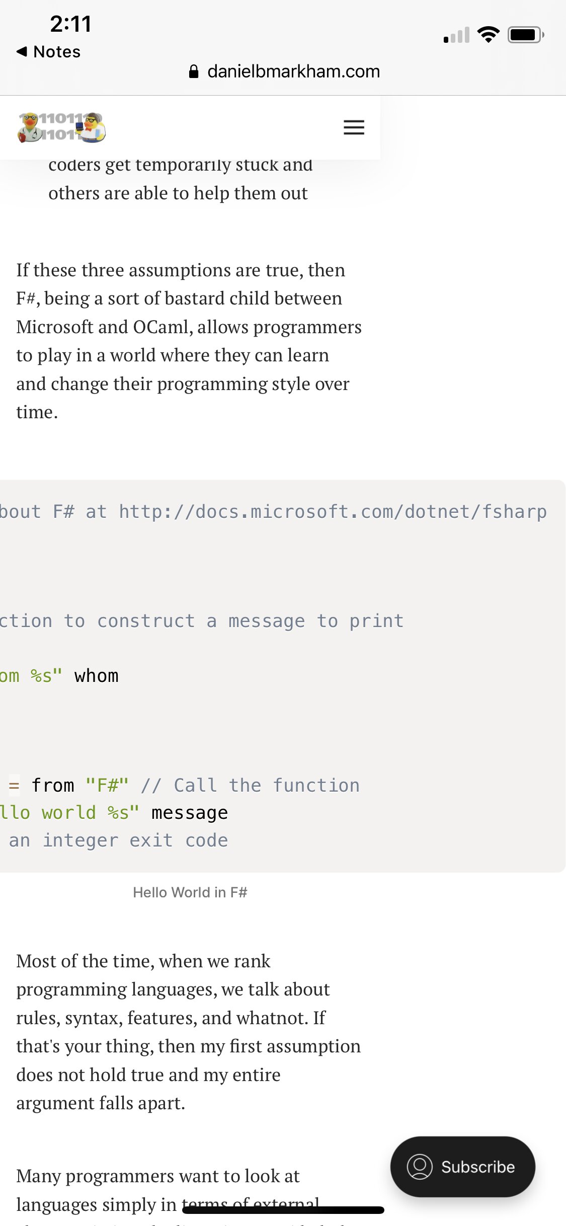
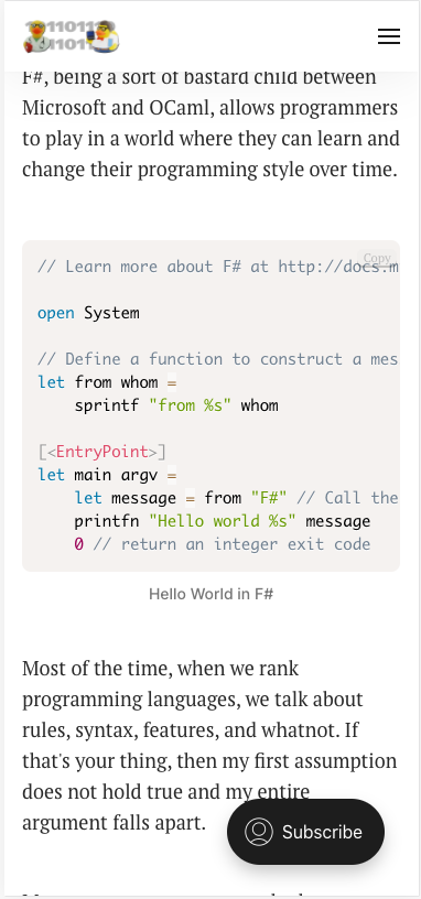
F#
This page is called F# Is The Best Coding Language Today. Once again, a good viewport, but an over-wide <pre> code block. Jeez, what is it with these code blocks?
Left: After loading the page, noticing it’s got a horizontal scroll bar, and zooming out. Right: The culprit code block.
Two oddities with this one:
-
Not only is the code overly wide, but the left part is also cut off and can’t be revealed. Not sure how that one happened.
-
The page becomes a broken, un-styled mess when I download it to make tweaks. I’m guessing it’s blocking some CSS from being loaded.
Because of 2., I only made minimal tweaks in the browser’s developer tools to fix things (fix #2).
/* Attached these to the <figure> element,
   the literal root of figurative evil. */
max-width: 100%;
/* Once again, you'd want to tweak font
   sizes for desktop vs mobile. */
font-size: 14px;
CSS

Fixed view of the top of the page (left), and the code block (right).
This fixes the page and makes the code readable. Hooray!
Extra credit
Nothing else major here, but I would wrap the comments in the code earlier so we could get rid of horizontal scrolling entirely. The URL, which would be hard to wrap, could simply be moved outside of the code.
Hydroponic
This page is called Automated Hydroponic System Build. In a crazy turn of events, 🚨 it’s not code in a <pre> block this time! 🚨 This page actually contains pretty huge chunks of code, but they all obey the body width. What’s the issue, then?
An overly long URL, yeeted into the comments by none other than the author himself. Bummer.
In fact, there’s a different comment from another person that includes a URL that would also stretch the page (fix #2). This means that any commenter can break the mobile page layout 😱
I checked out the source, and saw each comment has class="comment-body". So if we simply add the CSS:
.comment-body {
    overflow-wrap: break-word
}
CSS
… then everything is groovy.

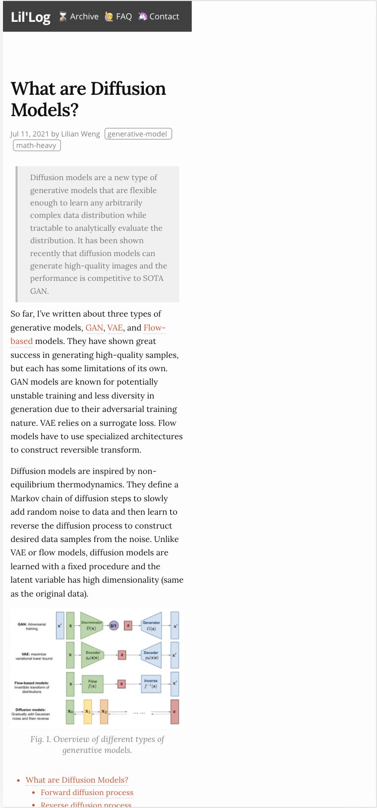
Diffusion Models
This page is called What are Diffusion Models? This time, it’s pesky math again, stretching a good viewport too wide.
We can tell MathJax to stay in its lane (fix #2) by adding the CSS:
.MathJax_Display {
    overflow-x: scroll;
}
CSS
… and the page is back in its box.


Footnotes
In hindsight, Safari’s Reader View almost completely solves this (for web pages, not PDFs). So I should just use that more. But it does mess up content on some pages, which you won’t know is happening while you’re reading it, and, you know, *waves hands* fixing stuff is fun etc. ↩︎
“Actual” device’s width is already a simplification, because screens have pretend pixels (e.g., “oh hey, I’m 375 x 812”) and actual pixels (e.g., “shh I’m actually 1125 x 2436 lol”). As usual, to read way more than you wanted to about this check out Mozilla’s docs on the viewport meta tag. ↩︎
I was in vague denial that everyone who visited my website would be on a desktop. Then I added some basic analytics. Nope, mostly phones. ↩︎
I was writing “author” until I realized, oh yeah, this is a design issue, and, like it or not, self-publishing on the web a designer of us all makes. ↩︎
Keep in mind for a real project we’d probably have the measurements change based on the screen size using CSS media queries. ↩︎
