Lyon
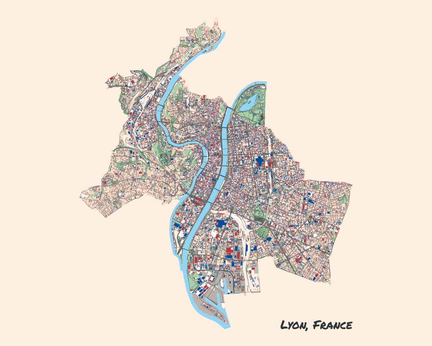
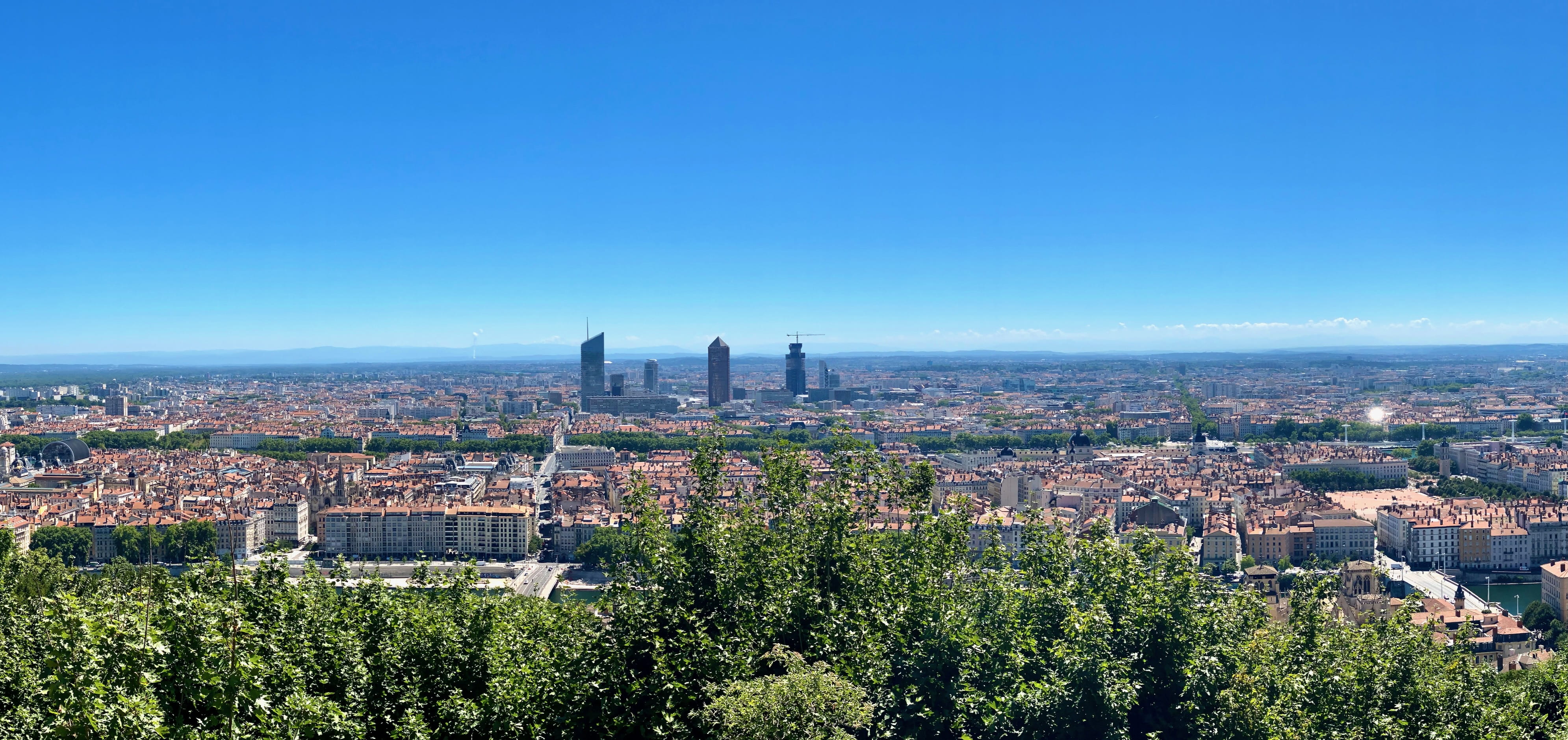
Lyon was my favorite French city we visited. I would love to go back.
The city is beautiful—w/ the river Rhône running right through it—and it’s got truly lovely parks and amazing food.
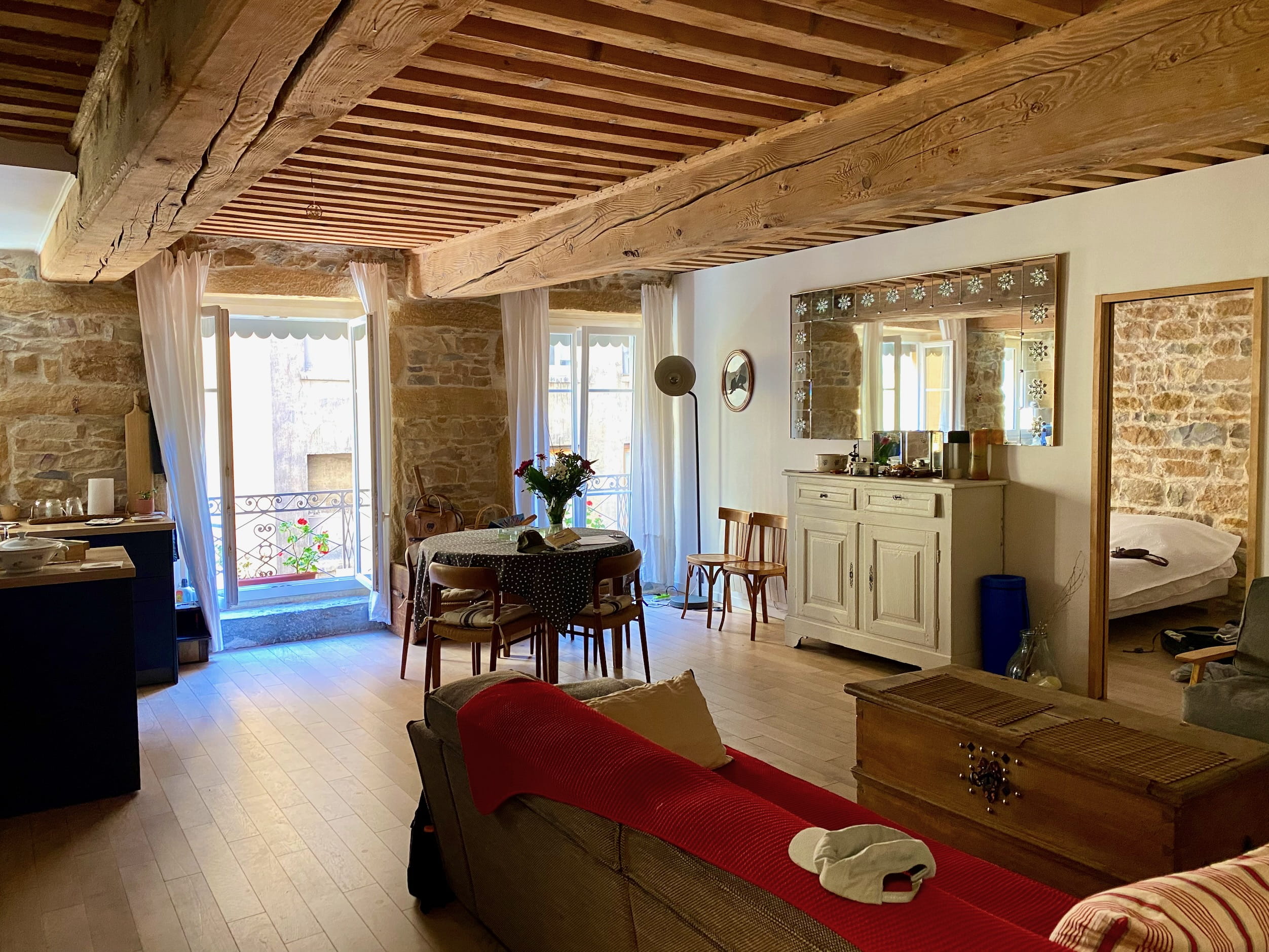
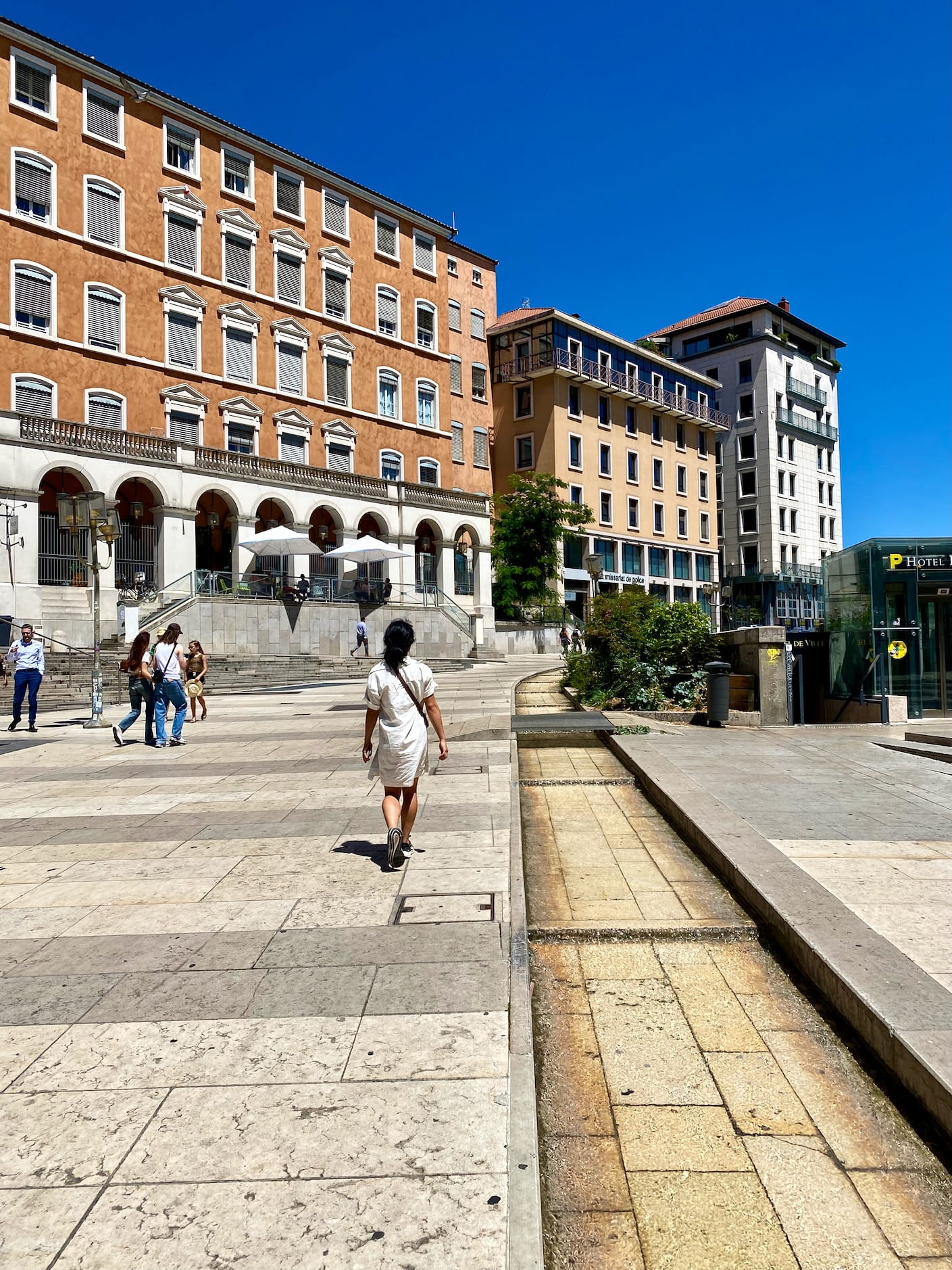
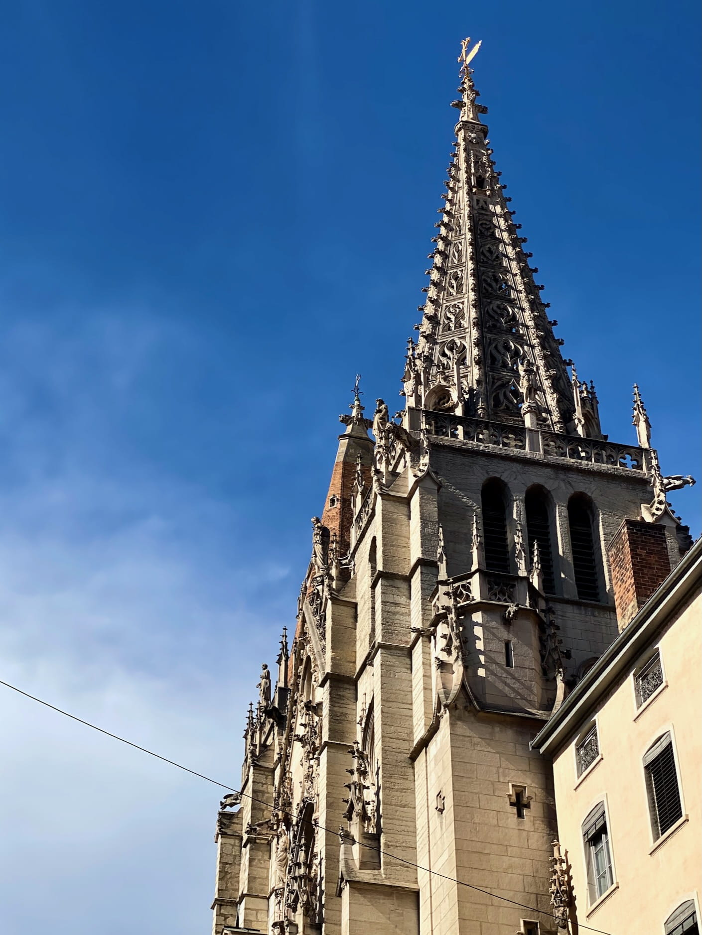
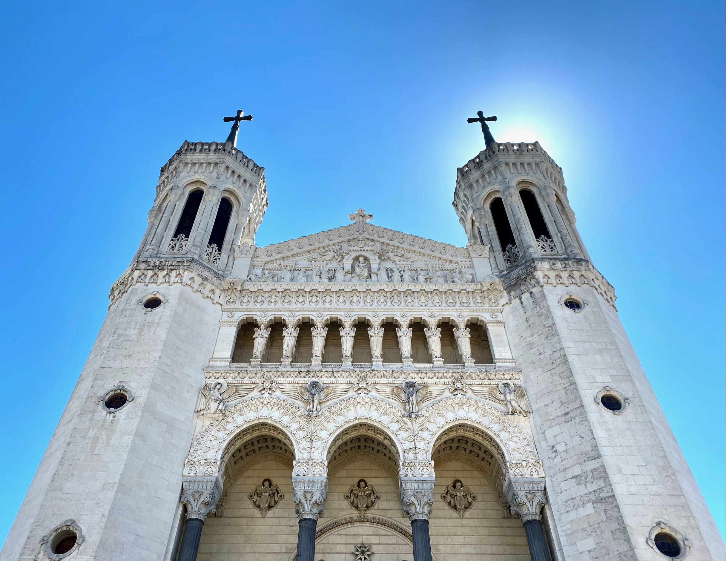
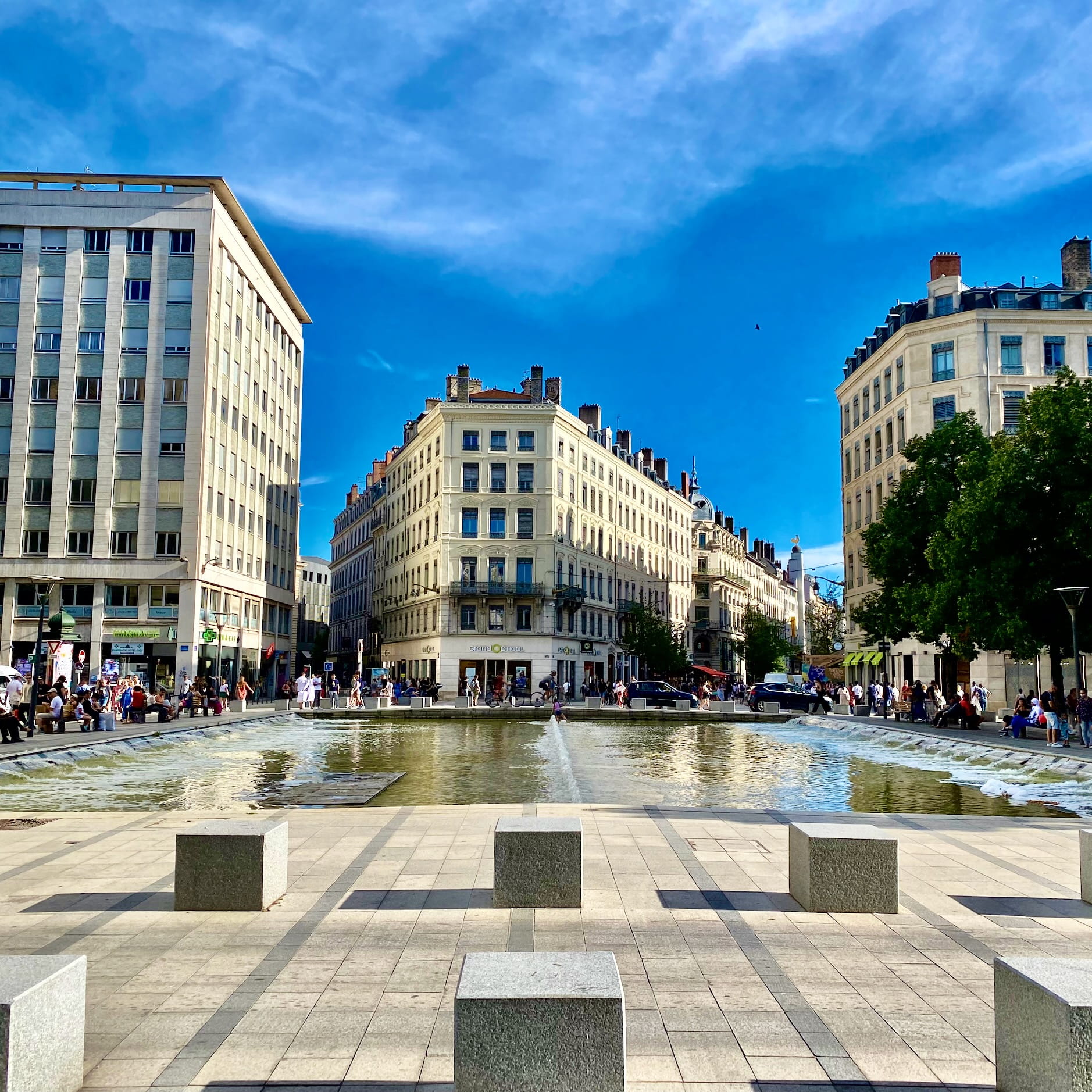
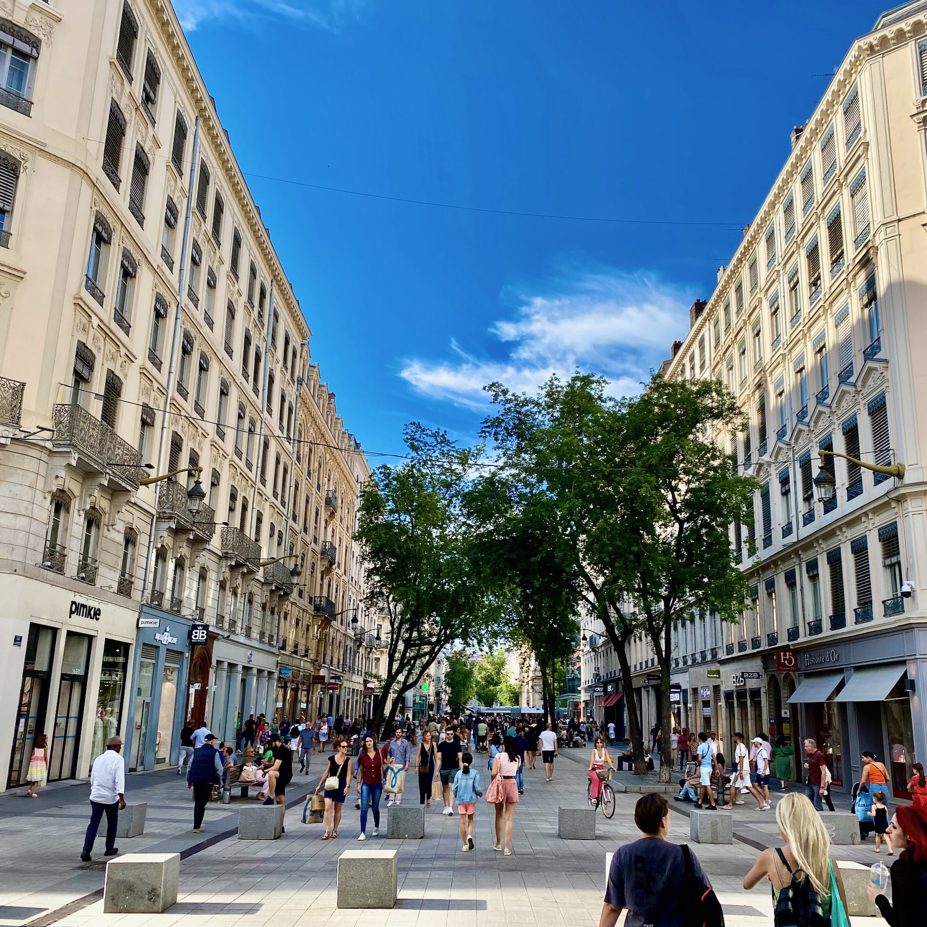
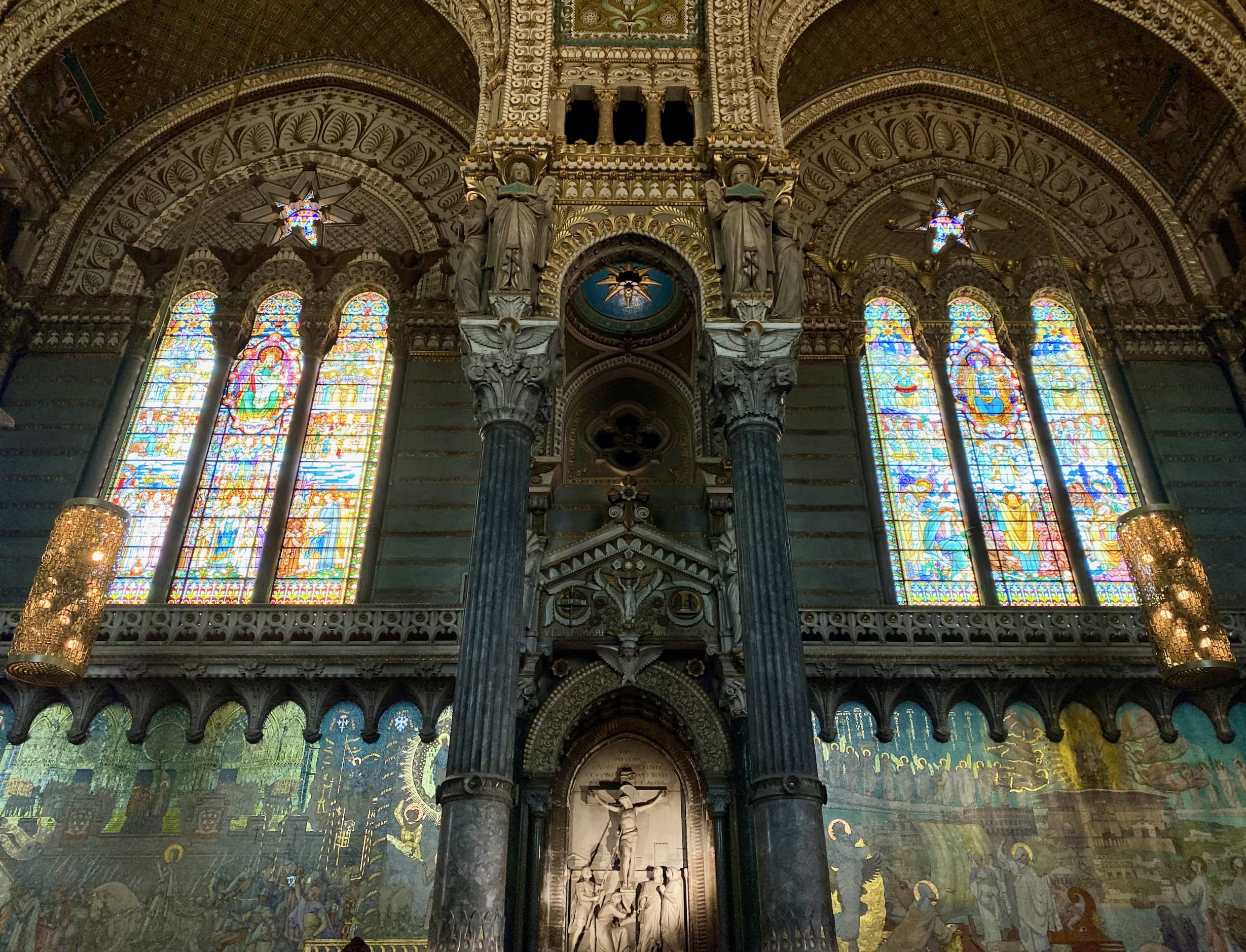
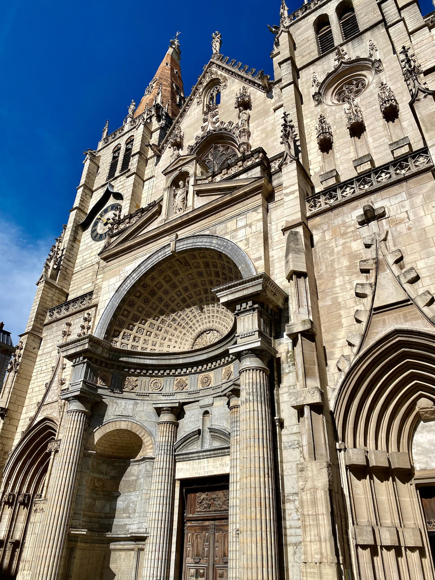
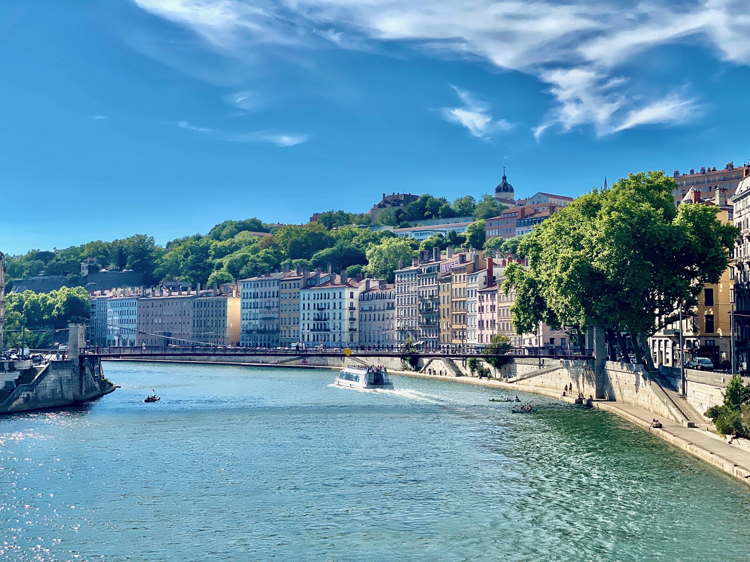
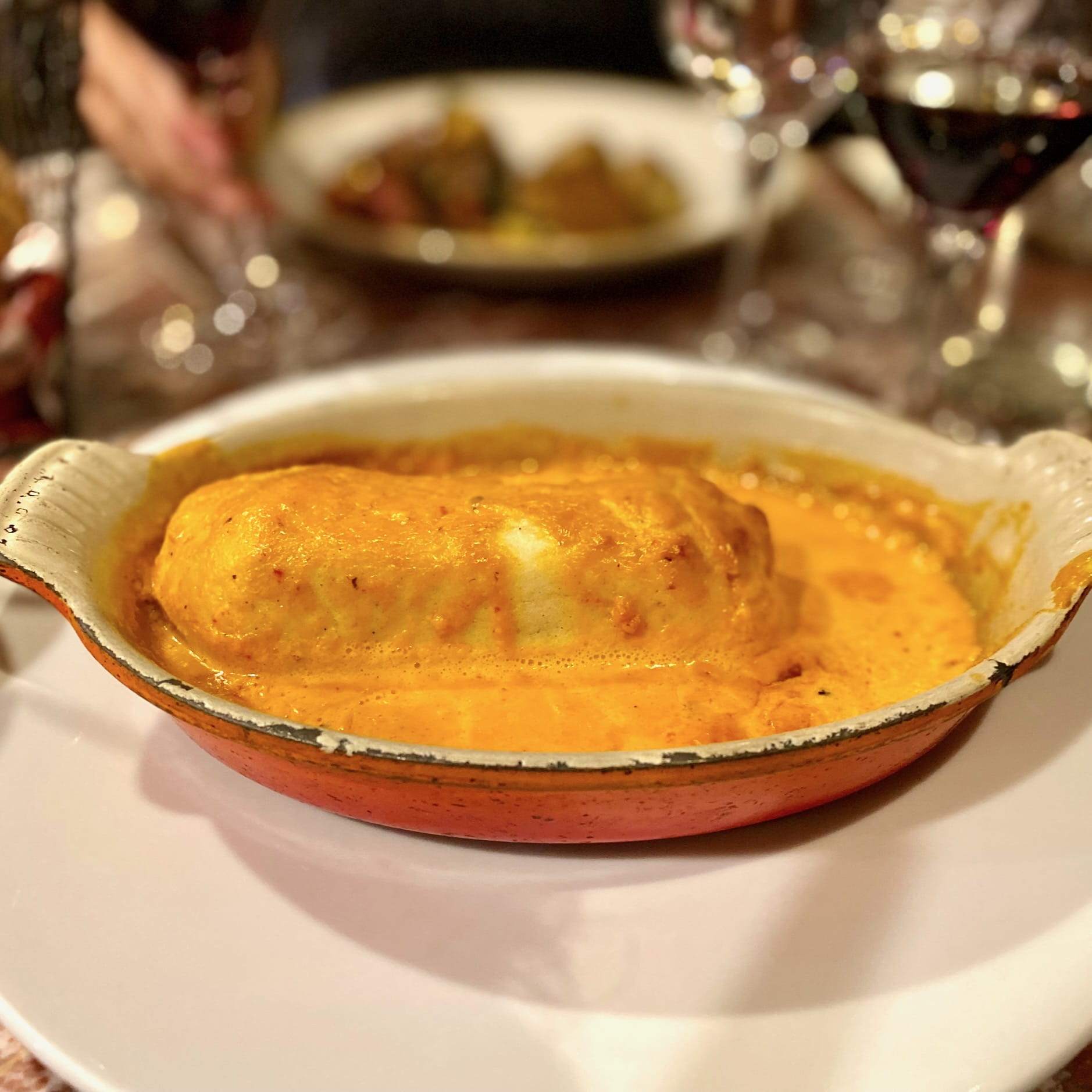
Bottom: Right: Quenelle Lyonnaise, a doughy white fish thing baked in this cream sauce.
There were a bunch of shops near where we stayed that seemed like DIY craft spaces / teaching halls. This one (pictured below) is for making your own beer. We also saw ones for pottery, clothes making, and painting.
It made me think a bit about the value of having places for artists, and how challenging this is to maintain when a city gets really expensive, and how sad it is when that fails (see, e.g., Seattle for all of the above).
I have no reason to believe that Lyon has solved this issue. But seeing how many places there were for newbies to take classes made me wonder about that as a model for providing income and studio space for practitioners.
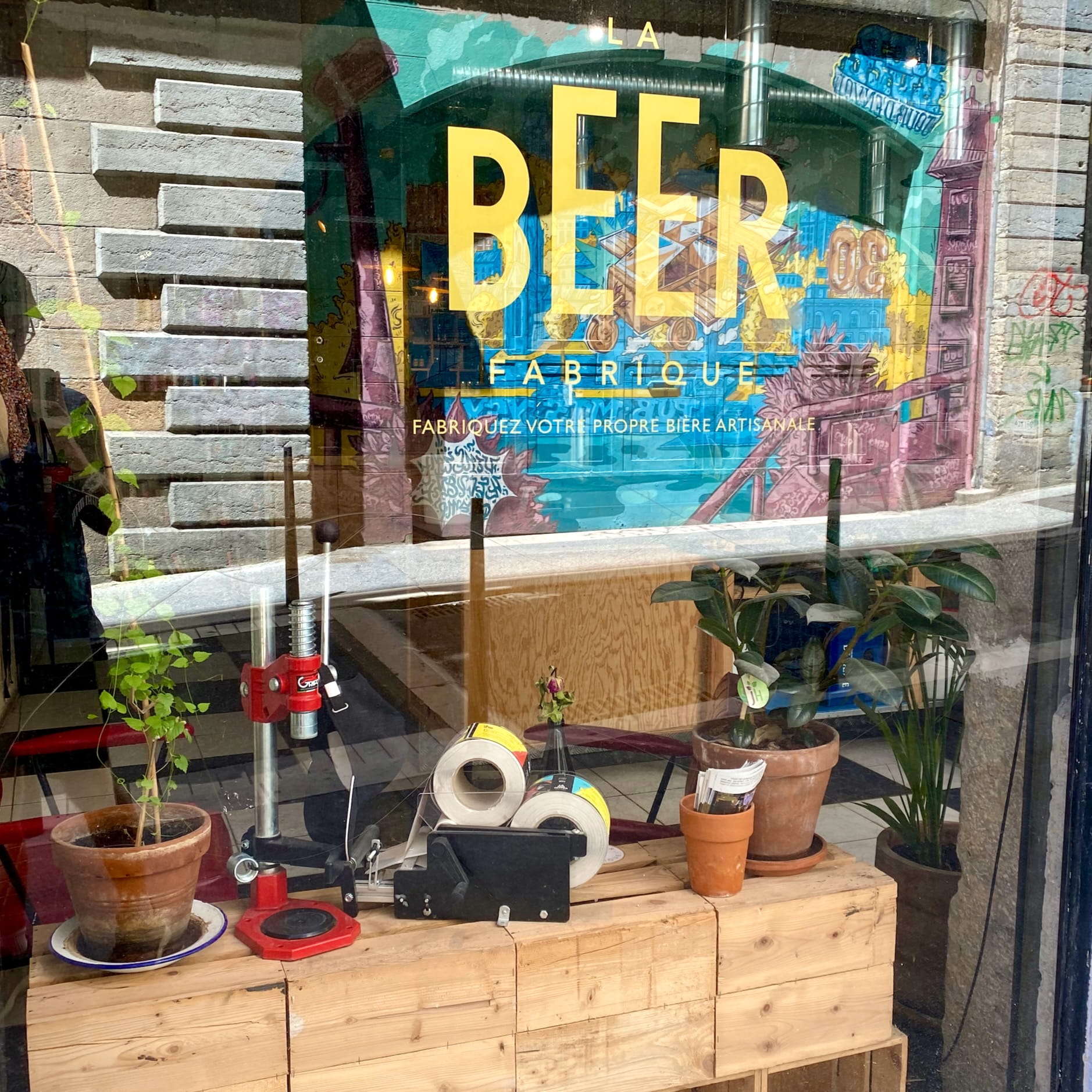
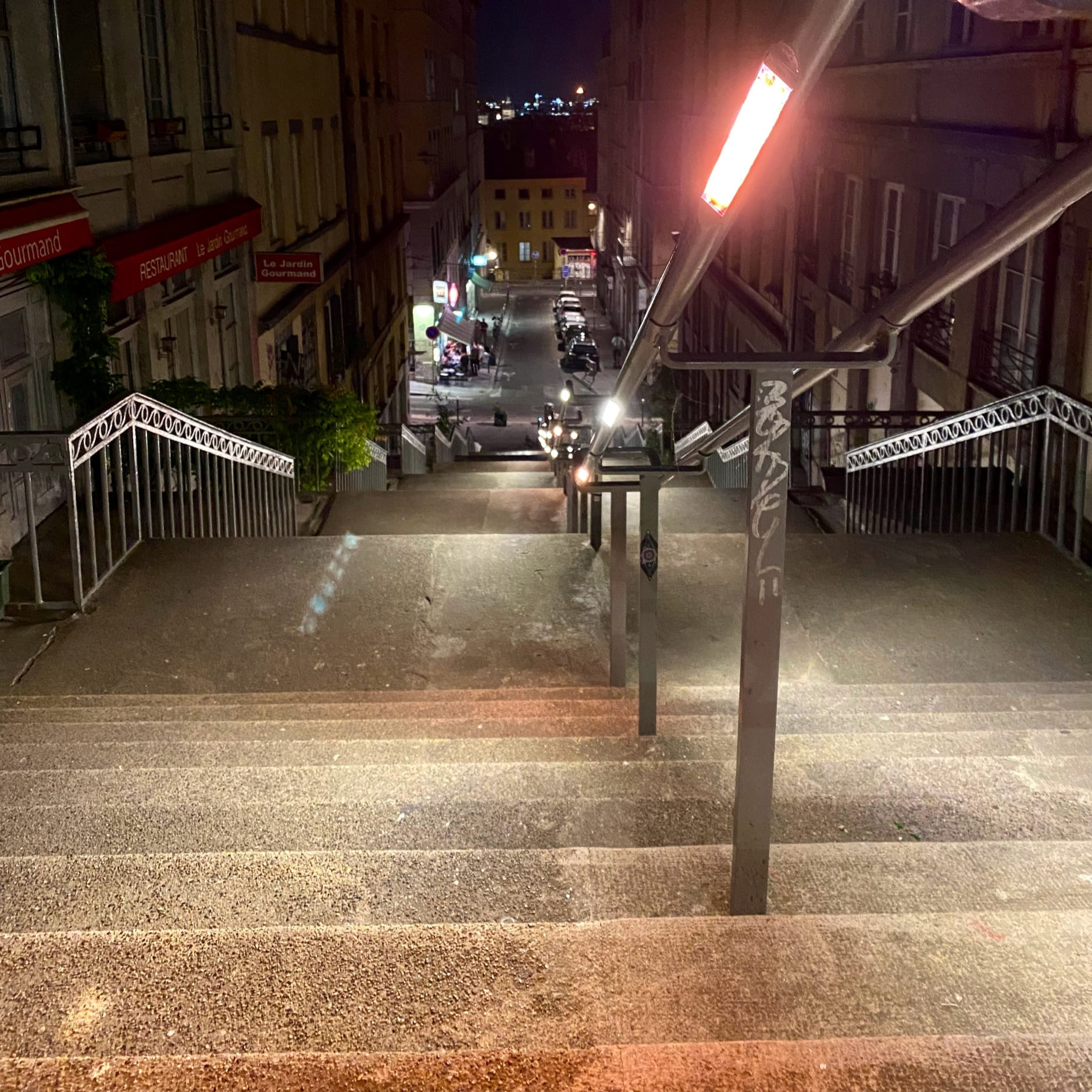
Top: Left: Aforementioned DIY beer studio. Bottom: Right: Random cool infrastructure thing: lights built into the underside of hand rails.
A tiny bit about taking pictures.
I have no photography training (as I am sure you can easily tell from looking at this blog), so I sometimes feel like I’m slowly learning by doing everything wrong.
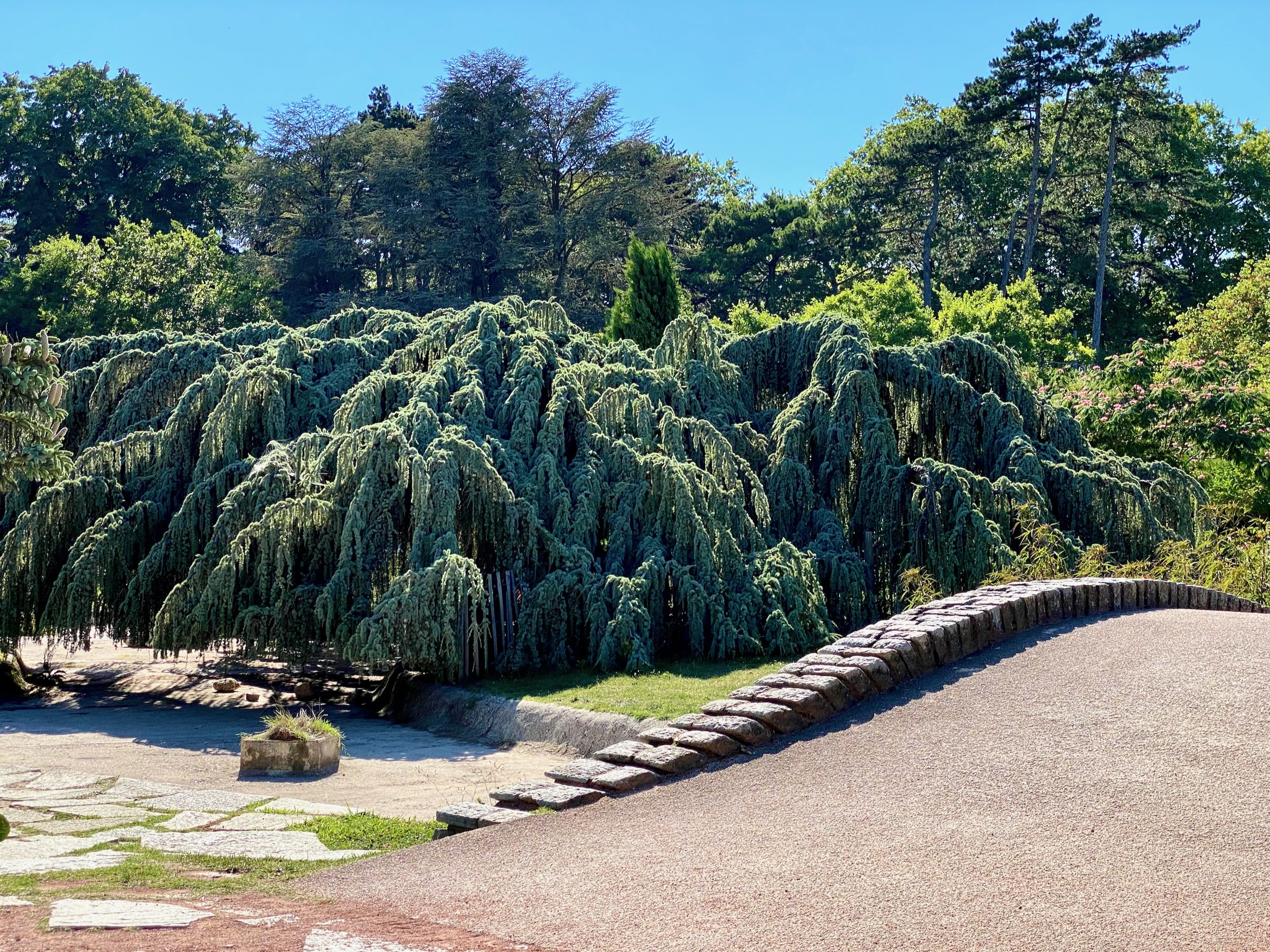
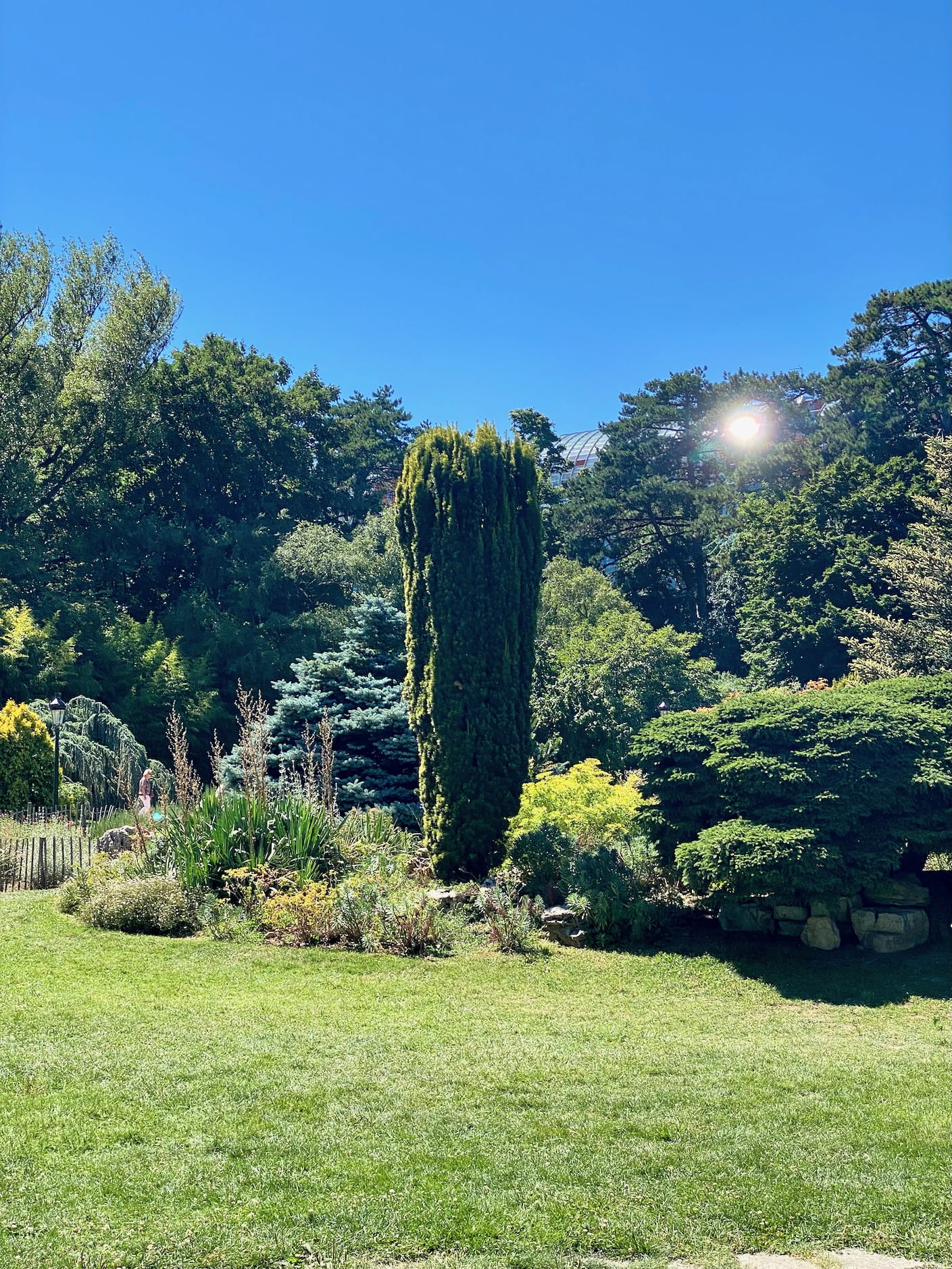
E.g., I noticed that all of my photos of this big Lyon park (Parc de la Tête d’Or) look… I don’t know, somehow off. Like the lighting is bad. Which is weird, because the sun was extremely bright, and there was like no cloud cover. I think I had a similar problem in Crete.
My recent thought: I wonder if direct overhead lighting is bad? It’s like, “too harsh,” or something like that? Maybe it’s good to have shadowed areas that are more horizontal than vertical?
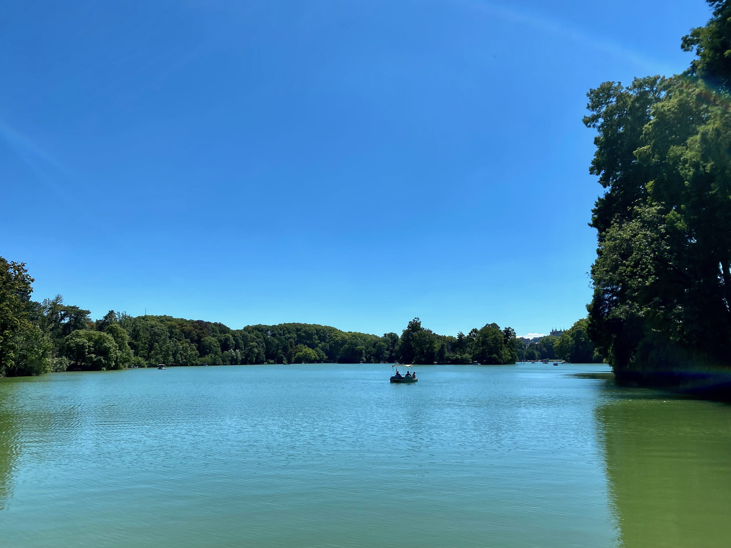
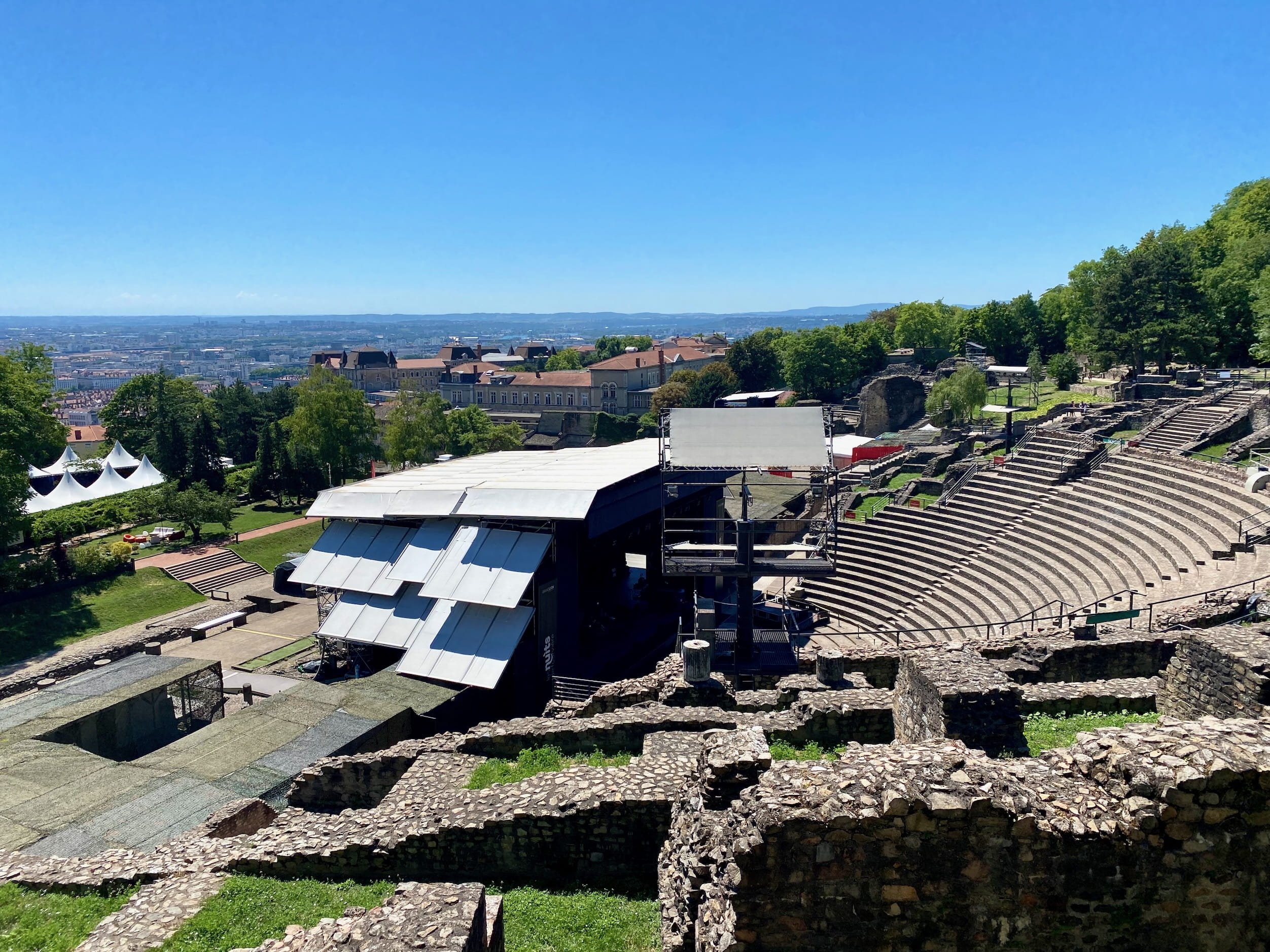
Top: Left: Aforementioned weird lighting in a beautiful park. Perhaps sun too overhead? Bottom: Right: Lyon did something cool with Roman ruins: kept them and modernized them as a concert space. So you can attend a concert in an ancient Roman ampitheater. Way to go, guys. Apparently the Romans had also built a 90-ft tall wall behind the stage to… block off the whole amazing view of the city? Good call tearing that thing down.
Photographing Art
I have two modes in museums:
- Not photographing anything. Looking down at people who take photographs. “Just enjoy the art!” I think to myself. How foolish they are.
- Photographing a bunch of stuff. “I want to remember, to be inspired later!” I think.
It’s really impressive how bad the photos always are. In fact, they rarely even remind me what was so good about a piece.
To me, it’s quite surprising that this is the case. You’d think, an image is an image, right? The scale and texture and physicality really matters, though, I think. Not to mention the whole designated space / mood for looking at them. Plus the context of an exhibition.
Anyway here’s a few I took and some light commentary.
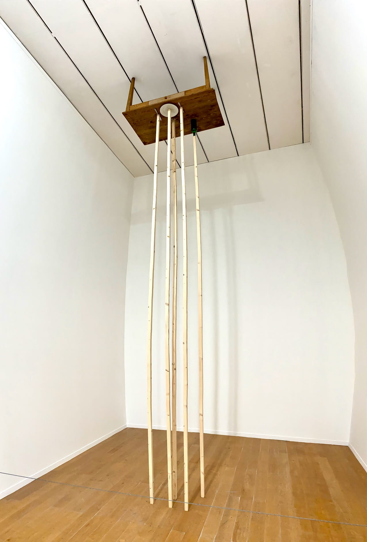
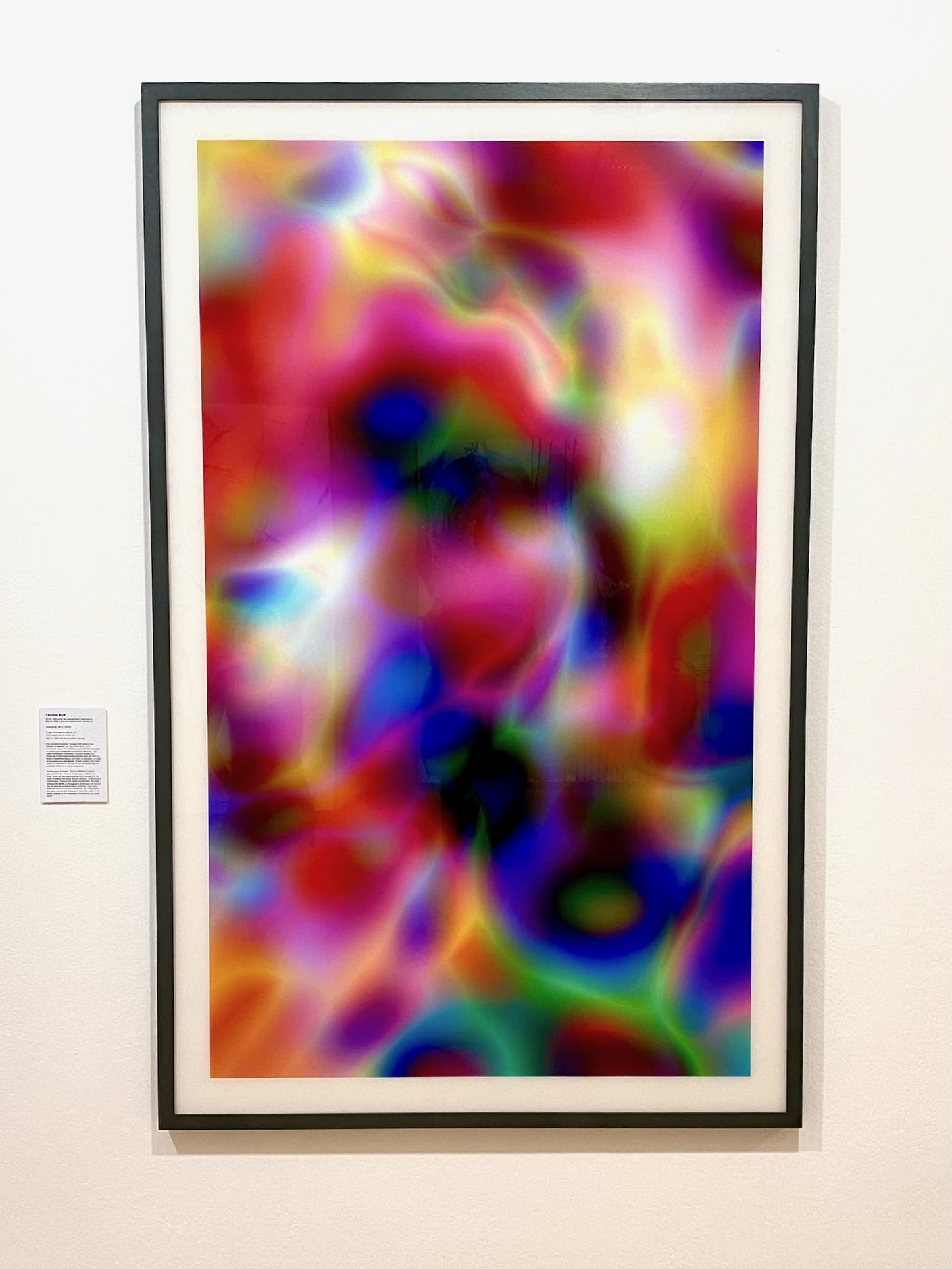
Top: Left: Set table all balanced on wood poles, no adhesive, quite high up (20ft? see distortion on right corner). Bottom: Right: This is a prime example of photo not capturing what I liked about the piece. The piece is printed on some special material… maybe layered enamel? The way light passed through the image just had beautiful optics to it. Rendered as a photo, it just looks muddy.
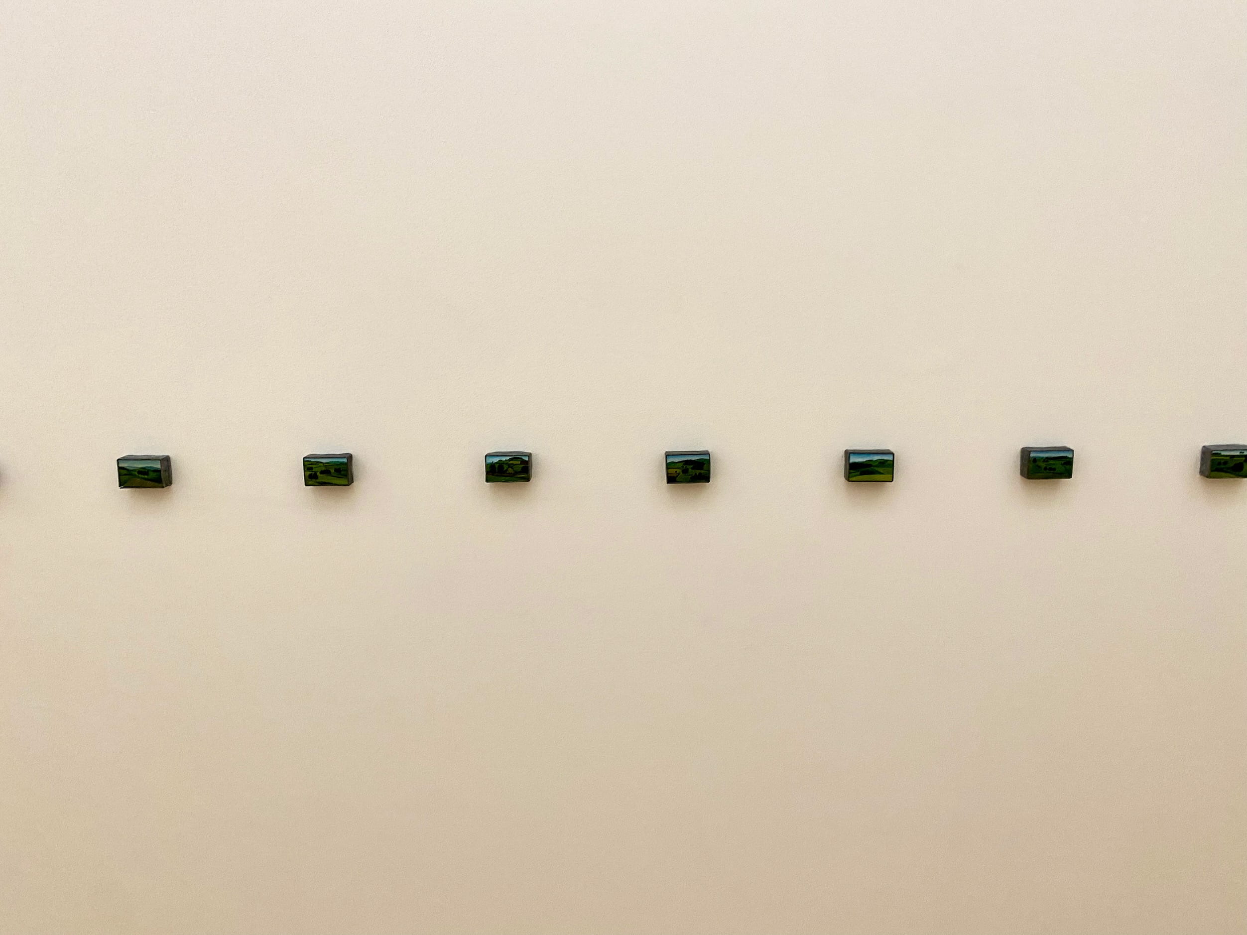
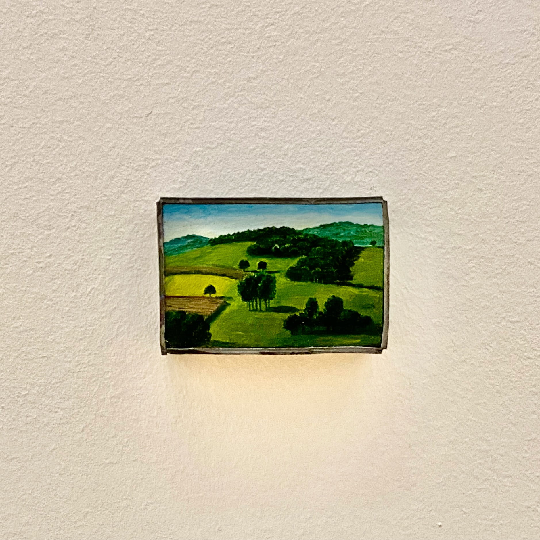
Top: Left: Teensy matchbox-sized paintings. Bottom: Right: Close-up of one. Amount of detail/sq.in. is staggering.
So anyway I will resume omitting museum / art gallery photos now.