Get the Picture
Seoul
We’re staying near the Dongdaemun Design Plaza, this enormous swoopy blob of a multi-building complex that looks like something Frank Gehry would make if you took all the angst out of him.
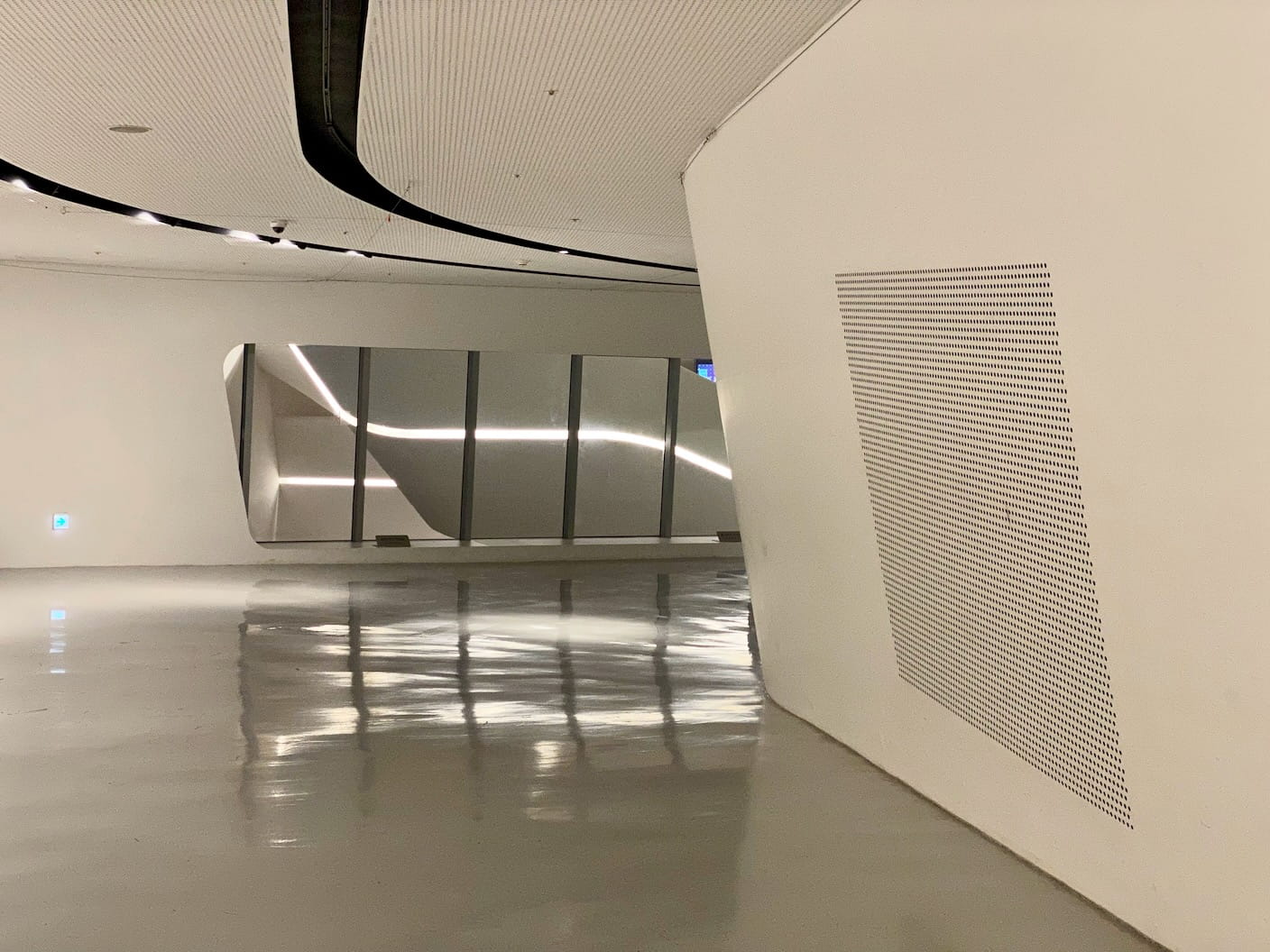
Even the inside is full of huge luxurious curves.
(It is, truthfully, quite nice.)
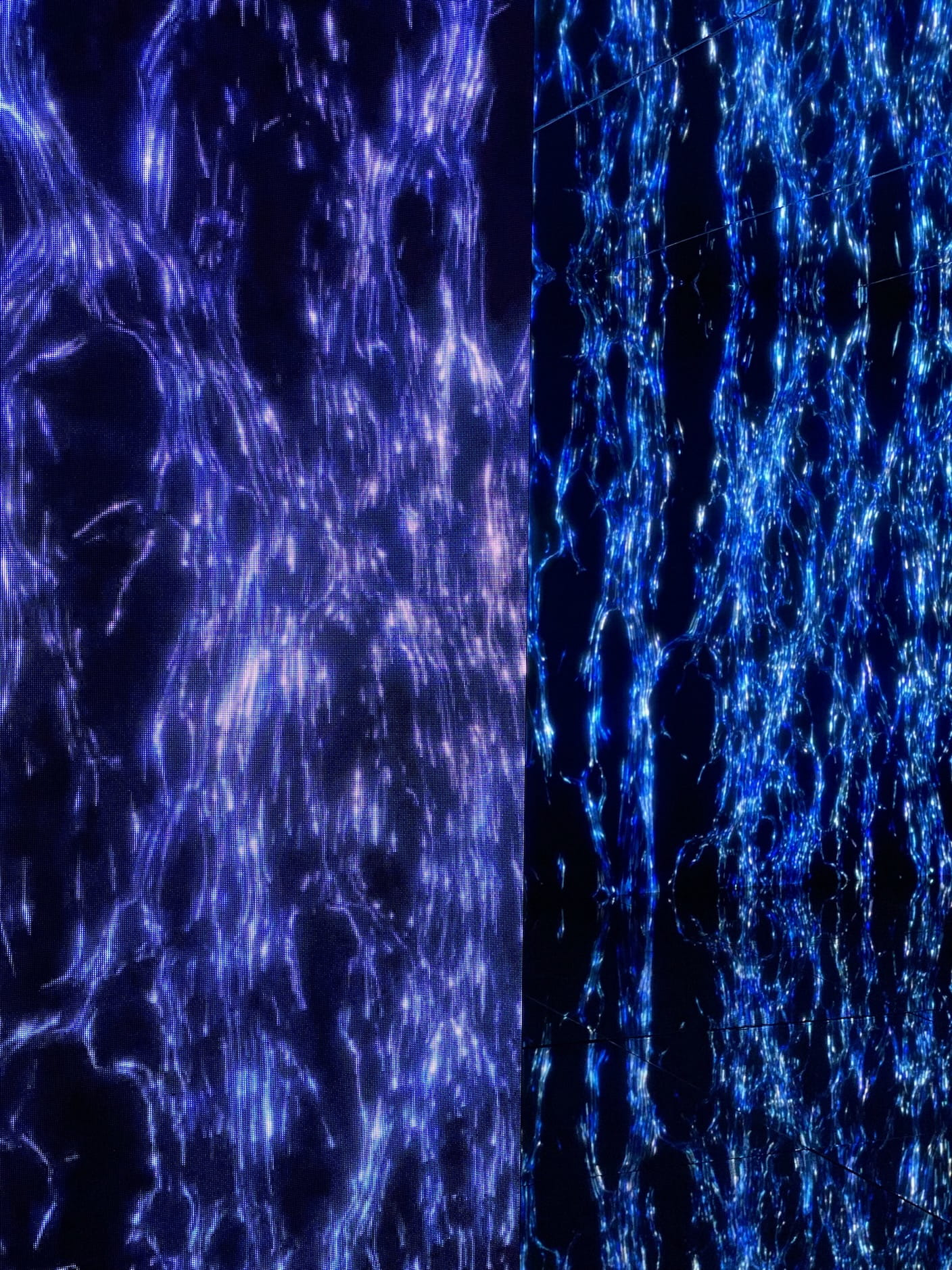
Anyway, we finally made time to explore it today, and got to see an art exhibit called “Opposites United.”
The piece—a multi-room tour with light projections, screens, and accompanying audio—immediately smells like high-production corporate art. (This made sense in hindsight; leaving, I saw the exhibit is funded by Kia, the car manufacturer.) The framerates are good, the choreography is energetic and crisp, and the audio belongs in a decent superhero movie. At times I felt like I was somehow watching K-pop but in abstract projected 3D renders.
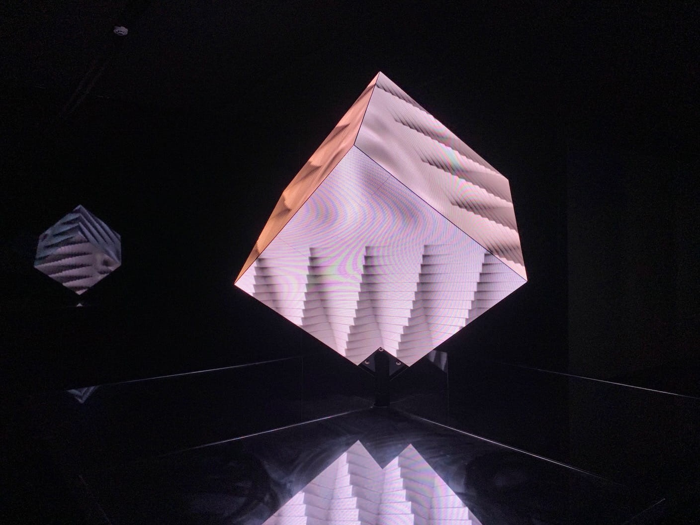
But, that’s pretty much it. It was not even an inch deep; an ultra polished veneer, but veneer only.
Here’s what’s bothering me though, in one sentence: everyone filmed the whole thing, which meant they wouldn’t have had access to any more depth even if it was there, and they filmed it because it looked so good, which makes me worry that somehow media art maybe has to be bad to be engaging?
I will now walk through this piece by piece.
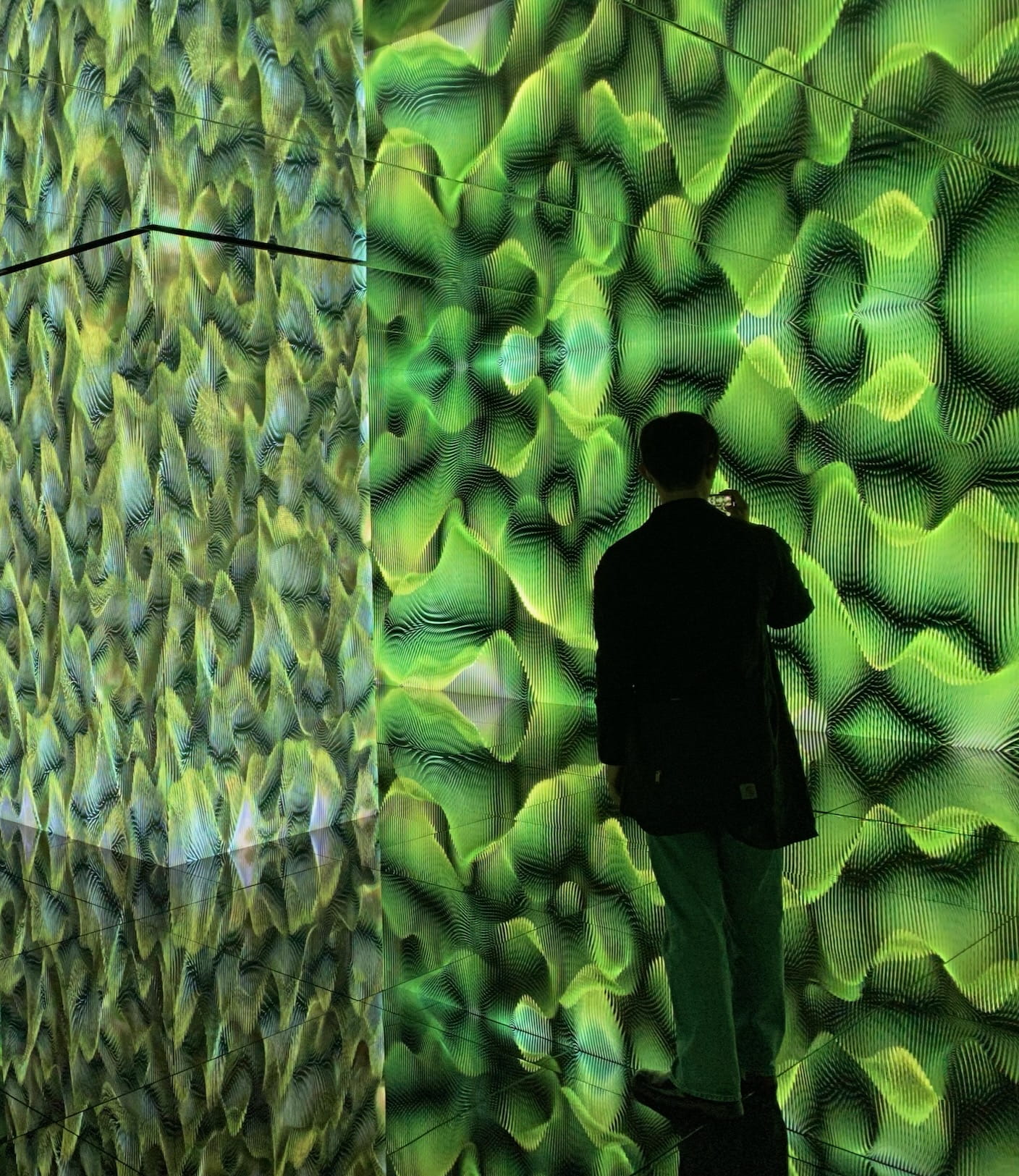
The level of polish was so high that everyone grabbed their phones in each room and recorded from start to finish:
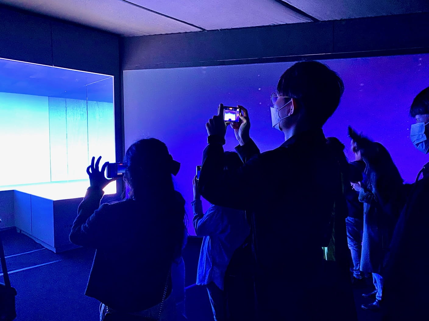
When you’re filming, what you can take from an art piece is immediately cut off, almost completely.
I don’t mean this in a philosophical way. I mean it as simply as that you can’t both drive a car and do a jigsaw puzzle well at the same time. You just lack the attentional capabilities to do both.
When filming, you’ve got the objective to get a good shot. You are composing the scene—maybe with your companions in it—and you’re thinking about how it looks, how it sounds, which parts you’ll post, how it will appear on your social media feed, etc. Your consumption of the media is mediated through your realtime construction of your own media.
Filming, I submit, ruins any chance you have at engaging with the art (or any experience) on a deeper level. This is the main reason why I don’t film much during my travels. Taking photos is risky enough.
In this case, it wasn’t to worry, because there wasn’t much to engage with. It was glossy corporate art, meant to wow and impress but not to deliver any message.
What’s bothering me is the necessary conclusion here.
In one way of looking, everyone saw how corporate art the whole thing was, knew there wouldn’t be a deeper message, and whipped out their Samsungs to grab fifteen slightly different angles of the whole twenty minutes.
But you and I both know this wasn’t the case. It was the polish, not the perceived lack of depth, that caused the filming.
This inevitably means that anything that’s polished will have people film it. And when people film it, they can’t engage with it.
If you’re making high-budget corporate art, you can’t make it look crappy. You gotta polish that thing to way past an inch of its life. You have to kill it with polish, drown any bitter meaning out of it until it’s nothing but a nice light show, with sections titled “Joy for Reason” or “Power to Progress” or “Technology for Life” (I’m not making these up).
Does this mean that if you want people to engage with your art, you can’t polish it or else they might film it? That it has to look bad? Does this explain the dozens of eye-rollingly 2005-looking media installations I’ve suffered the last umpteen art museums I visited in Europe—that the whole production is intentionally bad, because if it was too good people would immediately banish it to Instagram as yet another Infinity Mirror Rooms?
The other obvious option is to say “no photos,” but aside from people sneaking them anyway, this will mean that in the back of everyone’s mind they’ll wish they could photograph it. Maybe this is the answer. It seems to work for movies, but movies get to ease you into the whole absorption experience with the previews and all. Maybe a whole museum has to be photograph-free?
A Tiny Scroll
Cerami has raved about his scroll—the benefits of a cheap throwaway medium to pour onto your hours of doodling, dosed daily.
Today I saw a product made exactly for this, albeit in miniature. It uses receipt paper.
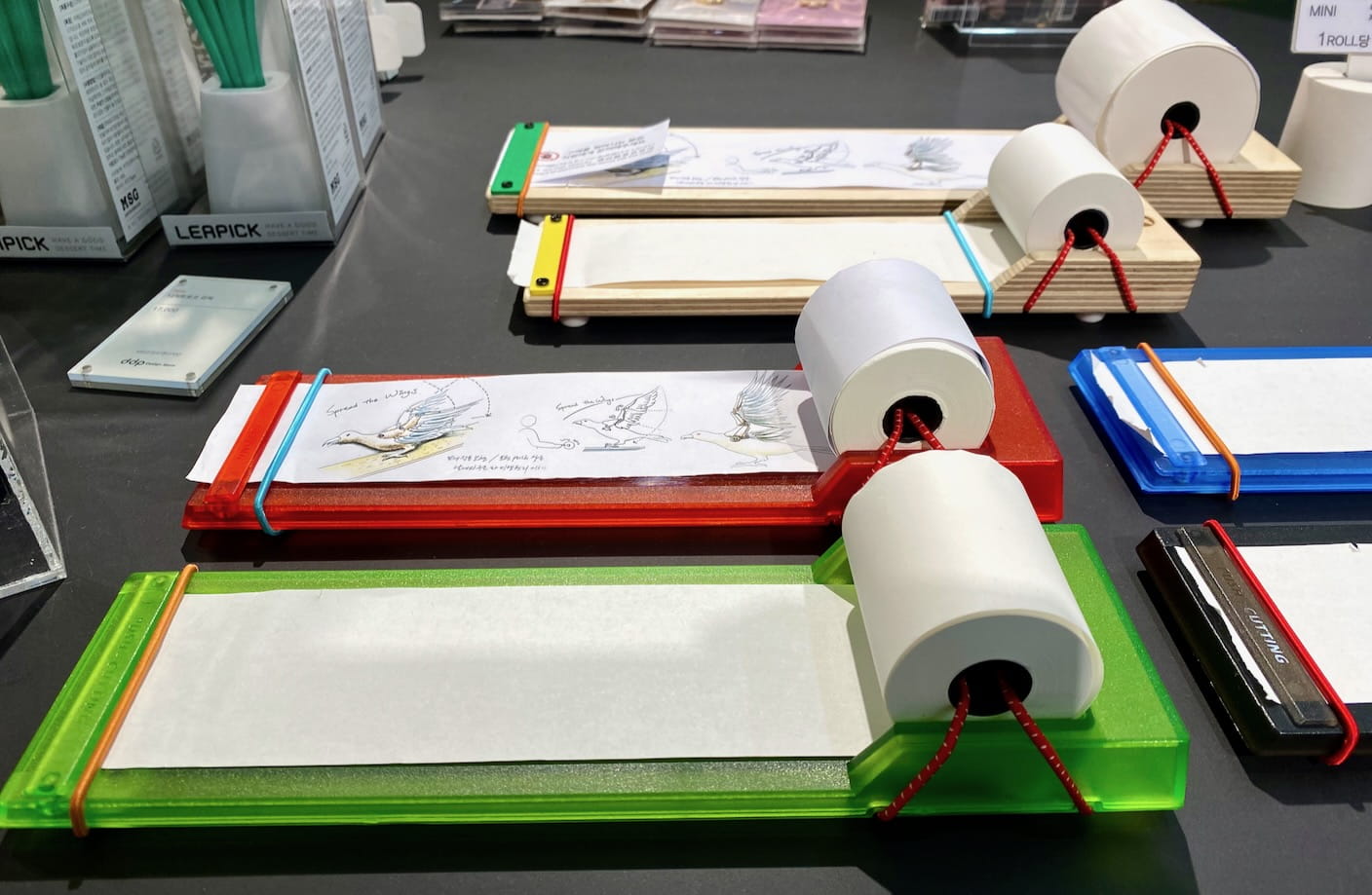
And they were selling receipt rolls for $0.33 US a pop.
Almost English
I am happy to report that, since my last visit in 2015, Korean design has retained its love of English near-misses. I’m not being sarcastic—I really treasure this stuff.
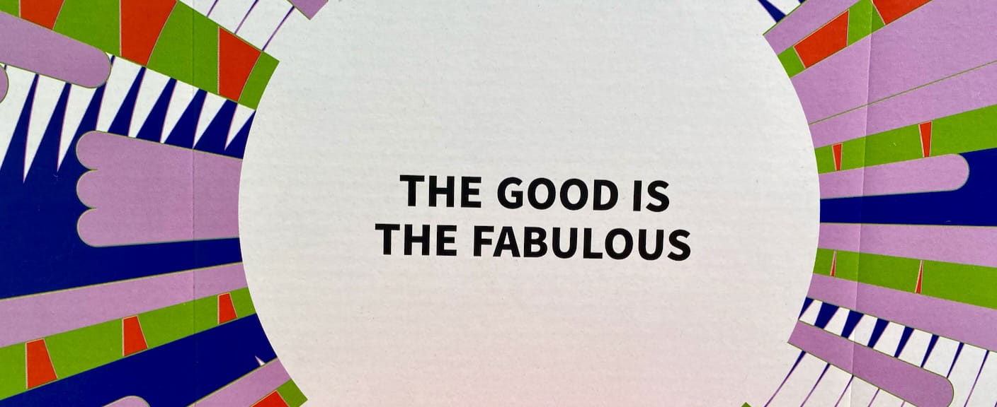
This kind of thing is everywhere.
Seven years ago I came home with several pieces of clothing that said stuff like “fascinating movement achievement project” and “don’t look back in anger.” (Unfortunately, no room in the suitcase this time.)
I’m also noticing a new category, which is merged words that make sense if you pronounce them but that you’d never see ordinarily in written English.
One example is “max style” written as “maxtyle.” Here is another:
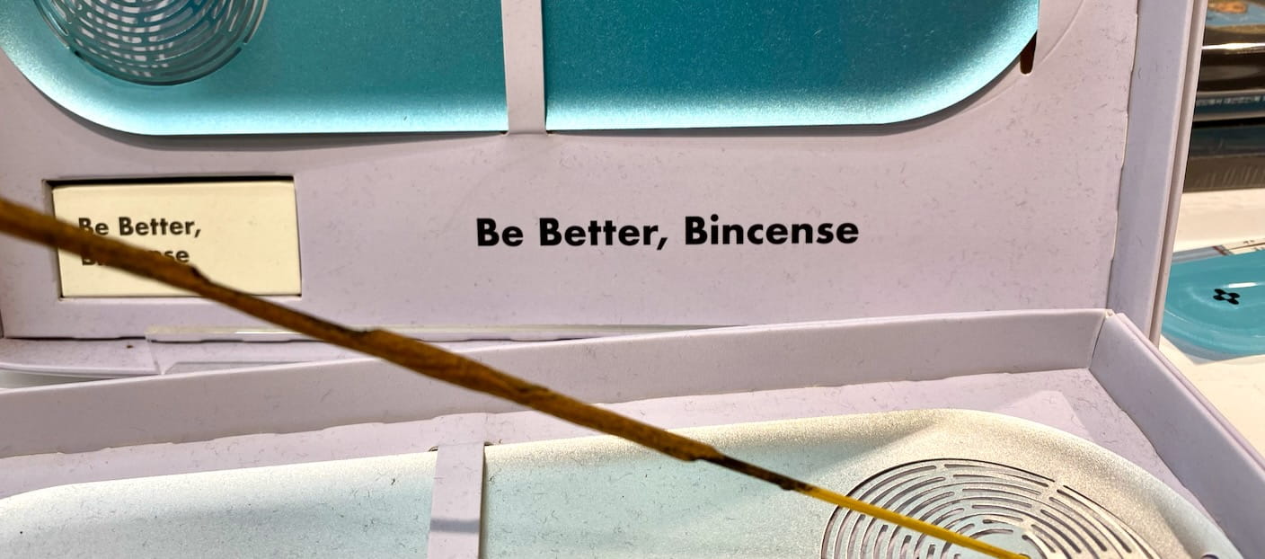
At least, I’m assuming you’re supposed to say it “be incense.”
I know it’s probably toeing the line of rudeness to like this stuff, but I do. I can’t help it.
I think maybe a little bit of it is the reminder of the mountainous volume of both grammar and idioms that are locked in the language center of my brain so deeply I am not even aware of them, just the same way Japanese speakers apparently often aren’t even aware their language has pitch accent, or that I wasn’t even aware that verb conjugation existed before I started beginner Spanish in grade ten. These kind of miracles of complexity, which you only notice upon their violation, give me renewed faith that maybe yes, there really is a language part to the brain that’s vibrating at cognitive pitches my deliberate conscious meat thinker can only dream of through its (the language center’s) echoes.
But mostly they just make me smile.