Misclicking Live Search
Breaking Latency Assumptions
This post is about problems with search-as-you-type features, like search on an iPhone or Spotlight on macOS.
An Example
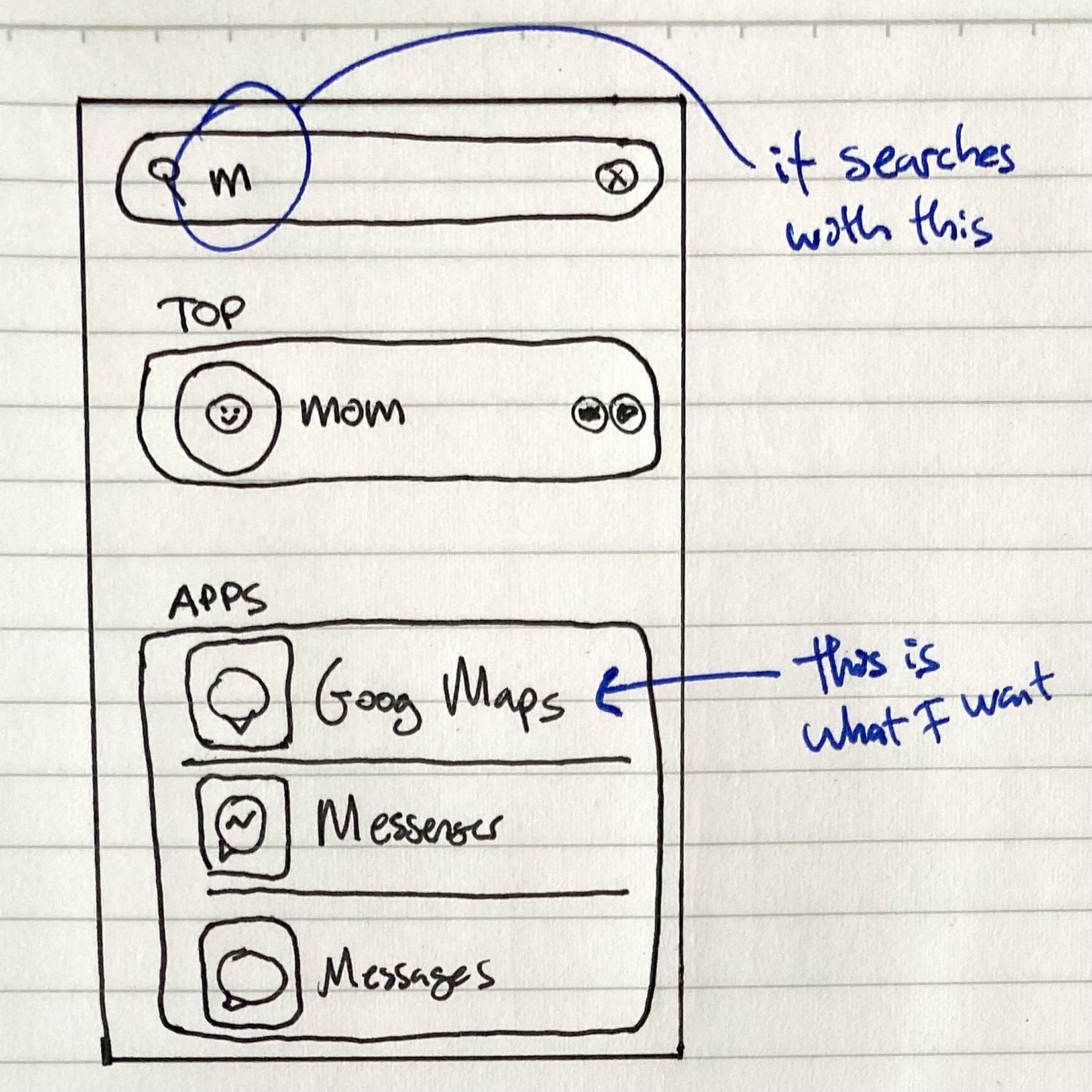
On my phone, I want to open Google Maps. So I swipe down and start typing “maps.” I get to “m” and search results start streaming in:

Ah good, there it is, just let me…
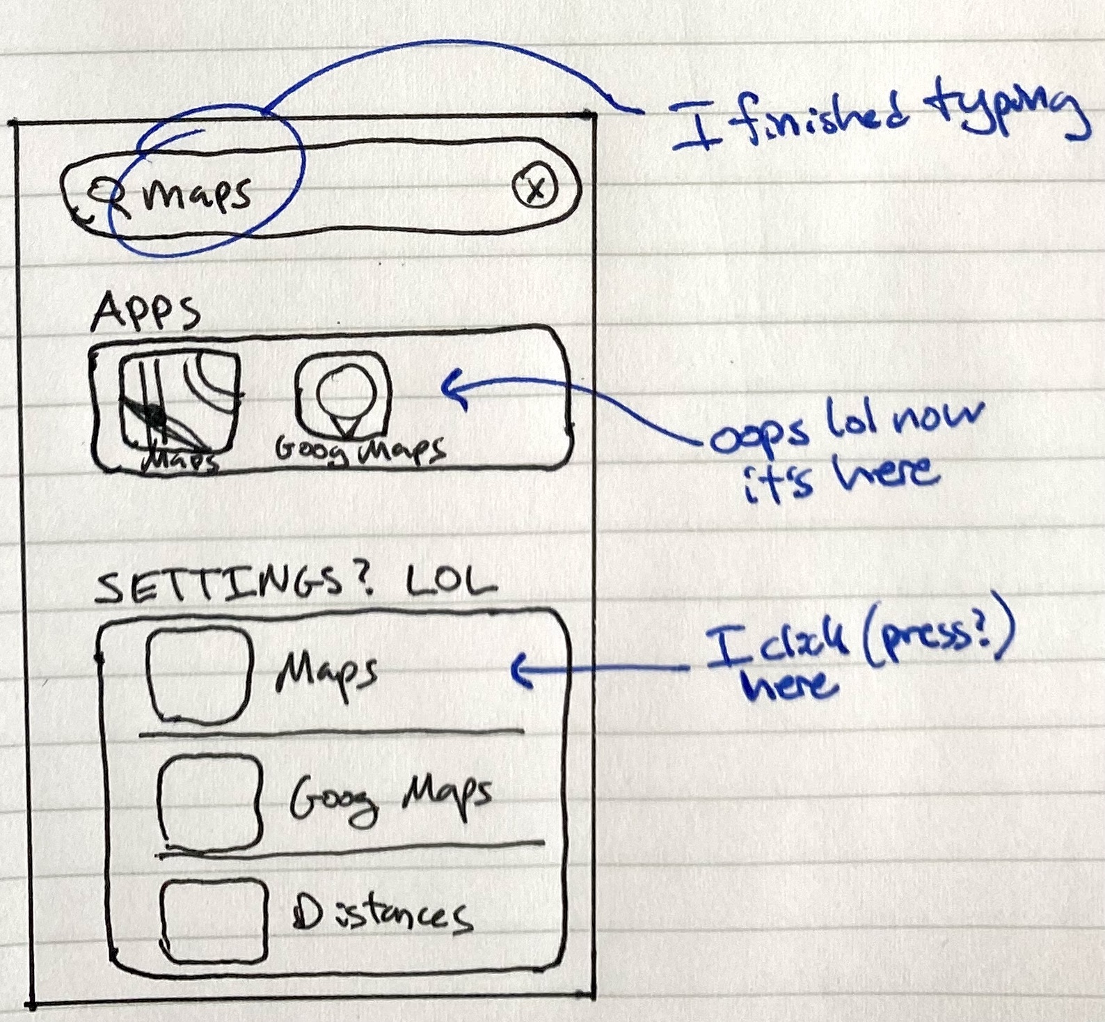
As I finish typing “maps,” I notice where Google Maps is, so I start moving my big stupid slow finger to press it. But right before I touch the screen:

I end up opening the settings page for Apple Maps, rather than the actual app for Google Maps.
This happened all the time when I had an iPhone 6. It was a shockingly bad experience right on the surface of multiple Apple products.
Of course, I knew the reason for it happening on my phone: it was too old. (I was still using my iPhone 6 up until the iPhone 11 came out.) They test all their stuff on newer phones, I’m sure, where the results latency is always very low. But the design does not degrade gracefully. When you phone is slower, your experience doesn’t just become slower, it actually causes errors.
The Problem(s)
There are actually two separate problems that might happen. The previous example was for problem #1. Both of the problems manifest in you selecting the wrong thing and getting grumpy.
-
Selecting too slow: updates during the physical act of selection. Search results update as you’re typing, but (inevitably) with some delay. So, the completions for a prefix (like “Desk”) are different than for the full query (like “Desktop”). This causes problems if you go to select on something from a partial completion, but the results update right before you press/click because of more text you typed.
This issue also happens due to search results coming from the Internet. They arrive after your local (on-device) search results. And they rearrange your local search results. So, you finish typing, see the device results for the full query, and go to tap on something. But then, right before you tap on it, Internet results come in and replace the thing you’re going to pick, and you end up selecting on something completely different.
-
Selecting too fast: old results present after completing a query. You want to click something from a full completion, and you know what the completion will be. For example, you know from past experience that the top hit for “Desktop” will be opening your Desktop folder. So you type in “Desktop” and immediately press Enter. But, the list still has results from some partial completion for about a second after you finish typing. So if you just type and press Enter, you will pick one of the old results.
I used to hit problem #2 almost daily with macOS Spotlight (cmd+space), the search function I use to open basically everything on my computer.
This is all bizarre to me because Apple usually does a great job with most interface stuff. I’m surprised to find something this consistently bad.
The Design Problem
First I was annoyed at this,
Then, I was still annoyed at this, but had to admit, “OK, that’s a hard design problem.”
You want to display some kind of results as quickly as possible so the user isn’t waiting around. But you must plan around variable latency. Even if you somehow cache everything on the phone and can guarantee those matches are quick, once you include Internet material, you simply must to plan for some results to come back with higher latency.
Here are some half-baked ideas.
-
Display nothing during typing. Have some fixed delay before anything is shown. If the user starts editing the query again, remove all the results until they’ve stopped, wait the delay, and then show the new list.
This would be annoying because it would be slow. Maybe you could let people explicitly tap/press Enter to get results more quickly.
-
Display slow results in separate sections. Have latency guarantees for different categories of results. For slow stuff like Internet searches, don’t let those results change the ordering of the fast results.
You could combine ideas 1 and 2. If you can be sure that one section will update fast enough nobody will select a stale one, you can display it early. However, for something like Spotlight, where the top result may be slow (Internet) or fast (local on your computer), the section-based idea wouldn’t help.
Epilogue
When I first wrote this, I was using an iPhone 6 and a Macbook Pro from 2015. Now, I’m using a newer iPhone and newer Macbook Pro. I don’t have these issues.
Have they fixed the design? Or have I just graduated back into the expensive class of blissful ignorance?