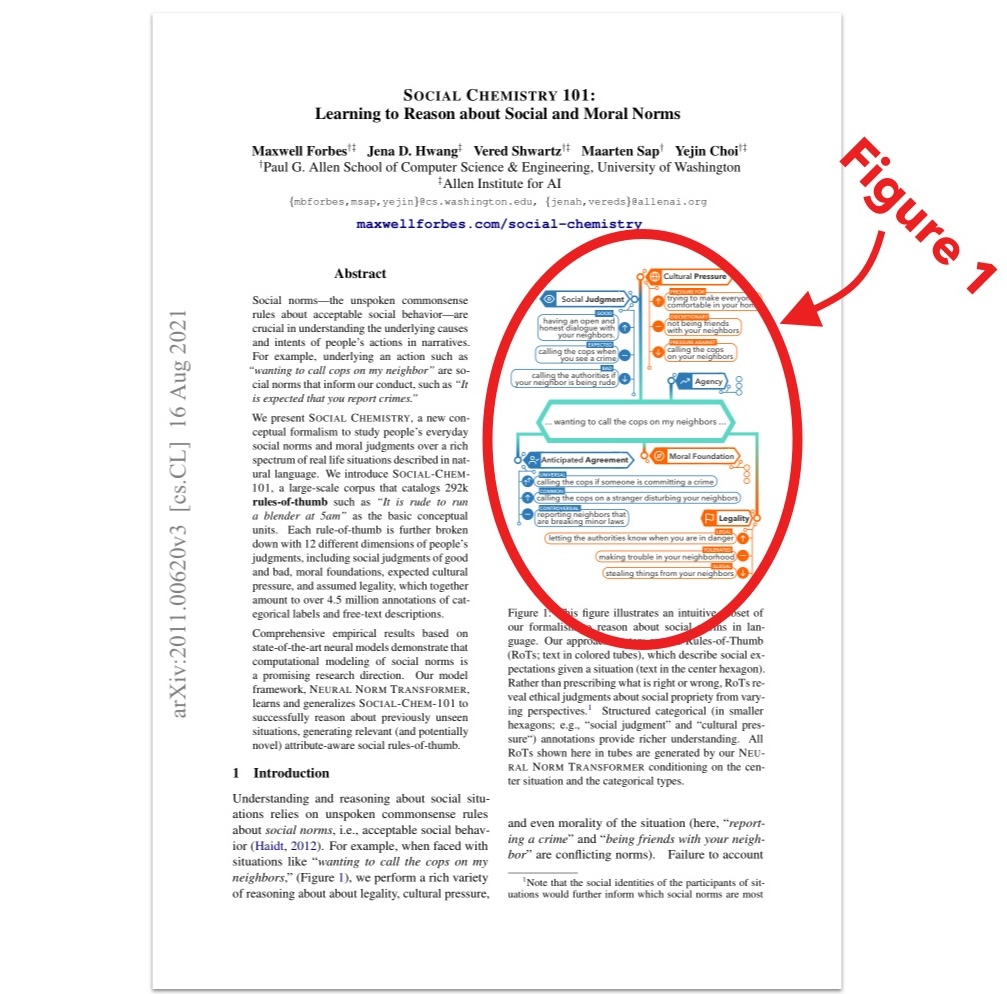
Figure Creation Tutorial: Making a Figure 1
The final figure, and eight drafts we’ll walk through.
Intro
One of the things I think our lab01 does well is that we put a lot of time into each “Figure 1” for our papers. It’s not uncommon for us to go through ten or even twenty revisions of this figure.
What is Figure 1? It’s what we call the figure that appears on the first page of a paper. Due to the software we use to write papers, this figure always gets automatically labeled “Figure 1,” hence the name.
As your paper’s graphical stamp, Figure 1 is like a book’s illustrated cover.
Figure 1 is important because:
- it’s how people will visually remember your paper,
- it’s a chance to engage someone’s interest and lure them into actually reading your paper,02
- and perhaps most crucially, it’s your first and best shot to visually explain what your paper does.
As a reader, I love seeing a Figure 1 because it often answers the question, “what did this paper actually do?” You can sometimes figure this out from the abstract and intro, but more often than not, what the paper literally accomplishes is somewhat buried behind pontificating and ambitious framing. A clear Figure 1 is a welcome shortcut to getting the “what’s the input and what’s the output?” view of the work.
This Tutorial
Because I’d like to see more people make Figure 1s, I figured (hehe) it’d be fun to share an example of my process making a Figure 1.
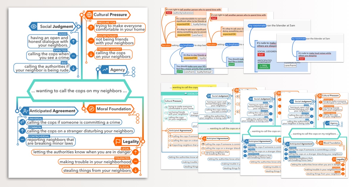
The Figure 1 I’m sharing here is for a paper I worked on called Social Chemistry 101.
It’s not a perfect Figure 1. I’ve seen better, and I think I’ve probably made better. But it’s a recent one for which I remembered to save my working drafts.
Shameless plug: if you’re interested in reading the Social Chemistry 101 paper, you can find it here.
Goals
My high-level goals for a Figure 1 are:
- Use a good example
- Have moderately high information density
- Make it as visually appealing as I can
Let’s break each of these down.
For me, a good example must hit several criteria:
-
The example should clearly articulate the primary mechanism accomplished by the paper. If your paper does syntax parsing by making a special representation of entities, then your Figure 1 should show an example syntax parse tree and some visualization of the entity representations. If your paper captions images by first replacing all people with dogs, please show some of those images and captions because omg that would be a hit.
-
The example should be plausibly producible by the proposed approach. We all expect the Figure 1 example to be cherry-picked, but it should at least be realistic.03
-
The example should be at least a little bit funny, interesting, or memorable. Picking at random from your dataset is usually a recipe for discovering how boring most text is, not capturing your reader’s attention.
Current paper aesthetics generally demand moderately high information density, and this includes Figure 1. Wasted space connotes a lack of content.
And by making the figure as visually appealing as you are able, I’m referencing the entire study of graphic design. As far as I can tell, design is a skill that must be acquired by practice. The best tip I have is to notice what you like, and keep making things so you’ll improve. For any project, you just do what you can with where you’re at on your design journey—hence the “as you are able” part.
I’ll get into some additional goals for this particular Figure 1 in a bit. In the meanwhile, let’s jump right in.
First Iterations
My first drafts centered around an example from our dataset, “Asking my boyfriend to stop being friends with his ex.” I drew out several related social rules-of-thumb, connected them to the relevant characters, and also provided some attributes.
If you’d like a brief primer on what the terms in these figures mean, the Social Chemistry website starts with a walkthrough of the core concepts.
v1 — Maximalist
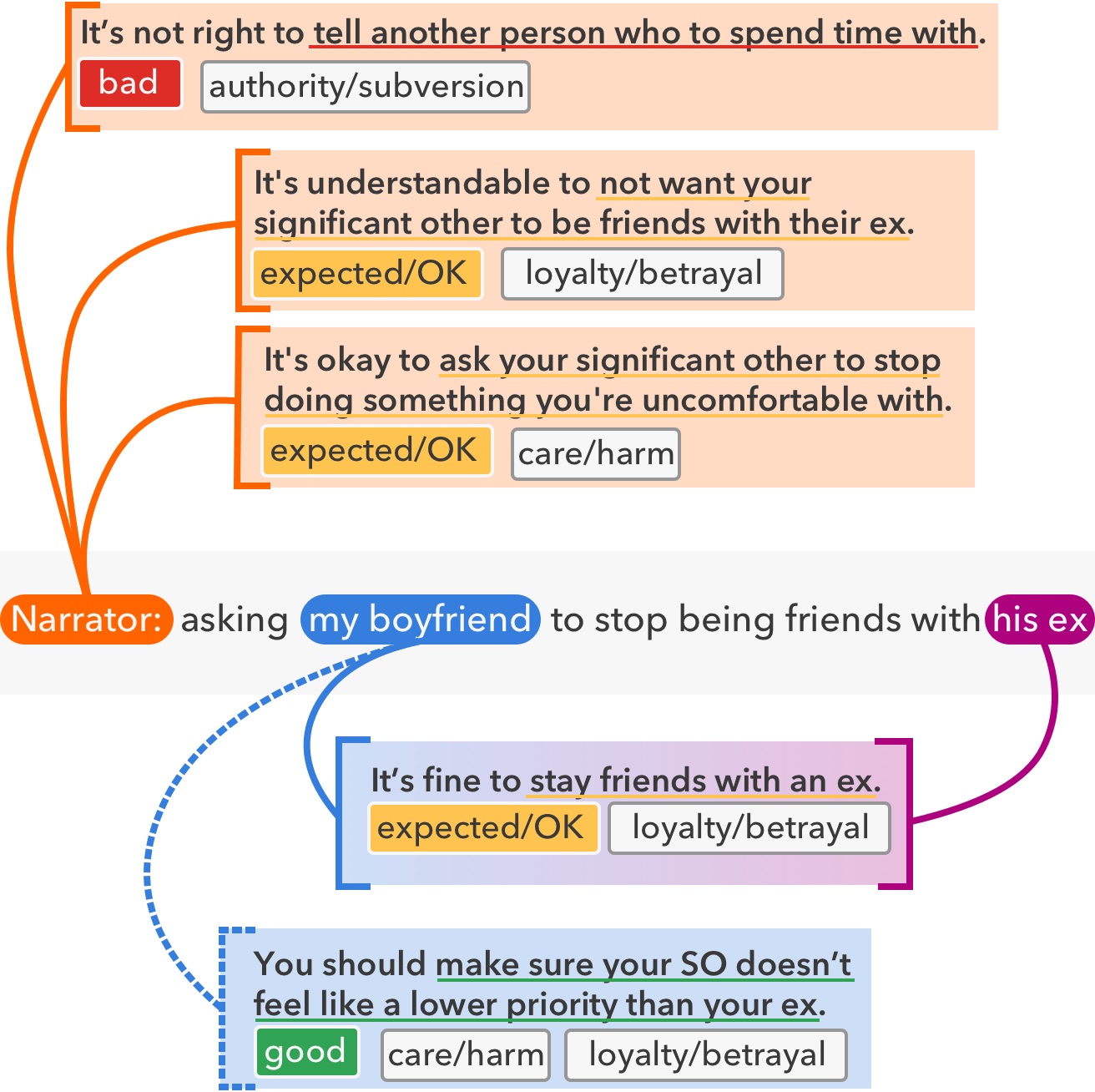
First draft (v1) of this Figure 1.
There is a lot going on here! If we focus on color, we have the colors of larger boxes representing the relevant character (orange, blue, purple), the underline and judgment box colors matching the whether an action is good or bad (green, yellow, red), and grey to otherwise provide borders.
I love using color to represent meaning in Figures, because our brains are great at doing color matching. A semantic color palette gives you an additional dimension to work with, allowing you to group concepts across space. 04
If we think about the concepts introduced, there are also quite a few: a situation (center), characters (narrator, my boyfriend, his ex), rules-of-thumb (larger boxes), actions (underlined), judgments (good, bad, expected / OK), and moral foundation axes (smaller gray boxes). I’ve also tried to slip in one additional concept, which is whether the rule-of-thumb is being followed or violated. I did this by using a dashed line connecting my boyfriend to the bottom rule-of-thumb.
Introducing so many concepts right in Figure 1 means that the caption must do a lot of legwork to explain it. As a rule-of-thumb, the Figure 1 + caption package should be understandable by someone else in your area of study on its own (i.e., without reading the paper).
With such a broad color palette and high density of concepts, I then tried out a few drafts to reduce the number of things appearing on the page at once.
v2 — A Reduction
Top: Left: v1 Bottom: Right: v2
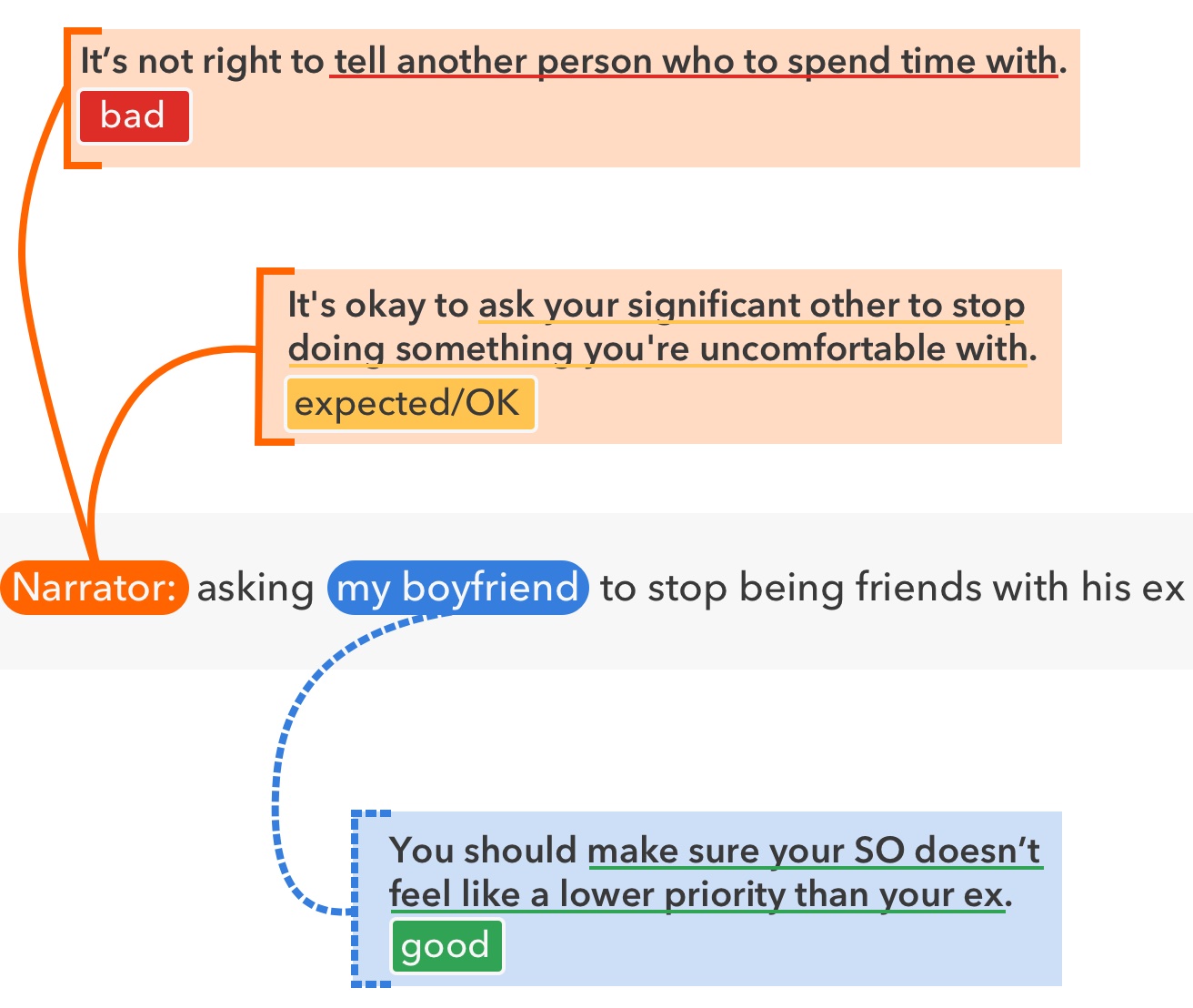
For v2, I tried eliminating the moral foundation axes and the his ex character. This reduces the number of concepts, and slightly narrows the color palette. (If we’d further developed this version, I’d have compressed the spacing to make it denser.)
v3 — Minimalist
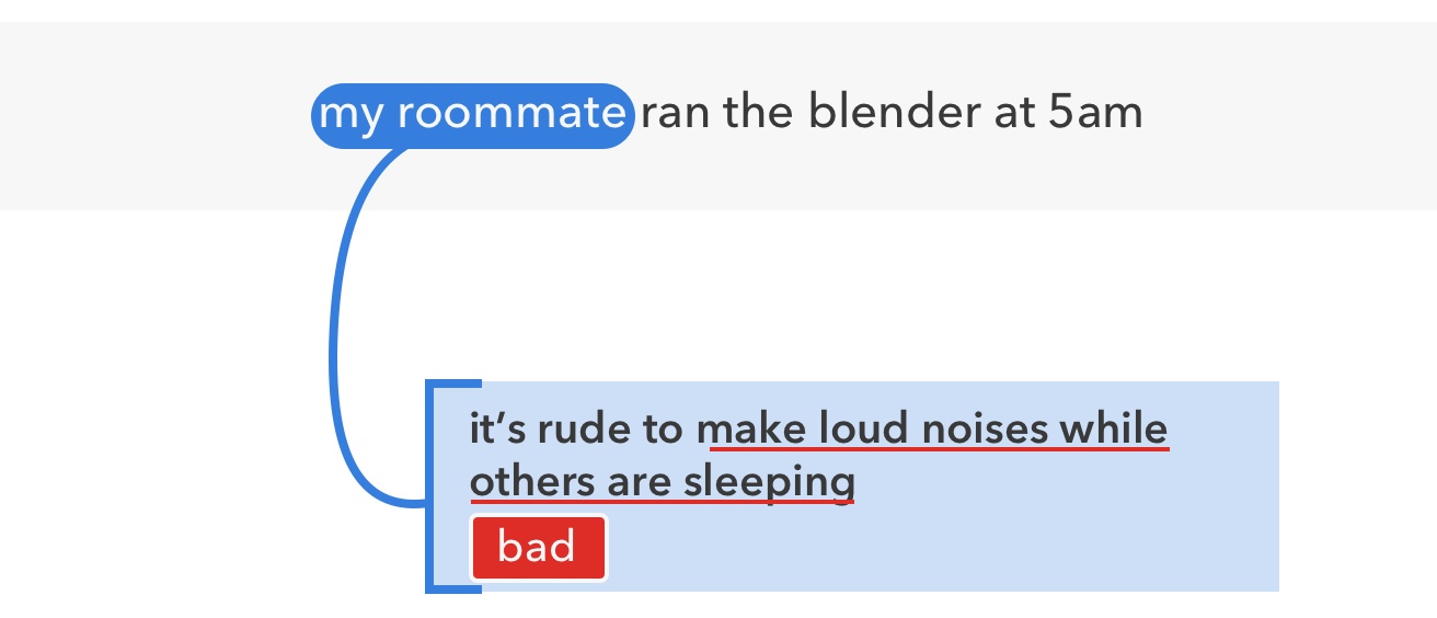
Top: Left: v2 Bottom: Right: v3
I wanted to try a much simpler example for v3 to try to evoke the essence of the project: rules-of-thumb (it’s rude to make loud noises while others are sleeping) annotated on characters (my roommate) in situations (running the blender at 5am). This his the other side of the complexity spectrum compared to v1.
Though we didn’t keep it, I think it’s helpful to try these minimalist reductions and see whether they work. I find I’m often trying to balance communicating the scope of what we did, with clearly getting across the key idea.
v4 — Add Back Attributes
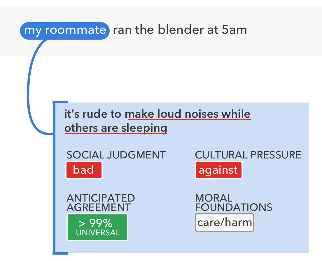
Top: Left: v3 Bottom: Right: v4
v4 expands on v3 in a different direction. Rather than emphasize the multiple character and multiple perspective angles we saw in v1 and v2, we introduce more attributes in v4: cultural pressure (against) and anticipated agreement (> 99%). This starts to hint at the density of the annotations we collect (we have over ten attributes per rule-of-thumb).
At this point—if not before—it’s good to share some drafts with collaborators. I’m usually so zoomed into the details of a project that it’s tough to see the bigger picture. Collaborators who aren’t as tightly involved can be a huge help because they don’t remember as much about the project. You can use them to simulate someone coming to the paper fresh.
Rethinking the Design
After discussing the designs with my collaborators, the main feedback I got was to evoke a graph-like structure from our work.05 This presented a new challenge to convey visually, because our annotations are dense, but have almost no connections between them.
To display a denser graph that still illustrated our problem, I eventually realized we could pivot through a few attributes in order to show multiple rules-of-thumb. This is best shown rather than described, so I’ll save further explanation until after v5.
My other goal, since we had settled on Social Chemistry as the name for our work, was to more deliberately evoke a “chemistry” look. I attempted this by mimicking the design of chemical structural formulas, which use hexagonal shapes.
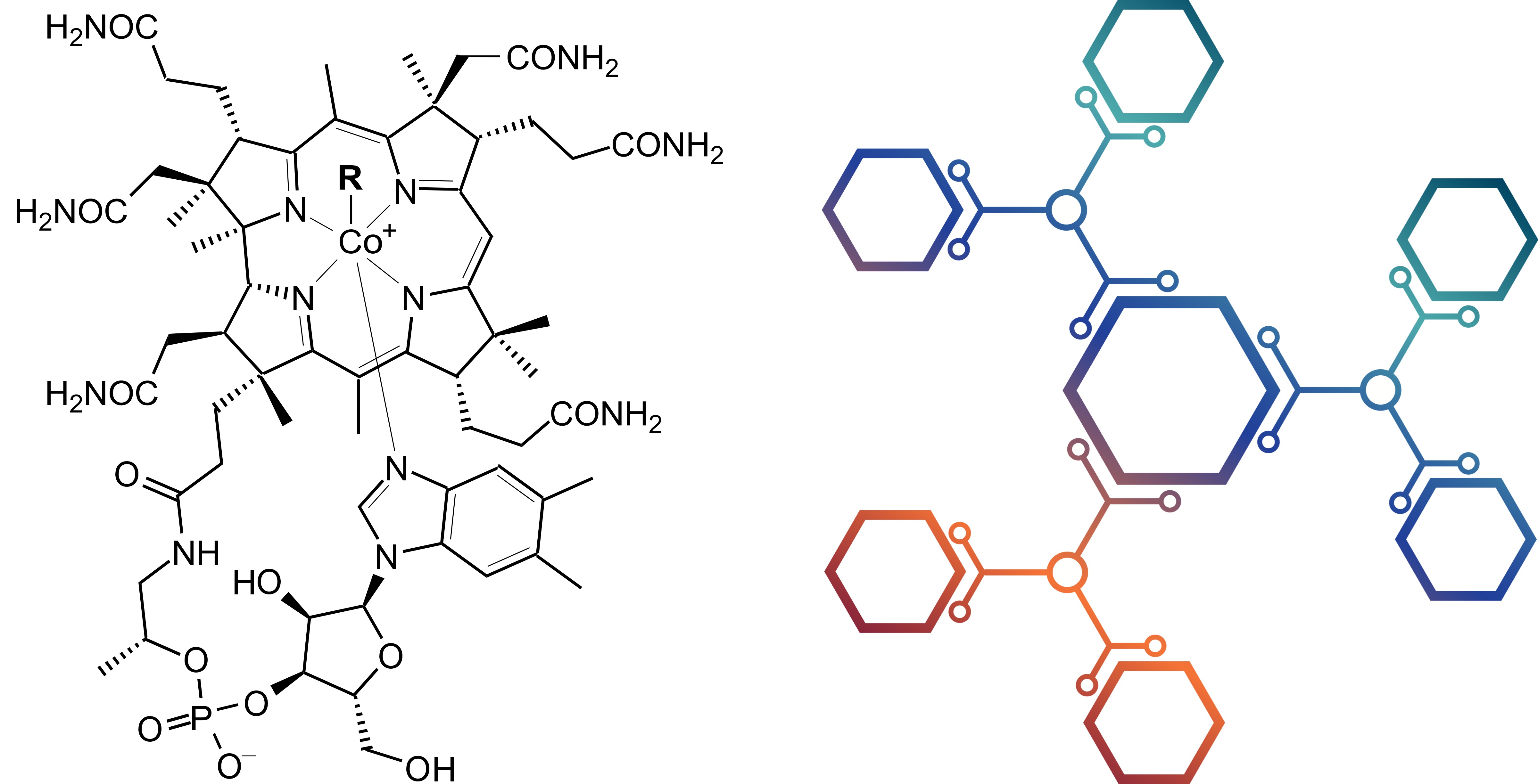
Example of structural formulas used in chemistry. Left: legit example from Wikipedia (source). Right: illustration, which also has circuitry-like embellishments (source from aggregator; original source unknown). I drew visual styles and color inspiration from the illustrated version.
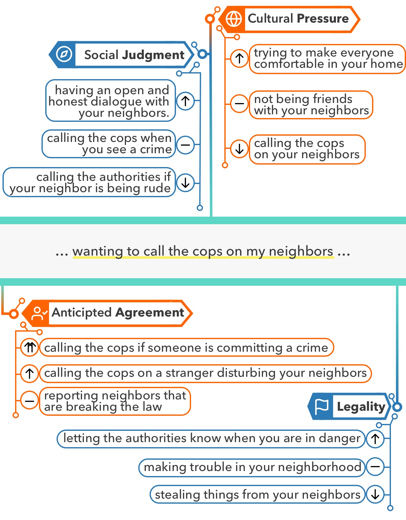
v5 — Refresh, Frame As +/-
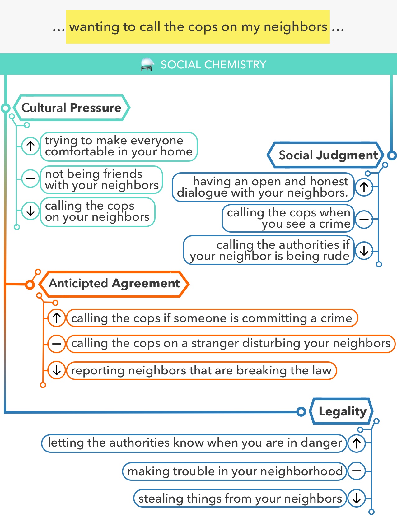
Top: Left: v4 Bottom: Right: v5
Rather than focusing on the rules-of-thumb that were annotated for a particular situation, for v5, I showed generated rules-of-thumb that illustrate different attribute labels. For example, for the Cultural Pressure dimension (top), I show rules-of-thumb for ↑ positive, — neutral, and ↓ negative cultural pressure.
The downside of this is that we move away from showing the literal annotation that we performed, which also sometimes makes the rules-of-thumb more loosely related to the actual situation.
The upside is that we can show a richer graph structure that illustrates a strength of the work: a hybrid between structured values (the attributes and ↑/—/↓ labels) and unstructured natural language (the free-form rules-of-thumb).
Aside: Notice that color no longer conveys any meaning in this figure 🤷
v6 — Refine
Top: Left: v5 Bottom: Right: v6
At this point, I was honing the visuals.
-
I centered the situation. With all attributes descending vertically, I thought things looked more list-like than graph-like. Centering the subject in the middle allows lines to emerge from multiple directions vertically, which I think helps with the impression of a graph.
-
I removed the ⚗️ pre-rendered emoji and project name. I was using Apple’s alembic emoji—which is beautiful—but I am pretty sure those rendered emoji are copyrighted. Since this was for an archival academic paper, I thought it would be better to err on the side of caution. And removing the project name from the figure just felt more tasteful.
-
I added icons for the four attributes. I made the icon backgrounds solid colors because I thought the figure felt too sparse. The icons add some fun, and the color adds some weight.06
-
I made the color usage more consistent. Restricting the teal to only be around the central situation helps differentiate it from the attributes, which now alternate orange and blue.
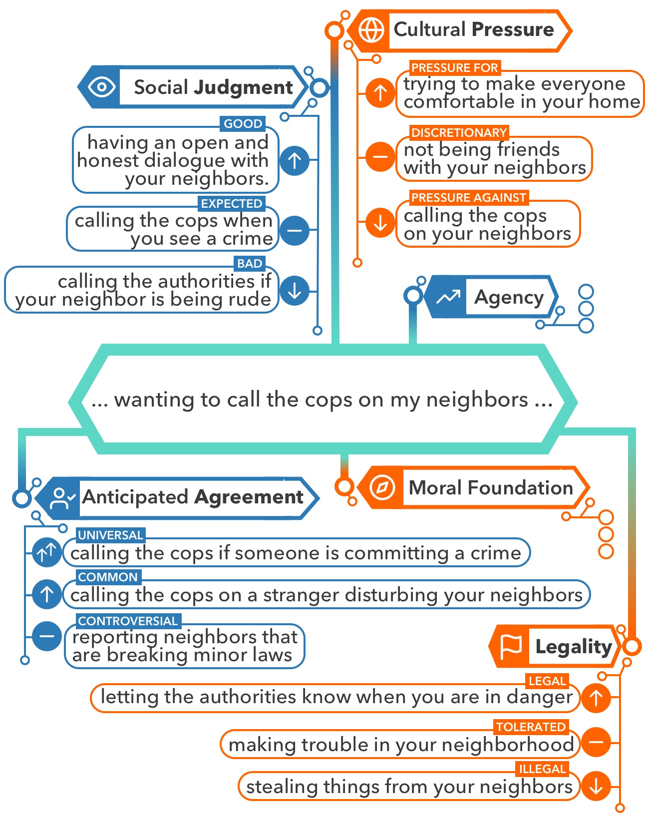
v7 — Emphasize

Top: Left: v6 Bottom: Right: v7
At this point, I was honing in on the design elements, and adding more bits as necessary for clarity.
-
I made the situation a hexagon, and thickened main lines. I also removed the gray and yellow colors on the situation.07 This, I hope, finally made things start to look chemistry diagram-like.
-
I added attribute value labels. E.g., for Social Judgment, I added the labels “good,” “expected,” and “bad” above the examples. I like the simplicity of the ↑/—/↓ icons, but having a key lets interested viewers understand more precisely what’s going on.
-
I gave attribute value icons solid colors. The solid colors behind the ↑/—/↓ icons further my effort to give more visual weight to each attribute section.
v8 — Typo
Top: Left: v7 Bottom: Right: v8
Can you spot the difference?
I had spelled "Anticipated" wrong. I’m certain one of my coauthors caught this.
Lack of spell-check is one knock against Sketch, the drawing software I use.
It’s Done
Eight short versions later, we’ve got a Figure 1. Now, rinse and repeat—with slightly different goals—for the other figures in the paper.
Five Final Tips
As I was writing this, I thought of a handful of tips that didn’t neatly fit into any of the revisions.
1. Start on Paper
Maybe if you’re a design guru you can think at the speed of click, but I find it vastly easier to cook up an initial design with a pen.
Usually, my first drawing won’t work perfectly with the space constraints of the figure, because I misestimate the sizes of objects or text. But it gets me started.
2. Use a Text Size Guide
The smallest text in your figures should be around the font size of footnotes. It can be difficult to judge this when you’re making the figure. I made some placeholder figures that have text at a legible size, and I use them as a guide when I’ve moved from pen and paper to building the actual figure.
3. Start with Decent Colors
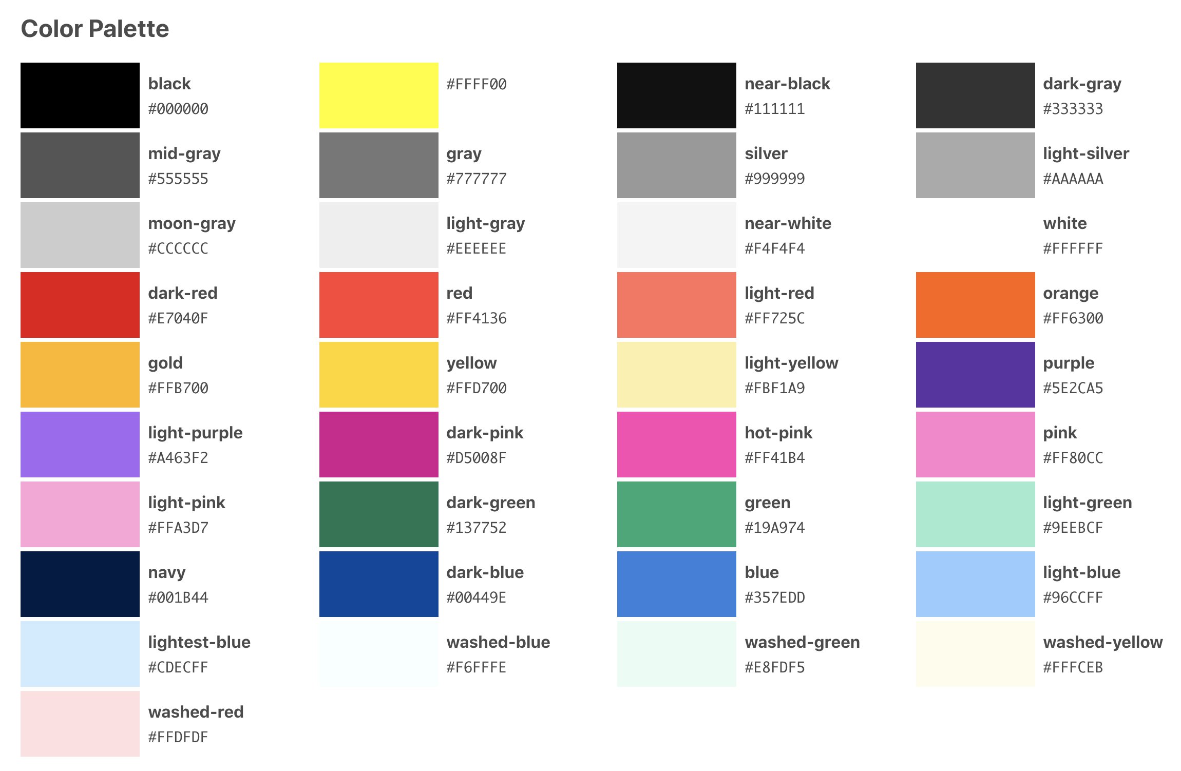
Curated color palette from Tachyons.
If you’re used to thinking that red should be #FF0000, you can immediately up your aesthetic game by starting from a curated palette, like the basic one above from Tachyons. If you’re using colors to describe a scale, either with sequential values or unrelated categories, consider starting from ColorBrewer. If you’re making a gradient, check out the collection at uiGradients.
4. Care about Contrast

The simplest tip I can give is to try switching your text color from black to white when the background gets darker.
- This is awful.
- This is fine.
If you want to be thorough, run any color combos you’re worried about through a contrast checking tool.08
5. Export a Scalable Format

E.g., PDF for a paper, SVG for a website.09 That way text and graphics remain sharp when people zoom in to read the tiny text you crammed in there when ignoring tip #2 (hey, no judgment).
Summary
Figure 1 is important for memory, engagement, and as a visual explanation.
I put forward three common goals for a Figure 1:
- Good example
- High information density
- Best design you can muster
In my Figure 1 design, the key points I hit on were:
- Using color either to convey meaning, or as visual engagement
- Explicitly considering a budget of introduced concepts
- The figure and caption should be self-contained
- Evoking a design (e.g., a graph structure) that is within the vocabulary of others in your field, and serves a broader purpose
- Evoking a connotation (e.g., chemistry)
- Minding copyrights (emojis, icons, and fonts if embedding in a website)
- Erring on over-labeling for clarity
- Last but not least, spell checking 🤦♂️
Then I gave five final tips:
- Paper first
- Sizing guide
- Colors
- Contrast
- Vector export
If you enjoyed this, consider following me on Twitter, or subscribing to my monthly email digest.
Footnotes
I’m in Yejin Choi’s lab (research group) at the UW. ↩︎
Given the volume of research published these days, especially in machine learning-related fields, getting people to read what you write turns out to be one of your biggest problems. I didn’t care about this until I wrote a paper I was actually proud of, and have had the damndest time getting folks to notice it. ↩︎
Cherry picking—or even hand-crafting—the example shown in Figure 1 might be a little controversial. My take right now is that the primary purpose of a Figure 1 is to convey the idea behind the work, not necessarily the strengths or weaknesses of the execution (unless that is the main idea). We have canonical spots later in papers for “examples chosen at random,” “model successes,” and “failure modes.” ↩︎
There are a couple caveats with color to bear in mind. One is whether the figure must be interpretable without it, i.e., when printed in black-and-white. In my opinion, this has flipped just over the course of my PhD (i.e., from 2015–2021). Previously, I would say it’s vital the figure conveys all meaning in black-and-white, but now, I think printing is so rare—simply due to the volume of papers we must skim—that it is fine to rely on color. Some paper venues may insist otherwise, in which case the colors must retain their perceptive grouping in grayscale, or another redundant element must be used (e.g., borders, or background textures like cross hatching). The other main caveat with using color to communicate meaning is the visually impaired. My rule-of-thumb is to mitigate the most common kind of colorblindness, both preemptively by choosing a color palette (e.g., with ColorBrewer) and at the end by running the figure through a colorblind simulator. ↩︎
In case “evoke a graph-like structure” seems like weird feedback, I offer a couple thoughts. First, if you’re like me and you get sucked into what you were literally doing in a project, it can be tough to remember that what you’re doing is probably an instance or special case of a broader research idea. So, while an overarching structure that you don’t see may seem artificial, it may in fact be true, or at the least helpful for communicating your work to others in the field who are familiar with a certain vocabulary of framing devices. Second, your work probably exists in part of a broader research agenda. Keeping research agendas moderately cohesive is helpful for science as a social practice—not just for purposes like funding and name recognition, but for easing the cognitive load of communicating with others in the field. Put another way, there are many ways of telling the story of a particular research project, and some of them may help both your lab’s and your own broader communication strategy. Anyway, I’m not an expert here, just my two cents. ↩︎
Icons or little graphics are another source of copyright headaches. I went with public domain icons that I tweaked. For other projects, I’ve used CC-BY icons and added an attribution in the figure caption. ↩︎
A rule-of-thumb I have for colors is to use as few as you can. I used to be so extreme about this that the Figure 1 for my first NLP paper is entirely in shades of gray. There is an elegance to this, but it could be more engaging, fun, and warm with a pop of color. As with everything, it’s a balance. ↩︎
Thanks to Callan Berry for suggesting the contrast checking tool. ↩︎
One big caveat with SVGs is that they typically require the viewer to have the fonts you used installed to display properly. This is because SVGs don’t embed the fonts, they just reference them by name. This means if your viewer doesn’t have the font you picked, their formatting may get totally messed up, and you probably won’t realize it because it looks fine on your computer. You can get around this by having the fonts included on your webpage, but this restricts you to using fonts you can distribute for free. You can also get around this by converting all of your text to shapes before exporting. However, this might be a pain—for Sketch (the software), it’s prohibitively annoying to do this. This is all just enough of a headache that you might consider skipping SVG altogether for a webpage and just slapping a JPG (😱) on the website. That’s what I used for this post because I didn’t want to deal with the potential font problems. ↩︎
