Blank Screen Manifesto
This is something I hope to rework into a proper post someday.
It’s crazy how much visual distraction there is by default when using a computer.
You open up the computer, and there’s icons and text absolutely everywhere.
That’s even if you don’t have much open. If you have a couple windows open, it’s complete madness.
What’s wild is it takes a bizarre frame of mind to even see this as madness.
You have many companies’ ideas of “UX” all shuffled around the same screen. Even with only high budget interfaces—Gmail, Slack, FB Messenger, a smorgasbord of Apple apps—they’ve all got embedded menus and selections and widgets, different typography and spacing and colors (I think Gmail will be the last webpage on earth to add dark mode). It’s a veritable cacophony.
And it’s not just sometimes—this is the default. This is how our hellhole is expected to look like.
When I’m feeling overloaded and want simplicity, I reach for a notebook. A fresh piece of paper is so perfectly, perfectly empty. But my handwriting is so much slower than typing, the lag behind my thinking becomes unbearable.
So then the computer it is.
Even opening a new Desktop, and just Apple Notes, there’s crap everywhere. Apple’s top menu bar, all the text, all the icons, the clock. Notes has folders, and if you collapse that, your collections of notes.
VS Code doesn’t get you all the way there, either. I had to spend a whole evening customizing “Zen mode” to make it marginally more Zen. The final stuff at the top—the filename, its path, and some icons—are unremovable except through forceful measures (changing the program’s CSS through a tampering extension).01 Little bits like word suggestion popups and misspelling squiggles that yell at you when you’re in the middle of typing a word are easy to accidentally let drive their cognitive ticks into your attention span repeatedly for hours. It’s wild to me that “just the text” is so radical it’s not even possible.
Zen-ish, even after hours of tweaking.
The whole thing makes me want to throw it all out and start over. Start without status bars, menus, widgets. Bare, beautiful rectangles. Allow a gradient or a single photo, if you like.
I wouldn’t have even thought this possible if I hadn’t seen some screenshots of someone named Nerdy Pepper’s computer interface a while back:
Source: Nerdy Pepper’s “Dijo”
This blew my mind.
There’s nothing but the application. NOTHING.02
He’s using some Linux build. It seems inconceivable for me to achieve this on macOS. How could you possibly turn everything off? But I’m unwilling to go back to Linux for my daily computer, so here we are.03
So what to do?
I started by removing everything.
I finally figured out how to hide Apple’s top menu bar (didn’t realize you could do that). I made the Dock comically tiny so I would never accidentally trigger it. I installed a macOS automation software called Hammerspoon, and finally learned a bit about the plethora of half-baked options Apple gives (AppleScript, Automator, Shortcuts). And I made a keybaord shortcut that quits all apps, closes all windows, and removes all extra desktops.04
Now, If I press ⌘⌥⌃C, literally everything goes away, and I’m left with beautiful blankness.
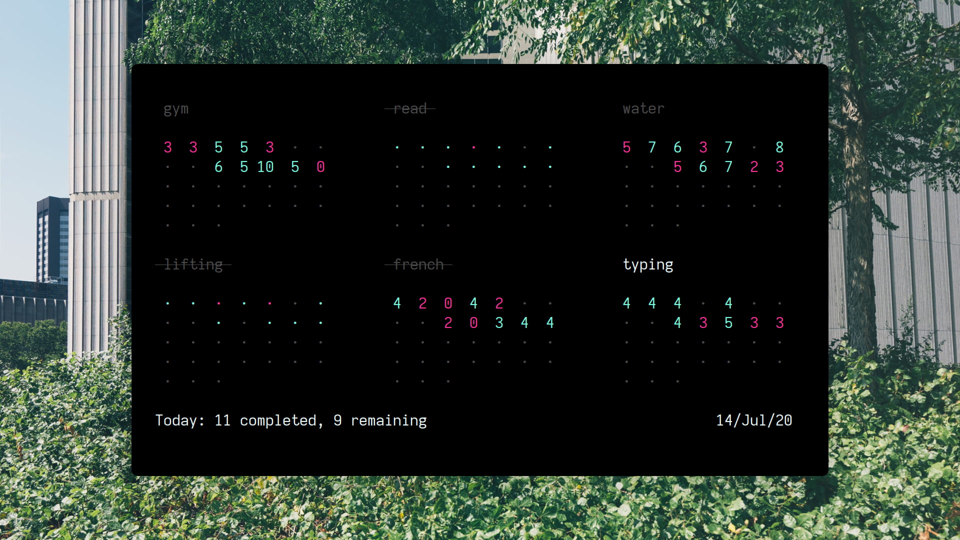
Actual desktop screenshot (!)
The most radical was closing my email inbox. I think I’ve had it open since 2011. I never want to close it. I don’t want to “miss something.” What would I possibly miss? This realization let me also close Slack, Messages, and others I felt I “had to have up.”
I’ve started pressing ⌘⌥⌃C when I’m finished doing anything. Then I can actually breathe and think. What do I want to do next?
My next step is slowly putting together new shortcuts to bring tasks to life. Groups of apps and windows that I use to do a task, maybe even play some music and start a Pomodoro timer.
I still think there’s a “messy desk” mode of general purpose work computing where you have fourteen apps and thirty-eight browser tabs all open. But now at least I have the choice to (metaphorically) clean the (metaphorical) desk when I (metaphorically) go home from (metaphorical) work.
Footnotes
It’s the icons that really get to me. They’re buttons for things I already have key shortcuts for, or never want to do. But I am forced to keep them. ↩︎
Well, the background picture, which I think is tasteful and clearly could be just a plain white if desired. ↩︎
It occurs to me now, only with his screenshot next to mine, that this might have just been a screen grab of part of his desktop, and I invented a whole world of customized operating systems with beautiful empty screens based on a misconception. But at this point it doesn’t matter, the idea is good anyway. ↩︎
Apparently what macOS always labels “Desktops” are actually called “Spaces”—this resulted in a lot of wasted Googling. Actually, a lot of Apple’s stuff is named terribly for Googling. Try getting material about the app called “Shortcuts.” ↩︎
